注意
前往結尾下載完整的範例程式碼。或透過 JupyterLite 或 Binder 在您的瀏覽器中執行此範例
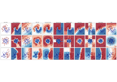
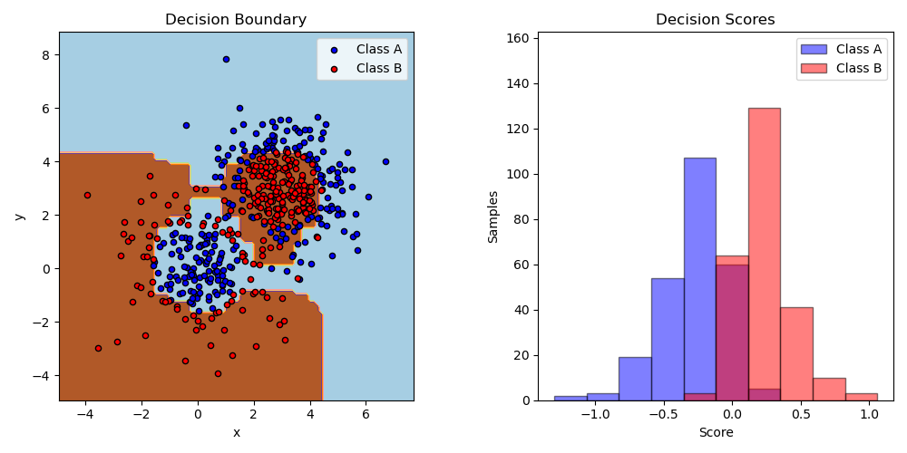
雙類別 AdaBoost#
此範例將 AdaBoosted 決策樹樁擬合在由兩個「高斯分位數」叢集組成的非線性可分離分類資料集上(請參閱sklearn.datasets.make_gaussian_quantiles),並繪製決策邊界和決策分數。決策分數的分佈分別顯示在 A 類和 B 類的樣本中。每個樣本的預測類別標籤由決策分數的符號決定。決策分數大於零的樣本分類為 B,否則分類為 A。決策分數的大小決定了與預測類別標籤的相似程度。此外,可以建構一個新的資料集,其中包含所需的 B 類純度,例如,僅選擇決策分數高於某個值的樣本。
# Authors: The scikit-learn developers
# SPDX-License-Identifier: BSD-3-Clause

import matplotlib.pyplot as plt
import numpy as np

from sklearn.datasets import make_gaussian_quantiles
from sklearn.ensemble import AdaBoostClassifier
from sklearn.inspection import DecisionBoundaryDisplay
from sklearn.tree import DecisionTreeClassifier

# Construct dataset
X1, y1 = make_gaussian_quantiles(
    cov=2.0, n_samples=200, n_features=2, n_classes=2, random_state=1
)
X2, y2 = make_gaussian_quantiles(
    mean=(3, 3), cov=1.5, n_samples=300, n_features=2, n_classes=2, random_state=1
)
X = np.concatenate((X1, X2))
y = np.concatenate((y1, -y2 + 1))

# Create and fit an AdaBoosted decision tree
bdt = AdaBoostClassifier(DecisionTreeClassifier(max_depth=1), n_estimators=200)
bdt.fit(X, y)

plot_colors = "br"
plot_step = 0.02
class_names = "AB"

plt.figure(figsize=(10, 5))

# Plot the decision boundaries
ax = plt.subplot(121)
disp = DecisionBoundaryDisplay.from_estimator(
    bdt,
    X,
    cmap=plt.cm.Paired,
    response_method="predict",
    ax=ax,
    xlabel="x",
    ylabel="y",
)
x_min, x_max = disp.xx0.min(), disp.xx0.max()
y_min, y_max = disp.xx1.min(), disp.xx1.max()
plt.axis("tight")

# Plot the training points
for i, n, c in zip(range(2), class_names, plot_colors):
    idx = np.where(y == i)
    plt.scatter(
        X[idx, 0],
        X[idx, 1],
        c=c,
        s=20,
        edgecolor="k",
        label="Class %s" % n,
    )
plt.xlim(x_min, x_max)
plt.ylim(y_min, y_max)
plt.legend(loc="upper right")

plt.title("Decision Boundary")

# Plot the two-class decision scores
twoclass_output = bdt.decision_function(X)
plot_range = (twoclass_output.min(), twoclass_output.max())
plt.subplot(122)
for i, n, c in zip(range(2), class_names, plot_colors):
    plt.hist(
        twoclass_output[y == i],
        bins=10,
        range=plot_range,
        facecolor=c,
        label="Class %s" % n,
        alpha=0.5,
        edgecolor="k",
    )
x1, x2, y1, y2 = plt.axis()
plt.axis((x1, x2, y1, y2 * 1.2))
plt.legend(loc="upper right")
plt.ylabel("Samples")
plt.xlabel("Score")
plt.title("Decision Scores")

plt.tight_layout()
plt.subplots_adjust(wspace=0.35)
plt.show()
腳本的總執行時間: (0 分鐘 0.802 秒)
相關範例