注意
前往結尾以下載完整的範例程式碼。或透過 JupyterLite 或 Binder 在您的瀏覽器中執行此範例
手寫數字資料上的 K 平均分群示範#
在此範例中,我們比較了 K 平均的各種初始化策略在執行時間和結果品質方面的差異。
由於此處已知真實值,我們還應用不同的分群品質指標來判斷分群標籤與真實值的擬合程度。
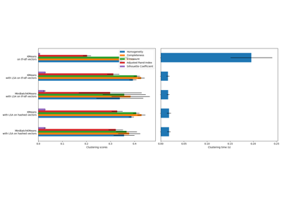
評估的分群品質指標(請參閱 分群效能評估 以取得指標的定義和討論)
縮寫 |
全名 |
|---|---|
homo |
同質性分數 |
compl |
完整性分數 |
v-meas |
V 度量 |
ARI |
調整的蘭德指數 |
AMI |
調整的互資訊 |
silhouette |
輪廓係數 |
# Authors: The scikit-learn developers
# SPDX-License-Identifier: BSD-3-Clause
載入資料集#
我們將從載入 digits 資料集開始。此資料集包含從 0 到 9 的手寫數字。在分群的上下文中,人們希望將圖像分組,使得圖像上的手寫數字相同。
import numpy as np

from sklearn.datasets import load_digits

data, labels = load_digits(return_X_y=True)
(n_samples, n_features), n_digits = data.shape, np.unique(labels).size

print(f"# digits: {n_digits}; # samples: {n_samples}; # features {n_features}")
# digits: 10; # samples: 1797; # features 64
定義我們的評估基準#
我們將首先我們的評估基準。在此基準期間,我們打算比較 KMeans 的不同初始化方法。我們的基準將
建立一個管線,該管線將使用
StandardScaler來縮放資料;訓練管線擬合並計時;
透過不同的指標衡量獲得的分群效能。
from time import time

from sklearn import metrics
from sklearn.pipeline import make_pipeline
from sklearn.preprocessing import StandardScaler


def bench_k_means(kmeans, name, data, labels):
    """Benchmark to evaluate the KMeans initialization methods.

    Parameters
    ----------
    kmeans : KMeans instance
        A :class:`~sklearn.cluster.KMeans` instance with the initialization
        already set.
    name : str
        Name given to the strategy. It will be used to show the results in a
        table.
    data : ndarray of shape (n_samples, n_features)
        The data to cluster.
    labels : ndarray of shape (n_samples,)
        The labels used to compute the clustering metrics which requires some
        supervision.
    """
    t0 = time()
    estimator = make_pipeline(StandardScaler(), kmeans).fit(data)
    fit_time = time() - t0
    results = [name, fit_time, estimator[-1].inertia_]

    # Define the metrics which require only the true labels and estimator
    # labels
    clustering_metrics = [
        metrics.homogeneity_score,
        metrics.completeness_score,
        metrics.v_measure_score,
        metrics.adjusted_rand_score,
        metrics.adjusted_mutual_info_score,
    ]
    results += [m(labels, estimator[-1].labels_) for m in clustering_metrics]

    # The silhouette score requires the full dataset
    results += [
        metrics.silhouette_score(
            data,
            estimator[-1].labels_,
            metric="euclidean",
            sample_size=300,
        )
    ]

    # Show the results
    formatter_result = (
        "{:9s}\t{:.3f}s\t{:.0f}\t{:.3f}\t{:.3f}\t{:.3f}\t{:.3f}\t{:.3f}\t{:.3f}"
    )
    print(formatter_result.format(*results))
執行基準#
我們將比較三種方法
使用
k-means++進行初始化。此方法是隨機的,我們將執行初始化 4 次;隨機初始化。此方法也是隨機的,我們將執行初始化 4 次;
基於
PCA投影的初始化。實際上,我們將使用PCA的元件來初始化 KMeans。此方法是決定性的,單一初始化就足夠了。
from sklearn.cluster import KMeans
from sklearn.decomposition import PCA

print(82 * "_")
print("init\t\ttime\tinertia\thomo\tcompl\tv-meas\tARI\tAMI\tsilhouette")

kmeans = KMeans(init="k-means++", n_clusters=n_digits, n_init=4, random_state=0)
bench_k_means(kmeans=kmeans, name="k-means++", data=data, labels=labels)

kmeans = KMeans(init="random", n_clusters=n_digits, n_init=4, random_state=0)
bench_k_means(kmeans=kmeans, name="random", data=data, labels=labels)

pca = PCA(n_components=n_digits).fit(data)
kmeans = KMeans(init=pca.components_, n_clusters=n_digits, n_init=1)
bench_k_means(kmeans=kmeans, name="PCA-based", data=data, labels=labels)

print(82 * "_")
__________________________________________________________________________________
init            time    inertia homo    compl   v-meas  ARI     AMI     silhouette
k-means++       0.038s  69545   0.598   0.645   0.621   0.469   0.617   0.152
random          0.038s  69735   0.681   0.723   0.701   0.574   0.698   0.170
PCA-based       0.013s  69513   0.600   0.647   0.622   0.468   0.618   0.162
__________________________________________________________________________________
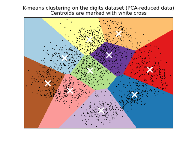
視覺化 PCA 縮減資料上的結果#
PCA 允許將資料從原始的 64 維空間投影到較低的維度空間。隨後,我們可以使用 PCA 投影到二維空間,並在此新空間中繪製資料和分群。
import matplotlib.pyplot as plt

reduced_data = PCA(n_components=2).fit_transform(data)
kmeans = KMeans(init="k-means++", n_clusters=n_digits, n_init=4)
kmeans.fit(reduced_data)

# Step size of the mesh. Decrease to increase the quality of the VQ.
h = 0.02  # point in the mesh [x_min, x_max]x[y_min, y_max].

# Plot the decision boundary. For that, we will assign a color to each
x_min, x_max = reduced_data[:, 0].min() - 1, reduced_data[:, 0].max() + 1
y_min, y_max = reduced_data[:, 1].min() - 1, reduced_data[:, 1].max() + 1
xx, yy = np.meshgrid(np.arange(x_min, x_max, h), np.arange(y_min, y_max, h))

# Obtain labels for each point in mesh. Use last trained model.
Z = kmeans.predict(np.c_[xx.ravel(), yy.ravel()])

# Put the result into a color plot
Z = Z.reshape(xx.shape)
plt.figure(1)
plt.clf()
plt.imshow(
    Z,
    interpolation="nearest",
    extent=(xx.min(), xx.max(), yy.min(), yy.max()),
    cmap=plt.cm.Paired,
    aspect="auto",
    origin="lower",
)

plt.plot(reduced_data[:, 0], reduced_data[:, 1], "k.", markersize=2)
# Plot the centroids as a white X
centroids = kmeans.cluster_centers_
plt.scatter(
    centroids[:, 0],
    centroids[:, 1],
    marker="x",
    s=169,
    linewidths=3,
    color="w",
    zorder=10,
)
plt.title(
    "K-means clustering on the digits dataset (PCA-reduced data)\n"
    "Centroids are marked with white cross"
)
plt.xlim(x_min, x_max)
plt.ylim(y_min, y_max)
plt.xticks(())
plt.yticks(())
plt.show()
腳本的總執行時間: (0 分鐘 0.717 秒)
相關範例