注意
前往結尾下載完整的範例程式碼。或透過 JupyterLite 或 Binder 在您的瀏覽器中執行此範例
線性模型係數解釋中的常見陷阱#
在線性模型中,目標值被建模為特徵的線性組合(請參閱線性模型使用者指南部分,以了解 scikit-learn 中可用的一組線性模型的描述)。多重線性模型中的係數表示給定特徵 \(X_i\) 與目標 \(y\) 之間的關係,假設所有其他特徵保持不變(條件相依性)。這與繪製 \(X_i\) 對 \(y\) 並擬合線性關係不同:在這種情況下,所有其他特徵的可能值都會在估計中被考慮(邊際相依性)。
此範例將提供一些解釋線性模型係數的提示,指出當線性模型不適合描述資料集,或當特徵相關時會出現的問題。
注意
請記住,特徵 \(X\) 和結果 \(y\) 通常是我們未知的資料生成過程的結果。訓練機器學習模型是為了從樣本資料中近似連接 \(X\) 和 \(y\) 的未觀察到的數學函數。因此,任何關於模型的解釋可能不一定能推廣到真實的資料生成過程。當模型品質不佳或當樣本資料不代表母體時,情況尤其如此。
我們將使用 1985 年「當前人口調查」的資料,根據經驗、年齡或教育等各種特徵來預測工資。
# Authors: The scikit-learn developers
# SPDX-License-Identifier: BSD-3-Clause
import matplotlib.pyplot as plt
import numpy as np
import pandas as pd
import scipy as sp
import seaborn as sns
資料集:工資#
我們從OpenML提取資料。請注意,將參數 as_frame 設定為 True 會將資料以 pandas 資料框的形式擷取。
from sklearn.datasets import fetch_openml

survey = fetch_openml(data_id=534, as_frame=True)
然後,我們識別特徵 X 和目標 y:WAGE 欄位是我們的目標變數(即,我們想要預測的變數)。
X = survey.data[survey.feature_names]
X.describe(include="all")
請注意,資料集包含類別變數和數值變數。我們之後在預處理資料集時需要考慮這一點。
X.head()
我們預測的目標:工資。工資被描述為每小時美元的浮點數。
y = survey.target.values.ravel()
survey.target.head()
0    5.10
1    4.95
2    6.67
3    4.00
4    7.50
Name: WAGE, dtype: float64
我們將樣本分成訓練資料集和測試資料集。以下探索性分析中只會使用訓練資料集。這是一種模擬真實情況的方式,在真實情況中,預測是在未知的目標上進行的,我們不希望我們的分析和決策因我們對測試資料的了解而產生偏差。
from sklearn.model_selection import train_test_split

X_train, X_test, y_train, y_test = train_test_split(X, y, random_state=42)
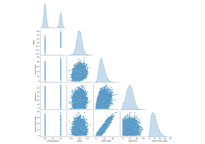
首先,讓我們透過查看變數分佈和它們之間的成對關係來獲得一些見解。只會使用數值變數。在下圖中,每個點代表一個樣本。
train_dataset = X_train.copy()
train_dataset.insert(0, "WAGE", y_train)
_ = sns.pairplot(train_dataset, kind="reg", diag_kind="kde")
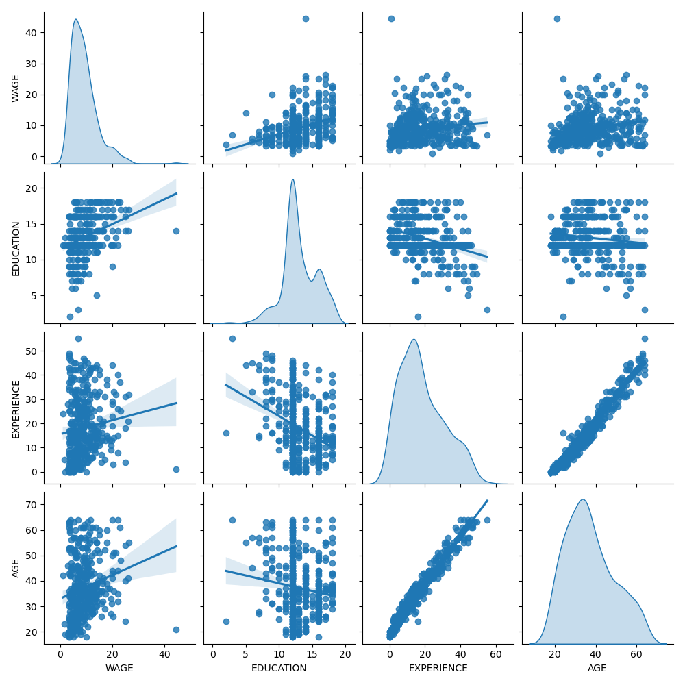
仔細觀察 WAGE 分佈會發現它有一個長尾。因此,我們應該取其對數,使其近似於常態分佈(線性模型(如嶺迴歸或 lasso)最適用於常態分佈的誤差)。
當教育程度增加時,工資會增加。請注意,這裡表示的工資和教育程度之間的相依性是邊際相依性,即它描述特定變數的行為,而沒有保持其他變數固定。
此外,經驗和年齡是強烈線性相關的。
機器學習管線#
為了設計我們的機器學習管線,我們先手動檢查我們正在處理的資料類型
survey.data.info()
<class 'pandas.core.frame.DataFrame'>
RangeIndex: 534 entries, 0 to 533
Data columns (total 10 columns):
 #   Column      Non-Null Count  Dtype
---  ------      --------------  -----
 0   EDUCATION   534 non-null    int64
 1   SOUTH       534 non-null    category
 2   SEX         534 non-null    category
 3   EXPERIENCE  534 non-null    int64
 4   UNION       534 non-null    category
 5   AGE         534 non-null    int64
 6   RACE        534 non-null    category
 7   OCCUPATION  534 non-null    category
 8   SECTOR      534 non-null    category
 9   MARR        534 non-null    category
dtypes: category(7), int64(3)
memory usage: 17.2 KB
如先前所見,資料集包含具有不同資料類型的欄位,我們需要對每種類型的資料套用特定的預處理。特別是,如果類別變數沒有先編碼為整數,則不能將其包含在線性模型中。此外,為了避免將類別特徵視為有序值,我們需要對它們進行 one-hot 編碼。我們的預處理器將
對類別欄位進行 one-hot 編碼(即,按類別產生一個欄位),僅適用於非二元類別變數;
作為第一種方法(我們稍後將看到數值標準化如何影響我們的討論),保持數值不變。
from sklearn.compose import make_column_transformer
from sklearn.preprocessing import OneHotEncoder

categorical_columns = ["RACE", "OCCUPATION", "SECTOR", "MARR", "UNION", "SEX", "SOUTH"]
numerical_columns = ["EDUCATION", "EXPERIENCE", "AGE"]

preprocessor = make_column_transformer(
    (OneHotEncoder(drop="if_binary"), categorical_columns),
    remainder="passthrough",
    verbose_feature_names_out=False,  # avoid to prepend the preprocessor names
)
為了將資料集描述為線性模型,我們使用具有非常小正規化的嶺迴歸器,並對工資的對數進行建模。
from sklearn.compose import TransformedTargetRegressor
from sklearn.linear_model import Ridge
from sklearn.pipeline import make_pipeline

model = make_pipeline(
    preprocessor,
    TransformedTargetRegressor(
        regressor=Ridge(alpha=1e-10), func=np.log10, inverse_func=sp.special.exp10
    ),
)
處理資料集#
首先,我們擬合模型。
model.fit(X_train, y_train)
然後,我們透過繪製模型在測試集上的預測值並計算模型的中位數絕對誤差等來檢查計算模型的效能。
from sklearn.metrics import PredictionErrorDisplay, median_absolute_error

mae_train = median_absolute_error(y_train, model.predict(X_train))
y_pred = model.predict(X_test)
mae_test = median_absolute_error(y_test, y_pred)
scores = {
    "MedAE on training set": f"{mae_train:.2f} $/hour",
    "MedAE on testing set": f"{mae_test:.2f} $/hour",
}
_, ax = plt.subplots(figsize=(5, 5))
display = PredictionErrorDisplay.from_predictions(
    y_test, y_pred, kind="actual_vs_predicted", ax=ax, scatter_kwargs={"alpha": 0.5}
)
ax.set_title("Ridge model, small regularization")
for name, score in scores.items():
    ax.plot([], [], " ", label=f"{name}: {score}")
ax.legend(loc="upper left")
plt.tight_layout()
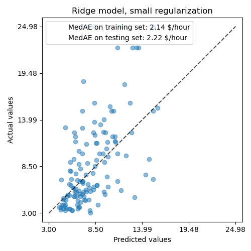
學習到的模型遠非一個能做出準確預測的好模型:當觀察上面的圖表時,這是顯而易見的,在圖表中,好的預測應該位於黑色虛線上。
在接下來的章節中,我們將解釋模型的係數。在進行解釋時,我們應該記住,我們得出的任何結論都是關於我們建立的模型,而不是關於數據真實(現實世界)的生成過程。
解釋係數:尺度很重要#
首先,我們可以看一下我們擬合的迴歸器的係數值。
feature_names = model[:-1].get_feature_names_out()

coefs = pd.DataFrame(
    model[-1].regressor_.coef_,
    columns=["Coefficients"],
    index=feature_names,
)

coefs
AGE 係數的單位是「每生活年限的美元/小時」,而 EDUCATION 係數的單位是「每受教育年限的美元/小時」。這種係數表示方式的好處是明確了模型的實際預測:AGE 增加 \(1\) 年表示每小時工資減少 \(0.030867\) 美元,而 EDUCATION 增加 \(1\) 年表示每小時工資增加 \(0.054699\) 美元。另一方面,類別變數(如 UNION 或 SEX)是無因次數字,取值為 0 或 1。它們的係數以美元/小時表示。因此,我們不能比較不同係數的大小,因為特徵有不同的自然尺度,因此由於其不同的度量單位而有不同的數值範圍。如果我們繪製係數,這點會更明顯。
coefs.plot.barh(figsize=(9, 7))
plt.title("Ridge model, small regularization")
plt.axvline(x=0, color=".5")
plt.xlabel("Raw coefficient values")
plt.subplots_adjust(left=0.3)
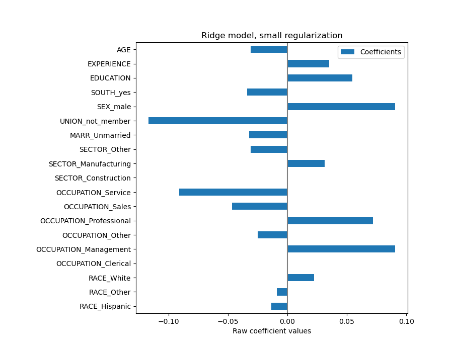
實際上,從上面的圖表來看,決定 WAGE 的最重要因素似乎是變數 UNION,即使我們的直覺可能會告訴我們,像 EXPERIENCE 這樣的變數應該有更大的影響。
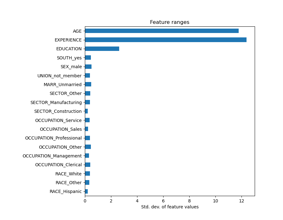
觀察係數圖來評估特徵重要性可能會產生誤導,因為其中一些係數在小範圍內變化,而另一些係數(如 AGE)則變化得多得多,達到幾十年。
如果我們比較不同特徵的標準差,就可以看出這一點。
X_train_preprocessed = pd.DataFrame(
    model[:-1].transform(X_train), columns=feature_names
)

X_train_preprocessed.std(axis=0).plot.barh(figsize=(9, 7))
plt.title("Feature ranges")
plt.xlabel("Std. dev. of feature values")
plt.subplots_adjust(left=0.3)
將係數乘以相關特徵的標準差會將所有係數縮減為相同的度量單位。正如我們在後面會看到的,這等同於將數值變數正規化為其標準差,如 \(y = \sum{coef_i \times X_i} = \sum{(coef_i \times std_i) \times (X_i / std_i)}\)。
這樣,我們強調特徵的變異數越大,對應係數對輸出的權重就越大,在其他條件相同的情況下。
coefs = pd.DataFrame(
    model[-1].regressor_.coef_ * X_train_preprocessed.std(axis=0),
    columns=["Coefficient importance"],
    index=feature_names,
)
coefs.plot(kind="barh", figsize=(9, 7))
plt.xlabel("Coefficient values corrected by the feature's std. dev.")
plt.title("Ridge model, small regularization")
plt.axvline(x=0, color=".5")
plt.subplots_adjust(left=0.3)
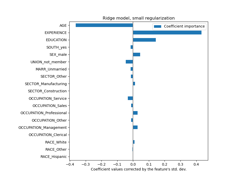
現在係數已經縮放,我們可以安全地比較它們。
警告
為什麼上面的圖表顯示年齡增長會導致工資下降?為什麼初始的 pairplot 顯示的是相反的結果?
上面的圖表告訴我們,當所有其他特徵保持不變時,特定特徵和目標之間的依賴關係,即條件依賴關係。當所有其他特徵保持不變時,AGE 的增加會導致 WAGE 的減少。相反地,當所有其他特徵保持不變時,EXPERIENCE 的增加會導致 WAGE 的增加。此外,AGE、EXPERIENCE 和 EDUCATION 是對模型影響最大的三個變數。
解釋係數:謹慎對待因果關係#
線性模型是衡量統計關聯的好工具,但我們在發表關於因果關係的聲明時應該謹慎,畢竟相關性並不總是意味著因果關係。這在社會科學中尤其困難,因為我們觀察到的變數僅作為潛在因果過程的代理變數。
在我們的特定案例中,我們可以將個人的 EDUCATION 視為他們職業能力的代理變數,這是我們感興趣但無法觀察到的真實變數。我們當然希望認為在學校待得越久會提高技術能力,但也很有可能因果關係是相反的。也就是說,那些技術能力強的人往往會在學校待得更久。
雇主不太可能關心是哪種情況(或者如果兩者兼而有之),只要他們仍然確信具有更多 EDUCATION 的人更適合這份工作,他們就會很樂意支付更高的 WAGE。
當考慮某種形式的干預時,例如政府對大學學位的補貼或鼓勵個人接受高等教育的宣傳材料時,這種效應的混淆會變得成問題。這些措施的效用最終可能會被誇大,特別是當混淆程度很強時。我們的模型預測,每多受一年教育,每小時工資就會增加 \(0.054699\)。由於這種混淆,實際的因果效應可能會較低。
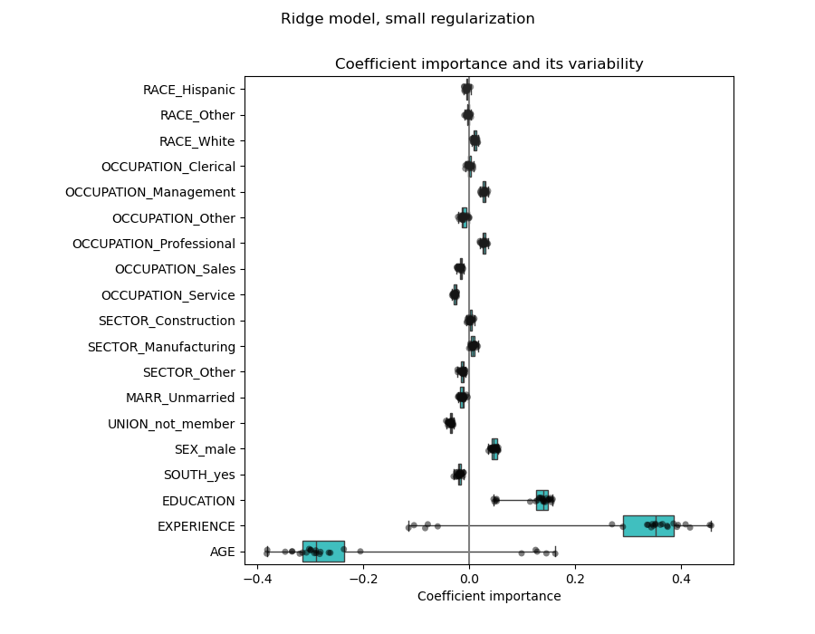
檢查係數的變異性#
我們可以通過交叉驗證來檢查係數的變異性:這是一種數據擾動的形式(與重採樣相關)。
如果係數在更改輸入數據集時變化很大,則無法保證其穩健性,並且可能應該謹慎解釋它們。
from sklearn.model_selection import RepeatedKFold, cross_validate

cv = RepeatedKFold(n_splits=5, n_repeats=5, random_state=0)
cv_model = cross_validate(
    model,
    X,
    y,
    cv=cv,
    return_estimator=True,
    n_jobs=2,
)

coefs = pd.DataFrame(
    [
        est[-1].regressor_.coef_ * est[:-1].transform(X.iloc[train_idx]).std(axis=0)
        for est, (train_idx, _) in zip(cv_model["estimator"], cv.split(X, y))
    ],
    columns=feature_names,
)
plt.figure(figsize=(9, 7))
sns.stripplot(data=coefs, orient="h", palette="dark:k", alpha=0.5)
sns.boxplot(data=coefs, orient="h", color="cyan", saturation=0.5, whis=10)
plt.axvline(x=0, color=".5")
plt.xlabel("Coefficient importance")
plt.title("Coefficient importance and its variability")
plt.suptitle("Ridge model, small regularization")
plt.subplots_adjust(left=0.3)
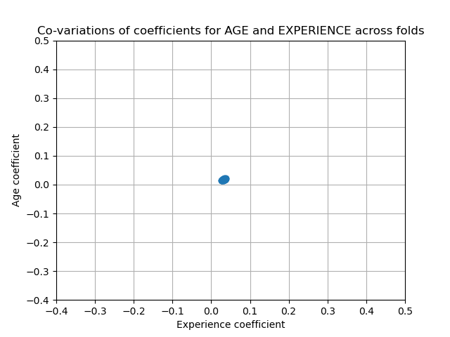
相關變數的問題#
AGE 和 EXPERIENCE 係數受到強烈變異性的影響,這可能是由於這兩個特徵之間的多重共線性造成的:由於 AGE 和 EXPERIENCE 在數據中一起變化,因此很難將它們的效果區分開來。
為了驗證這種解釋,我們繪製了 AGE 和 EXPERIENCE 係數的變異性。
plt.ylabel("Age coefficient")
plt.xlabel("Experience coefficient")
plt.grid(True)
plt.xlim(-0.4, 0.5)
plt.ylim(-0.4, 0.5)
plt.scatter(coefs["AGE"], coefs["EXPERIENCE"])
_ = plt.title("Co-variations of coefficients for AGE and EXPERIENCE across folds")
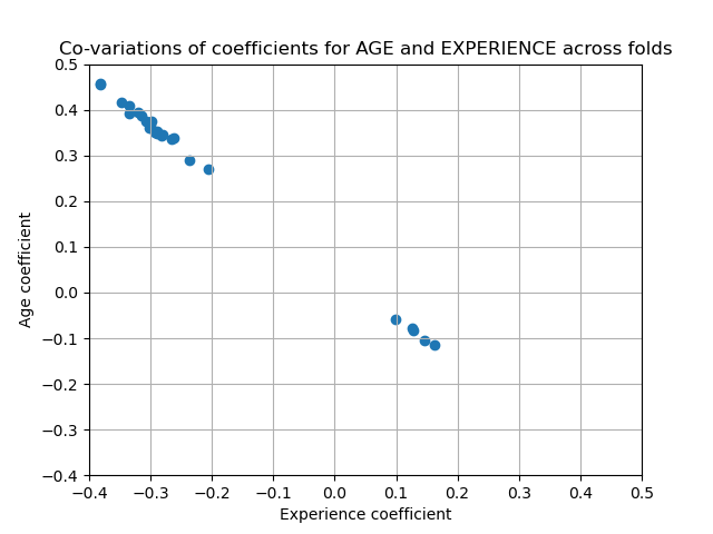
兩個區域被填充:當 EXPERIENCE 係數為正時,AGE 係數為負,反之亦然。
為了進一步研究,我們移除這兩個特徵中的一個,並檢查對模型穩定性的影響。
column_to_drop = ["AGE"]

cv_model = cross_validate(
    model,
    X.drop(columns=column_to_drop),
    y,
    cv=cv,
    return_estimator=True,
    n_jobs=2,
)

coefs = pd.DataFrame(
    [
        est[-1].regressor_.coef_
        * est[:-1].transform(X.drop(columns=column_to_drop).iloc[train_idx]).std(axis=0)
        for est, (train_idx, _) in zip(cv_model["estimator"], cv.split(X, y))
    ],
    columns=feature_names[:-1],
)
plt.figure(figsize=(9, 7))
sns.stripplot(data=coefs, orient="h", palette="dark:k", alpha=0.5)
sns.boxplot(data=coefs, orient="h", color="cyan", saturation=0.5)
plt.axvline(x=0, color=".5")
plt.title("Coefficient importance and its variability")
plt.xlabel("Coefficient importance")
plt.suptitle("Ridge model, small regularization, AGE dropped")
plt.subplots_adjust(left=0.3)
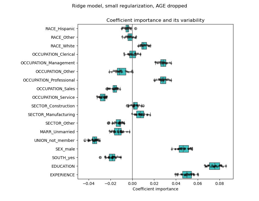
現在,EXPERIENCE 係數的估計顯示出變異性大大降低。在交叉驗證期間訓練的所有模型中,EXPERIENCE 仍然很重要。
預處理數值變數#
如上所述(請參閱「機器學習管線」),我們也可以選擇在訓練模型之前縮放數值。當我們在嶺迴歸中對所有數值應用相似的正規化量時,這會很有用。重新定義預處理器,以便減去均值並將變數縮放到單位變異數。
from sklearn.preprocessing import StandardScaler

preprocessor = make_column_transformer(
    (OneHotEncoder(drop="if_binary"), categorical_columns),
    (StandardScaler(), numerical_columns),
)
模型將保持不變。
model = make_pipeline(
    preprocessor,
    TransformedTargetRegressor(
        regressor=Ridge(alpha=1e-10), func=np.log10, inverse_func=sp.special.exp10
    ),
)
model.fit(X_train, y_train)
再次,我們檢查計算模型的性能,例如,使用模型的中位數絕對誤差和 R 平方係數。
mae_train = median_absolute_error(y_train, model.predict(X_train))
y_pred = model.predict(X_test)
mae_test = median_absolute_error(y_test, y_pred)
scores = {
    "MedAE on training set": f"{mae_train:.2f} $/hour",
    "MedAE on testing set": f"{mae_test:.2f} $/hour",
}

_, ax = plt.subplots(figsize=(5, 5))
display = PredictionErrorDisplay.from_predictions(
    y_test, y_pred, kind="actual_vs_predicted", ax=ax, scatter_kwargs={"alpha": 0.5}
)
ax.set_title("Ridge model, small regularization")
for name, score in scores.items():
    ax.plot([], [], " ", label=f"{name}: {score}")
ax.legend(loc="upper left")
plt.tight_layout()

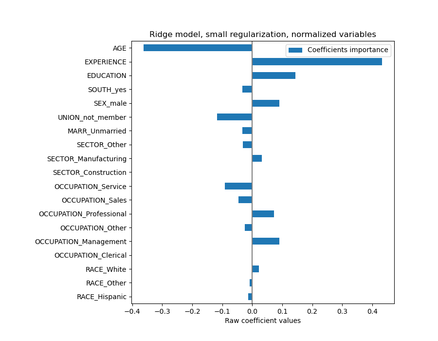
對於係數分析,這次不需要縮放,因為它是在預處理步驟中執行的。
coefs = pd.DataFrame(
    model[-1].regressor_.coef_,
    columns=["Coefficients importance"],
    index=feature_names,
)
coefs.plot.barh(figsize=(9, 7))
plt.title("Ridge model, small regularization, normalized variables")
plt.xlabel("Raw coefficient values")
plt.axvline(x=0, color=".5")
plt.subplots_adjust(left=0.3)
現在,我們檢查幾個交叉驗證折疊中的係數。與上面的示例一樣,我們不需要按特徵值的標準差來縮放係數,因為此縮放已在管線的預處理步驟中完成。
cv_model = cross_validate(
    model,
    X,
    y,
    cv=cv,
    return_estimator=True,
    n_jobs=2,
)
coefs = pd.DataFrame(
    [est[-1].regressor_.coef_ for est in cv_model["estimator"]], columns=feature_names
)
plt.figure(figsize=(9, 7))
sns.stripplot(data=coefs, orient="h", palette="dark:k", alpha=0.5)
sns.boxplot(data=coefs, orient="h", color="cyan", saturation=0.5, whis=10)
plt.axvline(x=0, color=".5")
plt.title("Coefficient variability")
plt.subplots_adjust(left=0.3)
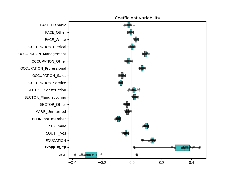
結果與非正規化情況非常相似。
具有正規化的線性模型#
在機器學習實踐中,嶺迴歸更常與不可忽略的正規化一起使用。
上面,我們將此正規化限制為非常小的量。正規化改善了問題的條件,並減少了估計的變異數。RidgeCV 應用交叉驗證,以確定哪個正規化參數 (alpha) 的值最適合預測。
from sklearn.linear_model import RidgeCV

alphas = np.logspace(-10, 10, 21)  # alpha values to be chosen from by cross-validation
model = make_pipeline(
    preprocessor,
    TransformedTargetRegressor(
        regressor=RidgeCV(alphas=alphas),
        func=np.log10,
        inverse_func=sp.special.exp10,
    ),
)
model.fit(X_train, y_train)
首先,我們檢查已選擇的 \(\alpha\) 值。
model[-1].regressor_.alpha_
np.float64(10.0)
然後,我們檢查預測的品質。
mae_train = median_absolute_error(y_train, model.predict(X_train))
y_pred = model.predict(X_test)
mae_test = median_absolute_error(y_test, y_pred)
scores = {
    "MedAE on training set": f"{mae_train:.2f} $/hour",
    "MedAE on testing set": f"{mae_test:.2f} $/hour",
}

_, ax = plt.subplots(figsize=(5, 5))
display = PredictionErrorDisplay.from_predictions(
    y_test, y_pred, kind="actual_vs_predicted", ax=ax, scatter_kwargs={"alpha": 0.5}
)
ax.set_title("Ridge model, optimum regularization")
for name, score in scores.items():
    ax.plot([], [], " ", label=f"{name}: {score}")
ax.legend(loc="upper left")
plt.tight_layout()
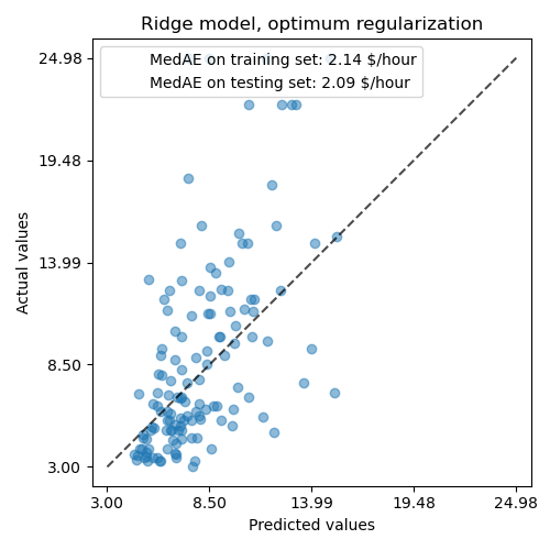
正規化模型重現數據的能力與非正規化模型相似。
coefs = pd.DataFrame(
    model[-1].regressor_.coef_,
    columns=["Coefficients importance"],
    index=feature_names,
)
coefs.plot.barh(figsize=(9, 7))
plt.title("Ridge model, with regularization, normalized variables")
plt.xlabel("Raw coefficient values")
plt.axvline(x=0, color=".5")
plt.subplots_adjust(left=0.3)
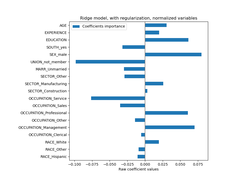
係數顯著不同。AGE 和 EXPERIENCE 係數都為正,但它們現在對預測的影響較小。
正規化減少了相關變數對模型的影響,因為權重在兩個預測變數之間共享,因此沒有任何一個單獨具有較大的權重。
另一方面,通過正規化獲得的權重更穩定(請參閱嶺迴歸和分類使用者指南章節)。從交叉驗證中從數據擾動獲得的圖表中可以看到這種增加的穩定性。此圖表可以與之前的圖表進行比較。
cv_model = cross_validate(
    model,
    X,
    y,
    cv=cv,
    return_estimator=True,
    n_jobs=2,
)
coefs = pd.DataFrame(
    [est[-1].regressor_.coef_ for est in cv_model["estimator"]], columns=feature_names
)
plt.ylabel("Age coefficient")
plt.xlabel("Experience coefficient")
plt.grid(True)
plt.xlim(-0.4, 0.5)
plt.ylim(-0.4, 0.5)
plt.scatter(coefs["AGE"], coefs["EXPERIENCE"])
_ = plt.title("Co-variations of coefficients for AGE and EXPERIENCE across folds")
具有稀疏係數的線性模型#
考慮數據集中相關變數的另一種可能性是估計稀疏係數。在先前的嶺迴歸估計中刪除 AGE 列時,我們已經以某種方式手動完成了它。
Lasso 模型(請參閱Lasso使用者指南章節)估計稀疏係數。LassoCV 應用交叉驗證,以確定哪個正規化參數 (alpha) 的值最適合模型估計。
from sklearn.linear_model import LassoCV

alphas = np.logspace(-10, 10, 21)  # alpha values to be chosen from by cross-validation
model = make_pipeline(
    preprocessor,
    TransformedTargetRegressor(
        regressor=LassoCV(alphas=alphas, max_iter=100_000),
        func=np.log10,
        inverse_func=sp.special.exp10,
    ),
)

_ = model.fit(X_train, y_train)
首先,我們驗證已選擇的 \(\alpha\) 值。
model[-1].regressor_.alpha_
np.float64(0.001)
然後,我們檢查預測的品質。
mae_train = median_absolute_error(y_train, model.predict(X_train))
y_pred = model.predict(X_test)
mae_test = median_absolute_error(y_test, y_pred)
scores = {
    "MedAE on training set": f"{mae_train:.2f} $/hour",
    "MedAE on testing set": f"{mae_test:.2f} $/hour",
}

_, ax = plt.subplots(figsize=(6, 6))
display = PredictionErrorDisplay.from_predictions(
    y_test, y_pred, kind="actual_vs_predicted", ax=ax, scatter_kwargs={"alpha": 0.5}
)
ax.set_title("Lasso model, optimum regularization")
for name, score in scores.items():
    ax.plot([], [], " ", label=f"{name}: {score}")
ax.legend(loc="upper left")
plt.tight_layout()
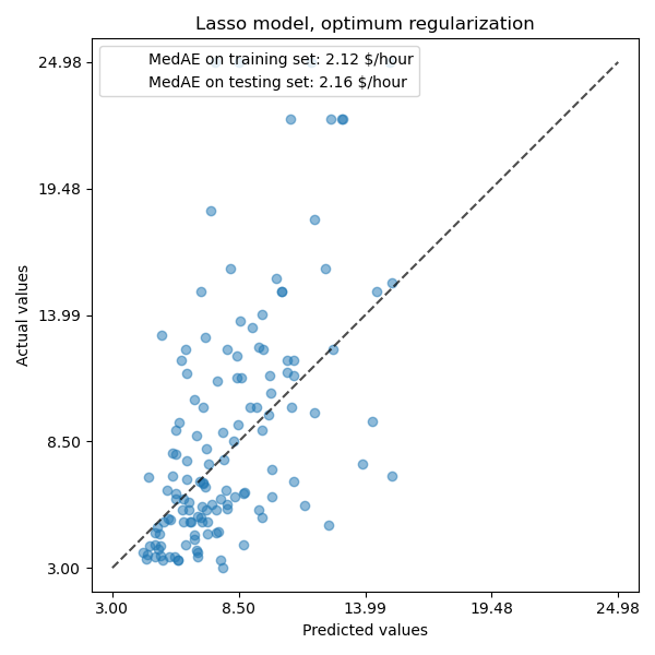
對於我們的數據集,該模型再次不具有很強的預測性。
coefs = pd.DataFrame(
    model[-1].regressor_.coef_,
    columns=["Coefficients importance"],
    index=feature_names,
)
coefs.plot(kind="barh", figsize=(9, 7))
plt.title("Lasso model, optimum regularization, normalized variables")
plt.axvline(x=0, color=".5")
plt.subplots_adjust(left=0.3)
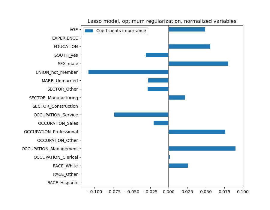
Lasso 模型識別 AGE 和 EXPERIENCE 之間的相關性,並為了預測而抑制其中一個。
重要的是要記住,被刪除的係數本身可能仍然與結果相關:模型選擇抑制它們,因為它們除了其他特徵之外幾乎沒有或沒有帶來額外資訊。此外,對於相關特徵,此選擇是不穩定的,應謹慎解釋。
實際上,我們可以檢查折疊中係數的變異性。
cv_model = cross_validate(
    model,
    X,
    y,
    cv=cv,
    return_estimator=True,
    n_jobs=2,
)
coefs = pd.DataFrame(
    [est[-1].regressor_.coef_ for est in cv_model["estimator"]], columns=feature_names
)
plt.figure(figsize=(9, 7))
sns.stripplot(data=coefs, orient="h", palette="dark:k", alpha=0.5)
sns.boxplot(data=coefs, orient="h", color="cyan", saturation=0.5, whis=100)
plt.axvline(x=0, color=".5")
plt.title("Coefficient variability")
plt.subplots_adjust(left=0.3)
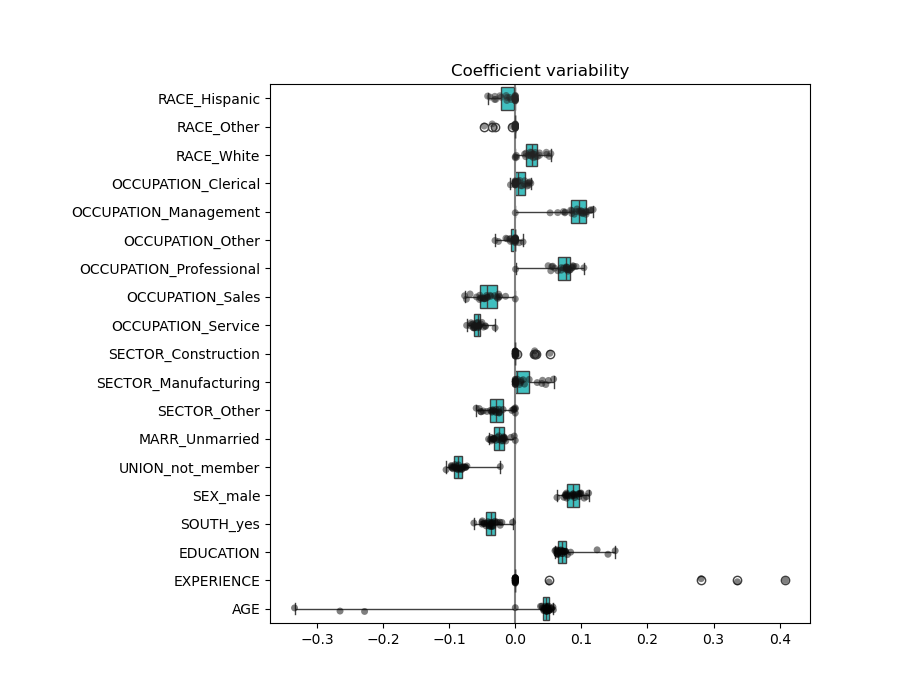
我們觀察到 AGE 和 EXPERIENCE 係數根據折疊的不同而變化很大。
錯誤的因果解釋#
政策制定者可能想了解教育對薪資的影響,以評估某項旨在鼓勵人們追求更高教育程度的政策是否具有經濟意義。雖然機器學習模型非常適合衡量統計關聯性,但它們通常無法推斷因果效應。
人們可能會想直接查看我們上一個模型(或任何模型)中教育程度對薪資的係數,並得出結論認為它捕捉到標準化教育變數變動對薪資的真實影響。
不幸的是,可能存在未被觀察到的干擾變數,這些變數可能會誇大或縮小該係數。干擾變數是指同時影響「教育程度」和「薪資」的變數。一個例子是能力。一般來說,能力較強的人更有可能追求教育,同時也更有可能在任何教育程度下賺取更高的時薪。在這種情況下,能力會在「教育程度」係數上產生正向的遺漏變數偏差 (Omitted Variable Bias, OVB),從而誇大教育對薪資的影響。
請參閱機器學習無法推斷因果效應的失敗案例,其中模擬了能力導致的遺漏變數偏差。
經驗教訓#
係數必須縮放到相同的衡量單位,才能取得特徵重要性。使用特徵的標準差進行縮放是一個有用的近似方法。
當存在干擾效應時,解釋因果關係是困難的。如果兩個變數之間的關係也受到未觀察到的因素影響,我們在對因果關係做出結論時應謹慎。
多元線性模型中的係數表示給定特徵與目標之間的相依性,此相依性是條件性的,取決於其他特徵。
相關的特徵會導致線性模型的係數不穩定,並且它們的影響無法很好地分離。
不同的線性模型對特徵相關性的反應不同,並且係數可能彼此之間差異很大。
檢查交叉驗證迴圈中各個折疊的係數,可以了解它們的穩定性。
係數不太可能具有任何因果意義。它們往往會受到未觀察到的干擾因素的偏差影響。
檢查工具不一定能提供關於真實資料生成過程的見解。
腳本總執行時間:(0 分鐘 13.554 秒)
相關範例