注意
前往結尾以下載完整範例程式碼。或透過 JupyterLite 或 Binder 在您的瀏覽器中執行此範例
使用顯示物件進行視覺化#
在此範例中,我們將直接從它們各自的指標建構顯示物件,ConfusionMatrixDisplay、RocCurveDisplay 和 PrecisionRecallDisplay。當模型的預測已計算或計算成本高昂時,這是一種替代使用其對應繪圖函數的方法。請注意,這是進階用法,一般而言,我們建議使用其各自的繪圖函數。
# Authors: The scikit-learn developers
# SPDX-License-Identifier: BSD-3-Clause
載入資料並訓練模型#
在此範例中,我們從 OpenML 載入一個輸血服務中心數據集。這是一個二元分類問題,其中目標是某人是否捐血。然後將資料分成訓練和測試數據集,並使用訓練數據集擬合邏輯回歸。
from sklearn.datasets import fetch_openml
from sklearn.linear_model import LogisticRegression
from sklearn.model_selection import train_test_split
from sklearn.pipeline import make_pipeline
from sklearn.preprocessing import StandardScaler

X, y = fetch_openml(data_id=1464, return_X_y=True)
X_train, X_test, y_train, y_test = train_test_split(X, y, stratify=y)

clf = make_pipeline(StandardScaler(), LogisticRegression(random_state=0))
clf.fit(X_train, y_train)
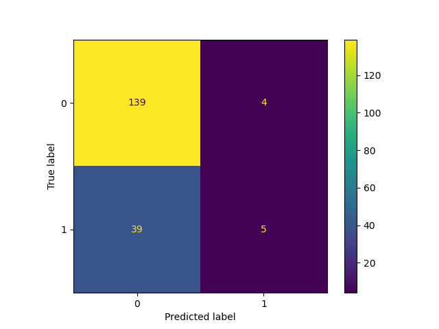
建立 ConfusionMatrixDisplay#
使用擬合模型,我們計算模型在測試數據集上的預測。這些預測用於計算混淆矩陣,該矩陣使用 ConfusionMatrixDisplay 繪製。
from sklearn.metrics import ConfusionMatrixDisplay, confusion_matrix

y_pred = clf.predict(X_test)
cm = confusion_matrix(y_test, y_pred)

cm_display = ConfusionMatrixDisplay(cm).plot()
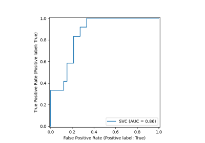
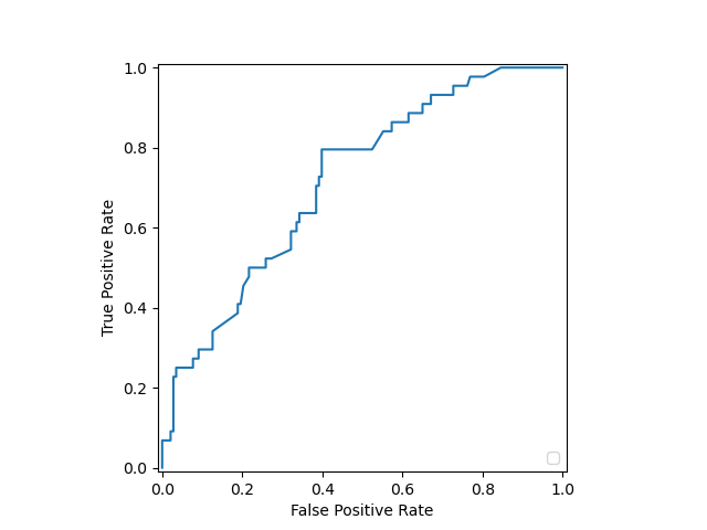
建立 RocCurveDisplay#
ROC 曲線需要估計器的機率或非閾值決策值。由於邏輯回歸提供決策函數,我們將使用它來繪製 ROC 曲線
from sklearn.metrics import RocCurveDisplay, roc_curve

y_score = clf.decision_function(X_test)

fpr, tpr, _ = roc_curve(y_test, y_score, pos_label=clf.classes_[1])
roc_display = RocCurveDisplay(fpr=fpr, tpr=tpr).plot()
/home/circleci/project/sklearn/metrics/_plot/roc_curve.py:189: UserWarning:

No artists with labels found to put in legend.  Note that artists whose label start with an underscore are ignored when legend() is called with no argument.
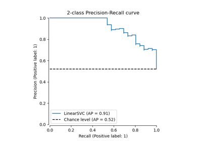
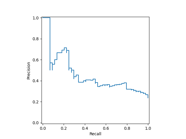
建立 PrecisionRecallDisplay#
同樣地,可以使用先前章節的 y_score 繪製精確率-召回率曲線。
from sklearn.metrics import PrecisionRecallDisplay, precision_recall_curve

prec, recall, _ = precision_recall_curve(y_test, y_score, pos_label=clf.classes_[1])
pr_display = PrecisionRecallDisplay(precision=prec, recall=recall).plot()
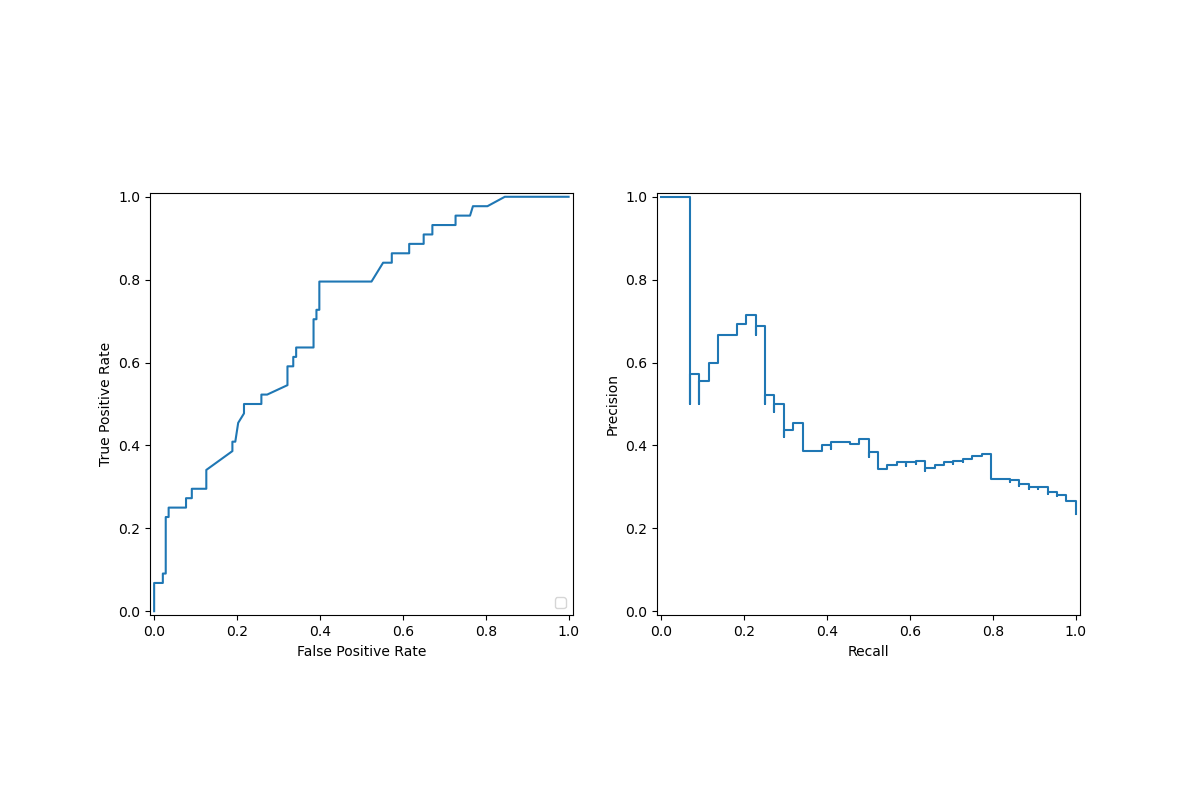
將顯示物件合併到單一繪圖中#
顯示物件會儲存作為引數傳遞的計算值。這允許使用 matplotlib 的 API 輕鬆組合視覺化。在以下範例中,我們將顯示物件並排放在一行中。
import matplotlib.pyplot as plt

fig, (ax1, ax2) = plt.subplots(1, 2, figsize=(12, 8))

roc_display.plot(ax=ax1)
pr_display.plot(ax=ax2)
plt.show()
/home/circleci/project/sklearn/metrics/_plot/roc_curve.py:189: UserWarning:

No artists with labels found to put in legend.  Note that artists whose label start with an underscore are ignored when legend() is called with no argument.
腳本總執行時間: (0 分鐘 0.368 秒)
相關範例