注意
前往結尾以下載完整的範例程式碼。或透過 JupyterLite 或 Binder 在您的瀏覽器中執行此範例
卜瓦松迴歸與非常態損失#
此範例說明在來自 [1] 的法國汽車第三方責任索賠資料集上使用對數線性卜瓦松迴歸,並將其與使用一般最小平方誤差擬合的線性模型和使用卜瓦松損失(以及對數連結)擬合的非線性 GBRT 模型進行比較。
一些定義
保單是保險公司與個人(即本案例中的駕駛人,即保戶)之間的合約。
索賠是保戶向保險公司提出的要求,以賠償保險範圍內的損失。
曝險是指定保單的保險期限,以年為單位。
索賠頻率是索賠次數除以曝險,通常以每年索賠次數來衡量。
在此資料集中,每個樣本對應一個保險單。可用特徵包括駕駛人年齡、車齡、汽車馬力等。
我們的目標是根據過去在保戶群體中的歷史資料,預測新保戶發生車禍後預期的索賠頻率。
import matplotlib.pyplot as plt
import numpy as np
import pandas as pd
法國汽車第三方責任索賠資料集#
讓我們從 OpenML 載入汽車索賠資料集:https://www.openml.org/d/41214
from sklearn.datasets import fetch_openml

df = fetch_openml(data_id=41214, as_frame=True).frame
df
索賠次數(ClaimNb)是一個正整數,可以用卜瓦松分佈建模。然後假設它是在給定時間間隔(Exposure,以年為單位)內以恆定速率發生的離散事件次數。
在這裡,我們希望通過(縮放的)卜瓦松分佈,在 X 的條件下為頻率 y = ClaimNb / Exposure 建模,並使用 Exposure 作為 sample_weight。
df["Frequency"] = df["ClaimNb"] / df["Exposure"]

print(
    "Average Frequency = {}".format(np.average(df["Frequency"], weights=df["Exposure"]))
)

print(
    "Fraction of exposure with zero claims = {0:.1%}".format(
        df.loc[df["ClaimNb"] == 0, "Exposure"].sum() / df["Exposure"].sum()
    )
)

fig, (ax0, ax1, ax2) = plt.subplots(ncols=3, figsize=(16, 4))
ax0.set_title("Number of claims")
_ = df["ClaimNb"].hist(bins=30, log=True, ax=ax0)
ax1.set_title("Exposure in years")
_ = df["Exposure"].hist(bins=30, log=True, ax=ax1)
ax2.set_title("Frequency (number of claims per year)")
_ = df["Frequency"].hist(bins=30, log=True, ax=ax2)
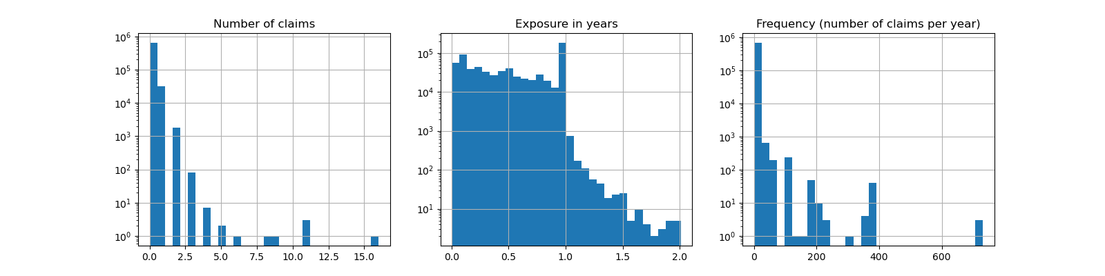
Average Frequency = 0.10070308464041304
Fraction of exposure with zero claims = 93.9%
其餘的欄可以用來預測索賠事件的頻率。這些欄非常異質,混合了具有不同尺度(可能分佈非常不均勻)的類別和數值變數。
因此,為了使用這些預測器擬合線性模型,有必要執行標準的特徵轉換,如下所示
from sklearn.compose import ColumnTransformer
from sklearn.pipeline import make_pipeline
from sklearn.preprocessing import (
    FunctionTransformer,
    KBinsDiscretizer,
    OneHotEncoder,
    StandardScaler,
)

log_scale_transformer = make_pipeline(
    FunctionTransformer(np.log, validate=False), StandardScaler()
)

linear_model_preprocessor = ColumnTransformer(
    [
        ("passthrough_numeric", "passthrough", ["BonusMalus"]),
        (
            "binned_numeric",
            KBinsDiscretizer(n_bins=10, random_state=0),
            ["VehAge", "DrivAge"],
        ),
        ("log_scaled_numeric", log_scale_transformer, ["Density"]),
        (
            "onehot_categorical",
            OneHotEncoder(),
            ["VehBrand", "VehPower", "VehGas", "Region", "Area"],
        ),
    ],
    remainder="drop",
)
恆定預測基準#
值得注意的是,超過 93% 的保戶索賠次數為零。如果我們要將這個問題轉換為二元分類任務,則會嚴重不平衡,即使是一個僅預測平均值的簡單模型也能達到 93% 的準確度。
為了評估所用指標的相關性,我們將考慮一個「虛擬」估計器作為基準,該估計器會不斷預測訓練樣本的平均頻率。
from sklearn.dummy import DummyRegressor
from sklearn.model_selection import train_test_split
from sklearn.pipeline import Pipeline

df_train, df_test = train_test_split(df, test_size=0.33, random_state=0)

dummy = Pipeline(
    [
        ("preprocessor", linear_model_preprocessor),
        ("regressor", DummyRegressor(strategy="mean")),
    ]
).fit(df_train, df_train["Frequency"], regressor__sample_weight=df_train["Exposure"])
讓我們使用 3 種不同的迴歸指標來計算此恆定預測基準的效能
from sklearn.metrics import (
    mean_absolute_error,
    mean_poisson_deviance,
    mean_squared_error,
)


def score_estimator(estimator, df_test):
    """Score an estimator on the test set."""
    y_pred = estimator.predict(df_test)

    print(
        "MSE: %.3f"
        % mean_squared_error(
            df_test["Frequency"], y_pred, sample_weight=df_test["Exposure"]
        )
    )
    print(
        "MAE: %.3f"
        % mean_absolute_error(
            df_test["Frequency"], y_pred, sample_weight=df_test["Exposure"]
        )
    )

    # Ignore non-positive predictions, as they are invalid for
    # the Poisson deviance.
    mask = y_pred > 0
    if (~mask).any():
        n_masked, n_samples = (~mask).sum(), mask.shape[0]
        print(
            "WARNING: Estimator yields invalid, non-positive predictions "
            f" for {n_masked} samples out of {n_samples}. These predictions "
            "are ignored when computing the Poisson deviance."
        )

    print(
        "mean Poisson deviance: %.3f"
        % mean_poisson_deviance(
            df_test["Frequency"][mask],
            y_pred[mask],
            sample_weight=df_test["Exposure"][mask],
        )
    )


print("Constant mean frequency evaluation:")
score_estimator(dummy, df_test)
Constant mean frequency evaluation:
MSE: 0.564
MAE: 0.189
mean Poisson deviance: 0.625
(廣義)線性模型#
首先,我們使用(l2 正規化)最小平方線性迴歸模型(更常見的名稱為嶺迴歸)為目標變數建模。我們使用低正規化 alpha,因為我們預期這樣的線性模型在如此龐大的資料集上會欠擬合。
卜瓦松偏差無法在模型預測的非正值上計算。對於確實返回一些非正預測的模型(例如 Ridge),我們會忽略對應的樣本,這表示獲得的卜瓦松偏差是近似的。另一種方法是使用 TransformedTargetRegressor 元估計器將 y_pred 對應到嚴格正的域。
print("Ridge evaluation:")
score_estimator(ridge_glm, df_test)
Ridge evaluation:
MSE: 0.560
MAE: 0.186
WARNING: Estimator yields invalid, non-positive predictions  for 595 samples out of 223745. These predictions are ignored when computing the Poisson deviance.
mean Poisson deviance: 0.597
接下來,我們將卜瓦松迴歸器擬合到目標變數。我們將正規化強度 alpha 設定為大約樣本數的 1e-6(即 1e-12),以模擬其 L2 懲罰項隨著樣本數變化而不同的嶺迴歸器。
由於卜瓦松迴歸器在內部將預期目標值的對數建模,而不是直接建模預期值(對數 vs. 恆等連結函數),因此 X 和 y 之間的關係不再是嚴格線性的。因此,卜瓦松迴歸器被稱為廣義線性模型 (GLM),而不是像嶺迴歸那樣的傳統線性模型。
from sklearn.linear_model import PoissonRegressor

n_samples = df_train.shape[0]

poisson_glm = Pipeline(
    [
        ("preprocessor", linear_model_preprocessor),
        ("regressor", PoissonRegressor(alpha=1e-12, solver="newton-cholesky")),
    ]
)
poisson_glm.fit(
    df_train, df_train["Frequency"], regressor__sample_weight=df_train["Exposure"]
)

print("PoissonRegressor evaluation:")
score_estimator(poisson_glm, df_test)
PoissonRegressor evaluation:
MSE: 0.560
MAE: 0.186
mean Poisson deviance: 0.594
卜瓦松迴歸的梯度提升迴歸樹#
最後,我們將考慮一個非線性模型,即梯度提升迴歸樹。基於樹的模型不需要將類別資料進行獨熱編碼:相反,我們可以使用 OrdinalEncoder 以任意整數編碼每個類別標籤。使用此編碼,樹會將類別特徵視為有序特徵,這可能不總是所需的行為。但是,對於能夠恢復特徵的類別性質的足夠深的樹來說,這種影響是有限的。OrdinalEncoder 比 OneHotEncoder 的主要優勢在於,它將使訓練速度更快。
梯度提升還可以使用卜瓦松損失(帶有隱式的對數連結函數)而不是預設的最小平方損失來擬合樹。在這裡,我們只用卜瓦松損失來擬合樹,以保持此範例簡潔。
from sklearn.ensemble import HistGradientBoostingRegressor
from sklearn.preprocessing import OrdinalEncoder

tree_preprocessor = ColumnTransformer(
    [
        (
            "categorical",
            OrdinalEncoder(),
            ["VehBrand", "VehPower", "VehGas", "Region", "Area"],
        ),
        ("numeric", "passthrough", ["VehAge", "DrivAge", "BonusMalus", "Density"]),
    ],
    remainder="drop",
)
poisson_gbrt = Pipeline(
    [
        ("preprocessor", tree_preprocessor),
        (
            "regressor",
            HistGradientBoostingRegressor(loss="poisson", max_leaf_nodes=128),
        ),
    ]
)
poisson_gbrt.fit(
    df_train, df_train["Frequency"], regressor__sample_weight=df_train["Exposure"]
)

print("Poisson Gradient Boosted Trees evaluation:")
score_estimator(poisson_gbrt, df_test)
Poisson Gradient Boosted Trees evaluation:
MSE: 0.566
MAE: 0.184
mean Poisson deviance: 0.575
與上面的卜瓦松 GLM 類似,梯度提升樹模型會最小化卜瓦松偏差。但是,由於預測能力較高,它達到了較低的卜瓦松偏差值。
使用單一訓練/測試分割評估模型容易受到隨機波動的影響。如果計算資源允許,則應驗證交叉驗證效能指標是否會得出類似的結論。
這些模型之間的質量差異也可以通過比較觀察到的目標值與預測值的直方圖來視覺化呈現。
fig, axes = plt.subplots(nrows=2, ncols=4, figsize=(16, 6), sharey=True)
fig.subplots_adjust(bottom=0.2)
n_bins = 20
for row_idx, label, df in zip(range(2), ["train", "test"], [df_train, df_test]):
    df["Frequency"].hist(bins=np.linspace(-1, 30, n_bins), ax=axes[row_idx, 0])

    axes[row_idx, 0].set_title("Data")
    axes[row_idx, 0].set_yscale("log")
    axes[row_idx, 0].set_xlabel("y (observed Frequency)")
    axes[row_idx, 0].set_ylim([1e1, 5e5])
    axes[row_idx, 0].set_ylabel(label + " samples")

    for idx, model in enumerate([ridge_glm, poisson_glm, poisson_gbrt]):
        y_pred = model.predict(df)

        pd.Series(y_pred).hist(
            bins=np.linspace(-1, 4, n_bins), ax=axes[row_idx, idx + 1]
        )
        axes[row_idx, idx + 1].set(
            title=model[-1].__class__.__name__,
            yscale="log",
            xlabel="y_pred (predicted expected Frequency)",
        )
plt.tight_layout()
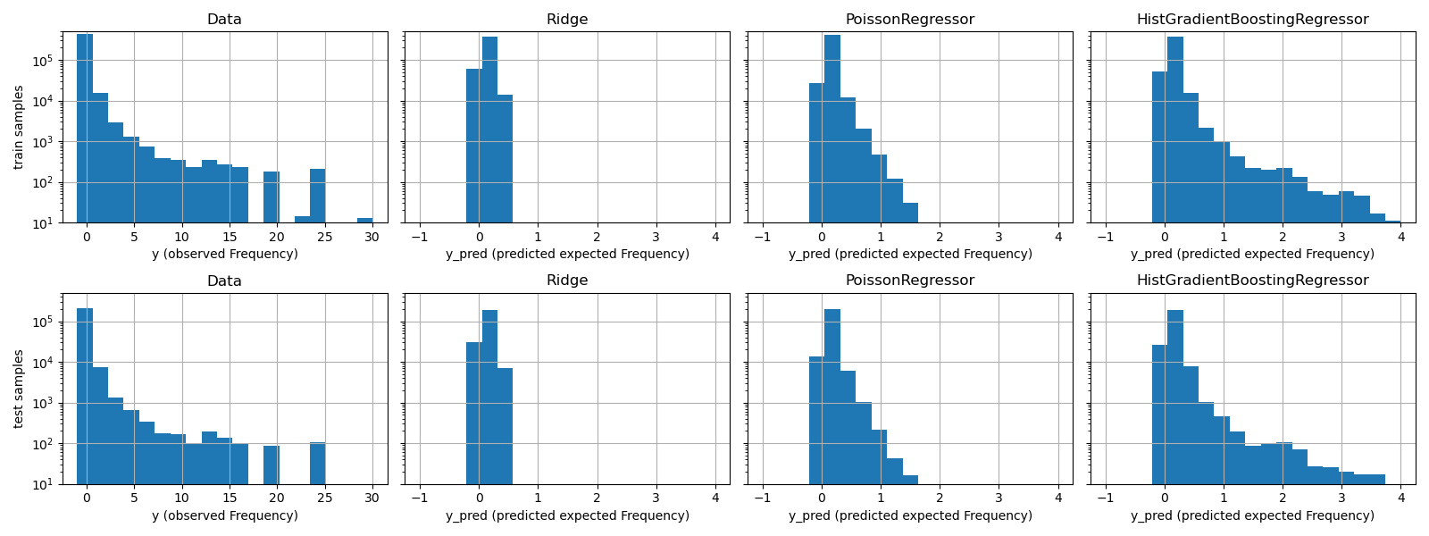
實驗數據顯示 y 的長尾分佈。在所有模型中,我們預測的是隨機變數的期望頻率,因此必然會比該隨機變數的觀察實現值擁有更少的極端值。這解釋了為什麼模型預測直方圖的眾數不一定對應於最小值。此外,Ridge 中使用的常態分佈具有恆定變異數,而 PoissonRegressor 和 HistGradientBoostingRegressor 中使用的卜瓦松分佈,其變異數與預測的期望值成正比。
因此,在所考慮的估計器中,相較於對目標變數的分佈做出錯誤假設的 Ridge 模型,PoissonRegressor 和 HistGradientBoostingRegressor 更適合用於建模非負數據的長尾分佈。
HistGradientBoostingRegressor 估計器具有最高的彈性,並且能夠預測更高的期望值。
請注意,我們本可以使用最小平方法損失函數來建立 HistGradientBoostingRegressor 模型。這會像 Ridge 模型一樣,錯誤地假設響應變數為常態分佈,並且可能導致稍微負面的預測結果。然而,梯度提升樹仍然會表現得相對良好,尤其是在訓練樣本數量龐大的情況下,會比 PoissonRegressor 更好,這歸因於樹狀結構的彈性。
預測校準的評估#
為了確保估計器對不同保戶類型產生合理的預測,我們可以根據每個模型返回的 y_pred 來劃分測試樣本。然後,對於每個分組,我們將平均預測值 y_pred 與平均觀察到的目標值進行比較。
from sklearn.utils import gen_even_slices


def _mean_frequency_by_risk_group(y_true, y_pred, sample_weight=None, n_bins=100):
    """Compare predictions and observations for bins ordered by y_pred.

    We order the samples by ``y_pred`` and split it in bins.
    In each bin the observed mean is compared with the predicted mean.

    Parameters
    ----------
    y_true: array-like of shape (n_samples,)
        Ground truth (correct) target values.
    y_pred: array-like of shape (n_samples,)
        Estimated target values.
    sample_weight : array-like of shape (n_samples,)
        Sample weights.
    n_bins: int
        Number of bins to use.

    Returns
    -------
    bin_centers: ndarray of shape (n_bins,)
        bin centers
    y_true_bin: ndarray of shape (n_bins,)
        average y_pred for each bin
    y_pred_bin: ndarray of shape (n_bins,)
        average y_pred for each bin
    """
    idx_sort = np.argsort(y_pred)
    bin_centers = np.arange(0, 1, 1 / n_bins) + 0.5 / n_bins
    y_pred_bin = np.zeros(n_bins)
    y_true_bin = np.zeros(n_bins)

    for n, sl in enumerate(gen_even_slices(len(y_true), n_bins)):
        weights = sample_weight[idx_sort][sl]
        y_pred_bin[n] = np.average(y_pred[idx_sort][sl], weights=weights)
        y_true_bin[n] = np.average(y_true[idx_sort][sl], weights=weights)
    return bin_centers, y_true_bin, y_pred_bin


print(f"Actual number of claims: {df_test['ClaimNb'].sum()}")
fig, ax = plt.subplots(nrows=2, ncols=2, figsize=(12, 8))
plt.subplots_adjust(wspace=0.3)

for axi, model in zip(ax.ravel(), [ridge_glm, poisson_glm, poisson_gbrt, dummy]):
    y_pred = model.predict(df_test)
    y_true = df_test["Frequency"].values
    exposure = df_test["Exposure"].values
    q, y_true_seg, y_pred_seg = _mean_frequency_by_risk_group(
        y_true, y_pred, sample_weight=exposure, n_bins=10
    )

    # Name of the model after the estimator used in the last step of the
    # pipeline.
    print(f"Predicted number of claims by {model[-1]}: {np.sum(y_pred * exposure):.1f}")

    axi.plot(q, y_pred_seg, marker="x", linestyle="--", label="predictions")
    axi.plot(q, y_true_seg, marker="o", linestyle="--", label="observations")
    axi.set_xlim(0, 1.0)
    axi.set_ylim(0, 0.5)
    axi.set(
        title=model[-1],
        xlabel="Fraction of samples sorted by y_pred",
        ylabel="Mean Frequency (y_pred)",
    )
    axi.legend()
plt.tight_layout()
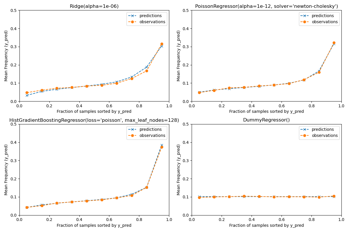
Actual number of claims: 11935
Predicted number of claims by Ridge(alpha=1e-06): 11933.4
Predicted number of claims by PoissonRegressor(alpha=1e-12, solver='newton-cholesky'): 11932.0
Predicted number of claims by HistGradientBoostingRegressor(loss='poisson', max_leaf_nodes=128): 12196.1
Predicted number of claims by DummyRegressor(): 11931.2
虛擬迴歸模型會預測一個恆定的頻率。這個模型並不會將相同的綁定排名賦予所有樣本,但整體來說校準良好(以估計整個族群的平均頻率)。
Ridge 迴歸模型可以預測非常低的期望頻率,這與數據不符。因此,它可能會嚴重低估某些保戶的風險。
PoissonRegressor 和 HistGradientBoostingRegressor 在預測目標值和觀察目標值之間表現出更好的一致性,尤其是在預測目標值較低的情況下。
所有預測值的總和也證實了 Ridge 模型的校準問題:它低估了測試集中索賠總數超過 3%,而其他三個模型可以大致恢復測試投資組合的索賠總數。
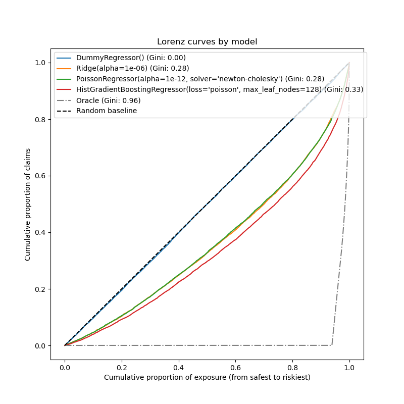
排名能力的評估#
對於某些商業應用,我們感興趣的是模型將風險最高的保戶與風險最低的保戶進行排名的能力,而與預測的絕對值無關。在這種情況下,模型評估會將問題視為排名問題,而不是迴歸問題。
為了從這個角度比較這 3 個模型,可以繪製索賠累計比例與測試樣本的曝險累計比例圖,測試樣本根據模型預測值由安全到風險最高進行排序。
這個圖稱為 Lorenz 曲線,可以用 Gini 指數來概括。
from sklearn.metrics import auc


def lorenz_curve(y_true, y_pred, exposure):
    y_true, y_pred = np.asarray(y_true), np.asarray(y_pred)
    exposure = np.asarray(exposure)

    # order samples by increasing predicted risk:
    ranking = np.argsort(y_pred)
    ranked_frequencies = y_true[ranking]
    ranked_exposure = exposure[ranking]
    cumulated_claims = np.cumsum(ranked_frequencies * ranked_exposure)
    cumulated_claims /= cumulated_claims[-1]
    cumulated_exposure = np.cumsum(ranked_exposure)
    cumulated_exposure /= cumulated_exposure[-1]
    return cumulated_exposure, cumulated_claims


fig, ax = plt.subplots(figsize=(8, 8))

for model in [dummy, ridge_glm, poisson_glm, poisson_gbrt]:
    y_pred = model.predict(df_test)
    cum_exposure, cum_claims = lorenz_curve(
        df_test["Frequency"], y_pred, df_test["Exposure"]
    )
    gini = 1 - 2 * auc(cum_exposure, cum_claims)
    label = "{} (Gini: {:.2f})".format(model[-1], gini)
    ax.plot(cum_exposure, cum_claims, linestyle="-", label=label)

# Oracle model: y_pred == y_test
cum_exposure, cum_claims = lorenz_curve(
    df_test["Frequency"], df_test["Frequency"], df_test["Exposure"]
)
gini = 1 - 2 * auc(cum_exposure, cum_claims)
label = "Oracle (Gini: {:.2f})".format(gini)
ax.plot(cum_exposure, cum_claims, linestyle="-.", color="gray", label=label)

# Random Baseline
ax.plot([0, 1], [0, 1], linestyle="--", color="black", label="Random baseline")
ax.set(
    title="Lorenz curves by model",
    xlabel="Cumulative proportion of exposure (from safest to riskiest)",
    ylabel="Cumulative proportion of claims",
)
ax.legend(loc="upper left")
<matplotlib.legend.Legend object at 0x74b4c2e41a00>
正如預期的那樣,虛擬迴歸器無法正確地對樣本進行排名,因此在此圖上的表現最差。
基於樹的模型在依風險對保戶進行排名方面明顯更好,而兩個線性模型的表現相似。
所有三個模型的表現都明顯優於隨機猜測,但離做出完美預測還很遠。
由於問題的本質,預期會出現最後一點:事故的發生主要受數據集中未捕捉到的環境因素影響,這些因素實際上可以被視為純粹的隨機因素。
線性模型假設輸入變數之間沒有相互作用,這可能導致擬合不足。插入多項式特徵提取器(PolynomialFeatures)確實將它們的區分能力提高了 2 個 Gini 指數點。特別是,它提高了模型識別風險最高的 5% 族群的能力。
主要結論#
可以根據模型產生良好校準的預測和良好排名的能力來評估模型的性能。
可以通過繪製平均觀察值與按預測風險分組的測試樣本的平均預測值來評估模型的校準。
Ridge迴歸模型的最小平方法損失(以及隱式使用單位連結函數)似乎導致該模型校準不良。特別是,它傾向於低估風險,甚至可能預測無效的負頻率。使用具有對數連結的卜瓦松損失可以糾正這些問題,並產生校準良好的線性模型。
Gini 指數反映了模型對預測值進行排名的能力,而與其絕對值無關,因此僅評估其排名能力。
儘管校準有所改善,但兩個線性模型的排名能力相當,並且遠低於梯度提升迴歸樹的排名能力。
計算為評估指標的卜瓦松偏差反映了模型的校準和排名能力。它還對響應變數的期望值和變異數之間的理想關係做出了線性假設。為了簡潔起見,我們沒有檢查此假設是否成立。
傳統的迴歸指標(例如均方誤差和平均絕對誤差)很難在具有許多零的計數值上進行有意義的解釋。
plt.show()
腳本的總執行時間: (0 分鐘 22.346 秒)
相關範例