CalibrationDisplay#
- class sklearn.calibration.CalibrationDisplay(prob_true, prob_pred, y_prob, *, estimator_name=None, pos_label=None)[原始碼]#
校準曲線(也稱為可靠性圖)視覺化。
建議使用
from_estimator或from_predictions來建立CalibrationDisplay。所有參數都以屬性形式儲存。在使用者指南中閱讀更多關於校準的資訊,並在視覺化中閱讀更多關於scikit-learn視覺化 API 的資訊。
有關如何使用視覺化的範例,請參閱機率校準曲線。
在 1.0 版本中新增。
- 參數:
- prob_true形狀為 (n_bins,) 的 ndarray
每個 bin 中,類別為正類的樣本比例(正例的比例)。
- prob_pred形狀為 (n_bins,) 的 ndarray
每個 bin 中預測的平均機率。
- y_prob形狀為 (n_samples,) 的 ndarray
每個樣本的正類機率估計值。
- estimator_namestr,預設值=None
估計器的名稱。如果為 None,則不會顯示估計器的名稱。
- pos_labelint、float、bool 或 str,預設值=None
計算校準曲線時的正類。預設情況下,當使用
from_estimator時,pos_label設定為estimators.classes_[1],當使用from_predictions時,設定為 1。在 1.1 版本中新增。
- 屬性:
- line_matplotlib Artist
校準曲線。
- ax_matplotlib Axes
帶有校準曲線的軸。
- figure_matplotlib Figure
包含曲線的圖形。
參見
範例
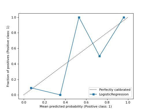
>>> from sklearn.datasets import make_classification
>>> from sklearn.model_selection import train_test_split
>>> from sklearn.linear_model import LogisticRegression
>>> from sklearn.calibration import calibration_curve, CalibrationDisplay
>>> X, y = make_classification(random_state=0)
>>> X_train, X_test, y_train, y_test = train_test_split(
...     X, y, random_state=0)
>>> clf = LogisticRegression(random_state=0)
>>> clf.fit(X_train, y_train)
LogisticRegression(random_state=0)
>>> y_prob = clf.predict_proba(X_test)[:, 1]
>>> prob_true, prob_pred = calibration_curve(y_test, y_prob, n_bins=10)
>>> disp = CalibrationDisplay(prob_true, prob_pred, y_prob)
>>> disp.plot()
<...>
- 使用估計器和資料繪製校準曲線。
classmethod from_estimator(estimator, X, y, *, n_bins=5, strategy='uniform', pos_label=None, name=None, ref_line=True, ax=None, **kwargs)[原始碼]#
使用二元分類器和資料繪製校準曲線。
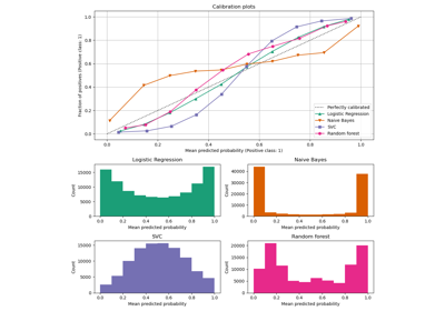
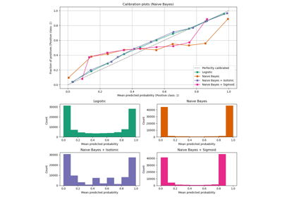
校準曲線(也稱為可靠性圖)使用二元分類器的輸入,並在 y 軸上繪製每個 bin 的平均預測機率與正類比例。
在使用者指南中閱讀更多關於校準的資訊,並在視覺化中閱讀更多關於scikit-learn視覺化 API 的資訊。
在 1.0 版本中新增。
- 參數:
- 額外的關鍵字參數將傳遞給
matplotlib.pyplot.plot。 estimator估計器實例
- 擬合的分類器或擬合的
Pipeline,其中最後一個估計器是分類器。分類器必須具有 predict_proba 方法。 X形狀為 (n_samples, n_features) 的 {類陣列, 稀疏矩陣}
- 輸入值。
y形狀為 (n_samples,) 的類陣列
- 二元目標值。
n_binsint,預設值=5
- 計算校準曲線時,將 [0, 1] 區間離散化的 bin 數。較大的數字需要更多資料。
strategy{‘uniform’, ‘quantile’},預設值=’uniform’
用於定義 bin 寬度的策略。
'uniform':bin 具有相同的寬度。
- pos_labelint、float、bool 或 str,預設值=None
'quantile':bin 具有相同數量的樣本,並取決於預測的機率。在 1.1 版本中新增。
- 計算校準曲線時的正類。預設情況下,
estimators.classes_[1]被視為正類。 namestr,預設值=None
- 用於標記曲線的名稱。如果
None,則使用估計器的名稱。 ref_linebool,預設值=True
- 如果
True,則繪製一條參考線,代表完全校準的分類器。 axmatplotlib 軸,預設值=None
- 繪圖的軸物件。如果
None,則會建立新的圖形和軸。 **kwargsdict
- 額外的關鍵字參數將傳遞給
- 要傳遞給
matplotlib.pyplot.plot的關鍵字參數。 - 傳回值:
display
CalibrationDisplay.
範例
>>> import matplotlib.pyplot as plt
>>> from sklearn.datasets import make_classification
>>> from sklearn.model_selection import train_test_split
>>> from sklearn.linear_model import LogisticRegression
>>> from sklearn.calibration import CalibrationDisplay
>>> X, y = make_classification(random_state=0)
>>> X_train, X_test, y_train, y_test = train_test_split(
...     X, y, random_state=0)
>>> clf = LogisticRegression(random_state=0)
>>> clf.fit(X_train, y_train)
LogisticRegression(random_state=0)
>>> disp = CalibrationDisplay.from_estimator(clf, X_test, y_test)
>>> plt.show()
- classmethod from_predictions(y_true, y_prob, *, n_bins=5, strategy='uniform', pos_label=None, name=None, ref_line=True, ax=None, **kwargs)[原始碼]#
使用真實標籤和預測機率繪製校準曲線。
校準曲線,也稱為可靠性圖,使用二元分類器的輸入,並在 y 軸上繪製每個 bin 的平均預測機率與正類別的比例。
校準曲線(也稱為可靠性圖)使用二元分類器的輸入,並在 y 軸上繪製每個 bin 的平均預測機率與正類比例。
在使用者指南中閱讀更多關於校準的資訊,並在視覺化中閱讀更多關於scikit-learn視覺化 API 的資訊。
在 1.0 版本中新增。
- 參數:
- y_true形狀如 (n_samples,) 的類陣列
真實標籤。
- y_prob形狀如 (n_samples,) 的類陣列
正類別的預測機率。
- 二元目標值。
n_binsint,預設值=5
- 計算校準曲線時,將 [0, 1] 區間離散化的 bin 數。較大的數字需要更多資料。
strategy{‘uniform’, ‘quantile’},預設值=’uniform’
用於定義 bin 寬度的策略。
'uniform':bin 具有相同的寬度。
- pos_labelint、float、bool 或 str,預設值=None
計算校準曲線時的正類別。預設情況下,
pos_label設定為 1。在 1.1 版本中新增。
- 計算校準曲線時的正類。預設情況下,
estimators.classes_[1]被視為正類。 用於標記曲線的名稱。
- 用於標記曲線的名稱。如果
None,則使用估計器的名稱。 ref_linebool,預設值=True
- 如果
True,則繪製一條參考線,代表完全校準的分類器。 axmatplotlib 軸,預設值=None
- 繪圖的軸物件。如果
None,則會建立新的圖形和軸。 **kwargsdict
- 要傳遞給
matplotlib.pyplot.plot的關鍵字參數。 - 傳回值:
display
CalibrationDisplay.
範例
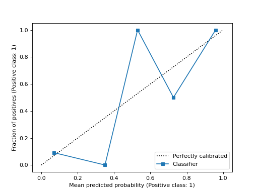
>>> import matplotlib.pyplot as plt
>>> from sklearn.datasets import make_classification
>>> from sklearn.model_selection import train_test_split
>>> from sklearn.linear_model import LogisticRegression
>>> from sklearn.calibration import CalibrationDisplay
>>> X, y = make_classification(random_state=0)
>>> X_train, X_test, y_train, y_test = train_test_split(
...     X, y, random_state=0)
>>> clf = LogisticRegression(random_state=0)
>>> clf.fit(X_train, y_train)
LogisticRegression(random_state=0)
>>> y_prob = clf.predict_proba(X_test)[:, 1]
>>> disp = CalibrationDisplay.from_predictions(y_test, y_prob)
>>> plt.show()
- plot(*, ax=None, name=None, ref_line=True, **kwargs)[原始碼]#
繪製視覺化圖表。
校準曲線(也稱為可靠性圖)使用二元分類器的輸入,並在 y 軸上繪製每個 bin 的平均預測機率與正類比例。
- 參數:
- axMatplotlib Axes,預設為 None
axmatplotlib 軸,預設值=None
- 計算校準曲線時的正類。預設情況下,
estimators.classes_[1]被視為正類。 用於標記曲線的名稱。如果
None,則使用estimator_name,如果None,則不顯示標籤。- 用於標記曲線的名稱。如果
None,則使用估計器的名稱。 ref_linebool,預設值=True
- 繪圖的軸物件。如果
None,則會建立新的圖形和軸。 **kwargsdict
- 要傳遞給
matplotlib.pyplot.plot的關鍵字參數。 - display
CalibrationDisplay display
CalibrationDisplay.
- display