注意
前往結尾下載完整的範例程式碼。或者透過 JupyterLite 或 Binder 在您的瀏覽器中執行此範例
機率校正曲線#
在執行分類時,人們通常不僅想預測類別標籤,還想預測相關的機率。此機率為預測提供某種程度的信心。此範例示範如何使用校正曲線 (也稱為可靠性圖) 來視覺化預測機率的校正程度。也會示範未校正分類器的校正。
# Authors: The scikit-learn developers
# SPDX-License-Identifier: BSD-3-Clause
資料集#
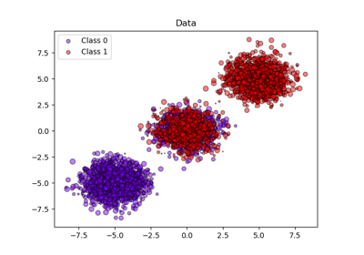
我們將使用具有 100,000 個樣本和 20 個特徵的合成二元分類資料集。在 20 個特徵中,只有 2 個是資訊性的,10 個是多餘的 (資訊性特徵的隨機組合),其餘 8 個是無資訊的 (隨機數字)。在 100,000 個樣本中,1,000 個將用於模型擬合,其餘用於測試。
from sklearn.datasets import make_classification
from sklearn.model_selection import train_test_split

X, y = make_classification(
    n_samples=100_000, n_features=20, n_informative=2, n_redundant=10, random_state=42
)

X_train, X_test, y_train, y_test = train_test_split(
    X, y, test_size=0.99, random_state=42
)
校正曲線#
高斯朴素貝氏#
首先,我們將比較
LogisticRegression(用作基準,因為通常,由於使用對數損失,適當正規化的邏輯迴歸預設會得到很好的校正)未校正的
GaussianNB具有等張和 S 型校正的
GaussianNB(請參閱 使用者指南)
以下繪製了所有 4 種條件的校正曲線,x 軸為每個箱子的平均預測機率,y 軸為每個箱子中正類別的比例。
import matplotlib.pyplot as plt
from matplotlib.gridspec import GridSpec

from sklearn.calibration import CalibratedClassifierCV, CalibrationDisplay
from sklearn.linear_model import LogisticRegression
from sklearn.naive_bayes import GaussianNB

lr = LogisticRegression(C=1.0)
gnb = GaussianNB()
gnb_isotonic = CalibratedClassifierCV(gnb, cv=2, method="isotonic")
gnb_sigmoid = CalibratedClassifierCV(gnb, cv=2, method="sigmoid")

clf_list = [
    (lr, "Logistic"),
    (gnb, "Naive Bayes"),
    (gnb_isotonic, "Naive Bayes + Isotonic"),
    (gnb_sigmoid, "Naive Bayes + Sigmoid"),
]
fig = plt.figure(figsize=(10, 10))
gs = GridSpec(4, 2)
colors = plt.get_cmap("Dark2")

ax_calibration_curve = fig.add_subplot(gs[:2, :2])
calibration_displays = {}
for i, (clf, name) in enumerate(clf_list):
    clf.fit(X_train, y_train)
    display = CalibrationDisplay.from_estimator(
        clf,
        X_test,
        y_test,
        n_bins=10,
        name=name,
        ax=ax_calibration_curve,
        color=colors(i),
    )
    calibration_displays[name] = display

ax_calibration_curve.grid()
ax_calibration_curve.set_title("Calibration plots (Naive Bayes)")

# Add histogram
grid_positions = [(2, 0), (2, 1), (3, 0), (3, 1)]
for i, (_, name) in enumerate(clf_list):
    row, col = grid_positions[i]
    ax = fig.add_subplot(gs[row, col])

    ax.hist(
        calibration_displays[name].y_prob,
        range=(0, 1),
        bins=10,
        label=name,
        color=colors(i),
    )
    ax.set(title=name, xlabel="Mean predicted probability", ylabel="Count")

plt.tight_layout()
plt.show()
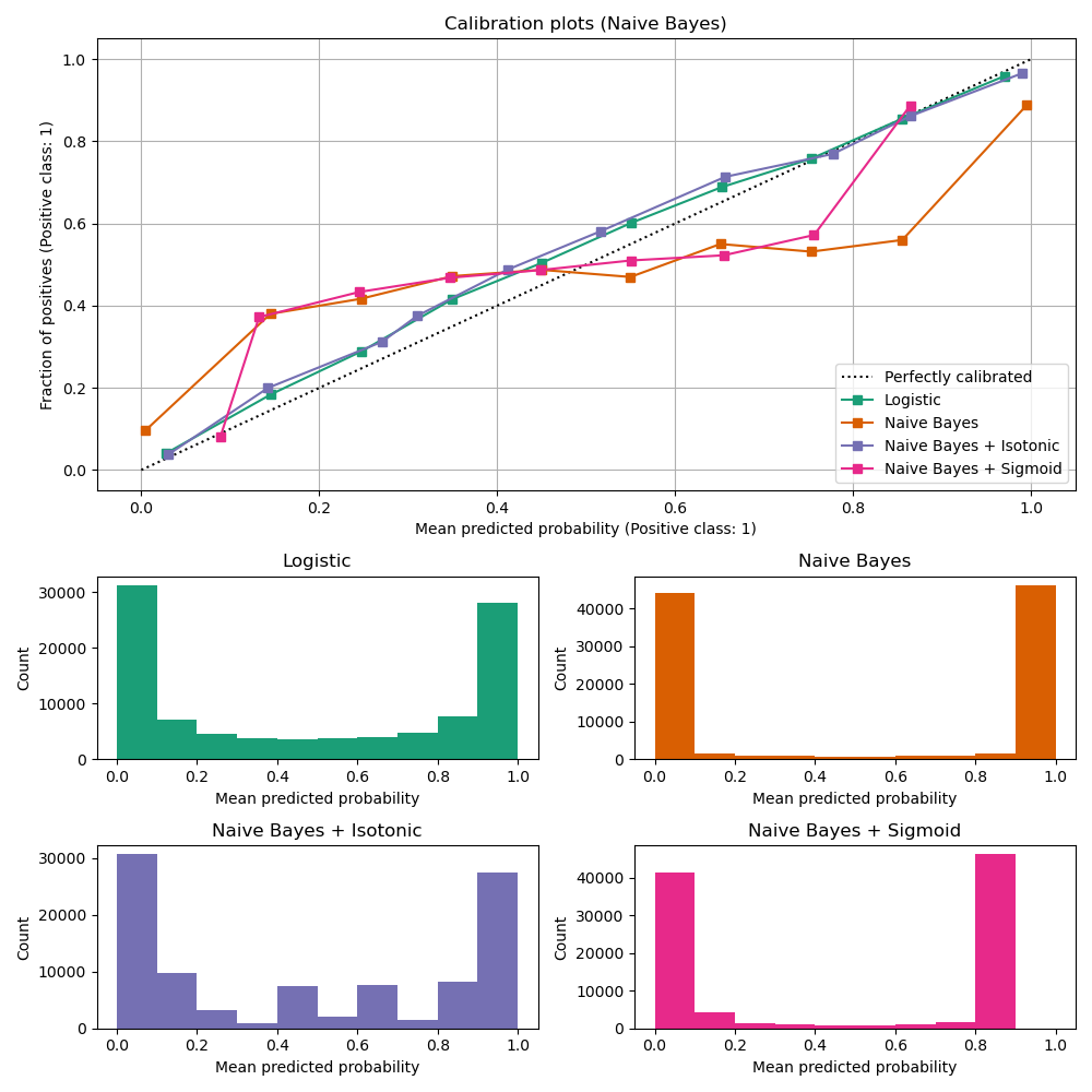
未校正的 GaussianNB 校正不良,因為多餘的特徵違反了特徵獨立性的假設,並導致過於自信的分類器,這可以由典型的轉置 S 形曲線表示。使用 等張迴歸 校正 GaussianNB 的機率可以解決此問題,從近乎對角的校正曲線可以看出這一點。S 型迴歸 也稍微改善了校正,但不如非參數等張迴歸那麼強烈。這可以歸因於我們有大量的校正資料,因此可以利用非參數模型的更大彈性。
以下我們將進行定量分析,考慮幾個分類指標:布里爾分數損失、對數損失、精確度、召回率、F1 分數 和 ROC AUC。
from collections import defaultdict

import pandas as pd

from sklearn.metrics import (
    brier_score_loss,
    f1_score,
    log_loss,
    precision_score,
    recall_score,
    roc_auc_score,
)

scores = defaultdict(list)
for i, (clf, name) in enumerate(clf_list):
    clf.fit(X_train, y_train)
    y_prob = clf.predict_proba(X_test)
    y_pred = clf.predict(X_test)
    scores["Classifier"].append(name)

    for metric in [brier_score_loss, log_loss, roc_auc_score]:
        score_name = metric.__name__.replace("_", " ").replace("score", "").capitalize()
        scores[score_name].append(metric(y_test, y_prob[:, 1]))

    for metric in [precision_score, recall_score, f1_score]:
        score_name = metric.__name__.replace("_", " ").replace("score", "").capitalize()
        scores[score_name].append(metric(y_test, y_pred))

    score_df = pd.DataFrame(scores).set_index("Classifier")
    score_df.round(decimals=3)

score_df
請注意,雖然校正改善了 布里爾分數損失 (由校正項和細化項組成的指標) 和 對數損失,但它不會顯著改變預測準確度指標 (精確度、召回率和 F1 分數)。這是因為校正不應顯著改變決策閾值位置的預測機率 (在圖表上的 x = 0.5 處)。但是,校正應該使預測的機率更準確,因此對於在不確定性下做出配置決策更有用。此外,ROC AUC 不應改變,因為校正是單調轉換。事實上,沒有排名指標會受到校正的影響。
線性支持向量分類器#
接下來,我們將比較
LogisticRegression(基準)未校正的
LinearSVC。由於 SVC 預設不會輸出機率,因此我們透過應用最小-最大縮放,將 決策函數 的輸出簡單地縮放到 [0, 1]。
import numpy as np

from sklearn.svm import LinearSVC


class NaivelyCalibratedLinearSVC(LinearSVC):
    """LinearSVC with `predict_proba` method that naively scales
    `decision_function` output for binary classification."""

    def fit(self, X, y):
        super().fit(X, y)
        df = self.decision_function(X)
        self.df_min_ = df.min()
        self.df_max_ = df.max()

    def predict_proba(self, X):
        """Min-max scale output of `decision_function` to [0, 1]."""
        df = self.decision_function(X)
        calibrated_df = (df - self.df_min_) / (self.df_max_ - self.df_min_)
        proba_pos_class = np.clip(calibrated_df, 0, 1)
        proba_neg_class = 1 - proba_pos_class
        proba = np.c_[proba_neg_class, proba_pos_class]
        return proba
lr = LogisticRegression(C=1.0)
svc = NaivelyCalibratedLinearSVC(max_iter=10_000)
svc_isotonic = CalibratedClassifierCV(svc, cv=2, method="isotonic")
svc_sigmoid = CalibratedClassifierCV(svc, cv=2, method="sigmoid")

clf_list = [
    (lr, "Logistic"),
    (svc, "SVC"),
    (svc_isotonic, "SVC + Isotonic"),
    (svc_sigmoid, "SVC + Sigmoid"),
]
fig = plt.figure(figsize=(10, 10))
gs = GridSpec(4, 2)

ax_calibration_curve = fig.add_subplot(gs[:2, :2])
calibration_displays = {}
for i, (clf, name) in enumerate(clf_list):
    clf.fit(X_train, y_train)
    display = CalibrationDisplay.from_estimator(
        clf,
        X_test,
        y_test,
        n_bins=10,
        name=name,
        ax=ax_calibration_curve,
        color=colors(i),
    )
    calibration_displays[name] = display

ax_calibration_curve.grid()
ax_calibration_curve.set_title("Calibration plots (SVC)")

# Add histogram
grid_positions = [(2, 0), (2, 1), (3, 0), (3, 1)]
for i, (_, name) in enumerate(clf_list):
    row, col = grid_positions[i]
    ax = fig.add_subplot(gs[row, col])

    ax.hist(
        calibration_displays[name].y_prob,
        range=(0, 1),
        bins=10,
        label=name,
        color=colors(i),
    )
    ax.set(title=name, xlabel="Mean predicted probability", ylabel="Count")

plt.tight_layout()
plt.show()
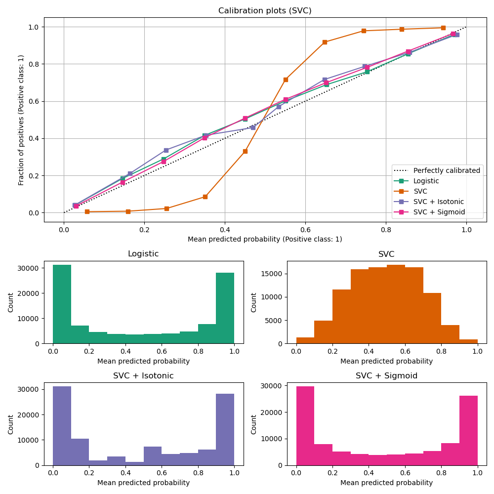
LinearSVC 顯示與 GaussianNB 相反的行為;校正曲線具有 S 形,這對於不夠自信的分類器來說很典型。在 LinearSVC 的情況下,這是由鉸鏈損失的邊界屬性引起的,該邊界屬性側重於靠近決策邊界 (支持向量) 的樣本。遠離決策邊界的樣本不會影響鉸鏈損失。因此,LinearSVC 並未嘗試在高信賴度區域中分離樣本是有意義的。這會導致 0 和 1 附近的校正曲線較平坦,並且在 Niculescu-Mizil & Caruana [1] 的各種資料集中經過實證證明。
兩種校正 (S 型和等張) 都可以解決此問題並產生相似的結果。
與之前一樣,我們顯示 布里爾分數損失、對數損失、精確度、召回率、F1 分數 和 ROC AUC。
scores = defaultdict(list)
for i, (clf, name) in enumerate(clf_list):
    clf.fit(X_train, y_train)
    y_prob = clf.predict_proba(X_test)
    y_pred = clf.predict(X_test)
    scores["Classifier"].append(name)

    for metric in [brier_score_loss, log_loss, roc_auc_score]:
        score_name = metric.__name__.replace("_", " ").replace("score", "").capitalize()
        scores[score_name].append(metric(y_test, y_prob[:, 1]))

    for metric in [precision_score, recall_score, f1_score]:
        score_name = metric.__name__.replace("_", " ").replace("score", "").capitalize()
        scores[score_name].append(metric(y_test, y_pred))

    score_df = pd.DataFrame(scores).set_index("Classifier")
    score_df.round(decimals=3)

score_df
與上面的 GaussianNB 相同,校正改善了 布里爾分數損失 和 對數損失,但並未大幅改變預測準確度指標 (精確度、召回率和 F1 分數)。
總結#
參數化的 Sigmoid 校準可以處理基礎分類器的校準曲線為 Sigmoid 型的情況(例如,對於 LinearSVC),但無法處理轉置 Sigmoid 型的情況(例如,GaussianNB)。非參數化的等張校準可以處理這兩種情況,但可能需要更多數據才能產生良好的結果。
參考文獻#
腳本總執行時間: (0 分鐘 2.241 秒)
相關範例