注意
前往結尾以下載完整的範例程式碼。或透過 JupyterLite 或 Binder 在您的瀏覽器中執行此範例
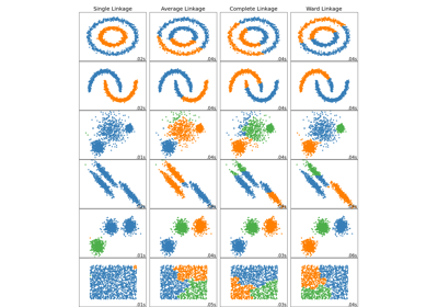
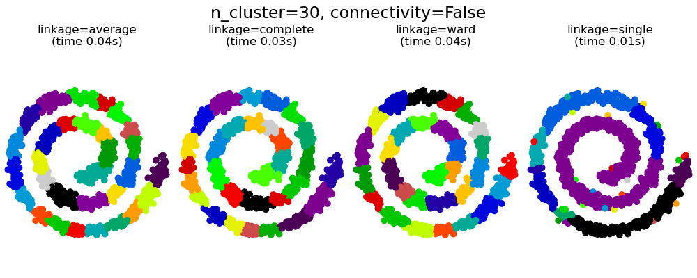
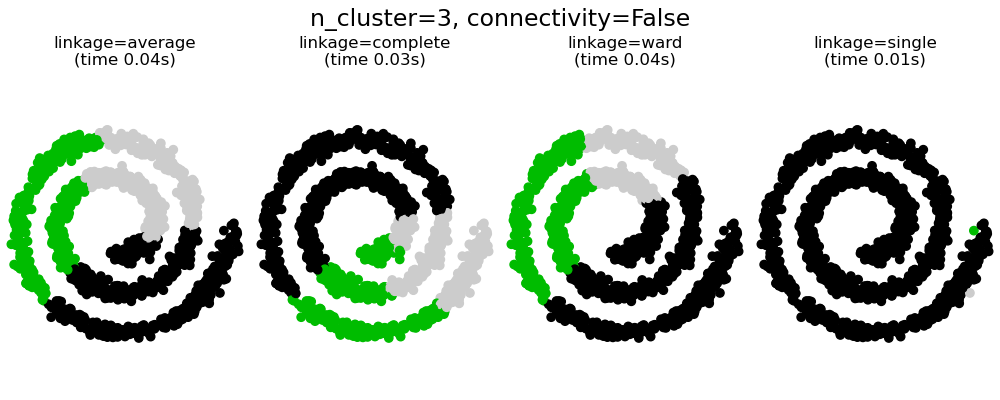
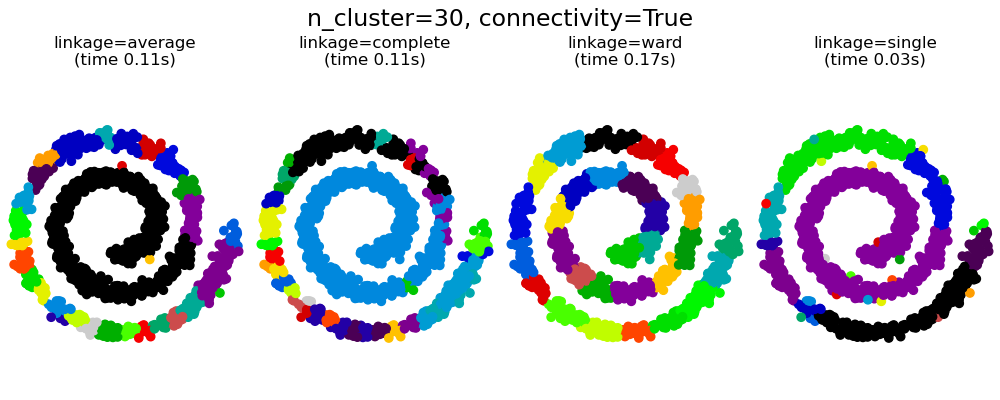
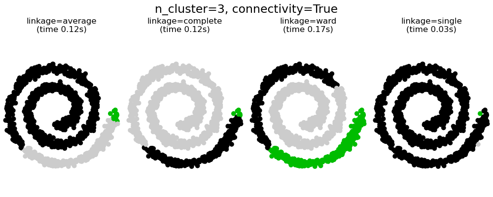
具有和不具有結構的聚合分群#
此範例顯示強加連通性圖來擷取資料中局部結構的效果。該圖只是 20 個最近鄰的圖。
強加連通性有兩個優點。首先,使用稀疏連通性矩陣進行分群通常更快。
其次,當使用連通性矩陣時,單連結、平均連結和完整連結是不穩定的,並且傾向於建立幾個快速成長的群集。實際上,平均連結和完整連結會在合併兩個群集時考慮它們之間的所有距離來對抗這種滲透行為 (而單連結則透過僅考慮群集之間的最短距離來誇大這種行為)。連通性圖打破了平均連結和完整連結的這種機制,使其類似於更易碎的單連結。對於非常稀疏的圖形 (嘗試減少 kneighbors_graph 中的鄰居數量) 和完整連結,這種效果更為明顯。尤其是,圖形中具有非常少數量的鄰居,會強制執行一種接近於單連結的幾何形狀,而單連結眾所周知具有這種滲透不穩定性。
# Authors: The scikit-learn developers
# SPDX-License-Identifier: BSD-3-Clause

import time

import matplotlib.pyplot as plt
import numpy as np

from sklearn.cluster import AgglomerativeClustering
from sklearn.neighbors import kneighbors_graph

# Generate sample data
n_samples = 1500
np.random.seed(0)
t = 1.5 * np.pi * (1 + 3 * np.random.rand(1, n_samples))
x = t * np.cos(t)
y = t * np.sin(t)


X = np.concatenate((x, y))
X += 0.7 * np.random.randn(2, n_samples)
X = X.T

# Create a graph capturing local connectivity. Larger number of neighbors
# will give more homogeneous clusters to the cost of computation
# time. A very large number of neighbors gives more evenly distributed
# cluster sizes, but may not impose the local manifold structure of
# the data
knn_graph = kneighbors_graph(X, 30, include_self=False)

for connectivity in (None, knn_graph):
    for n_clusters in (30, 3):
        plt.figure(figsize=(10, 4))
        for index, linkage in enumerate(("average", "complete", "ward", "single")):
            plt.subplot(1, 4, index + 1)
            model = AgglomerativeClustering(
                linkage=linkage, connectivity=connectivity, n_clusters=n_clusters
            )
            t0 = time.time()
            model.fit(X)
            elapsed_time = time.time() - t0
            plt.scatter(X[:, 0], X[:, 1], c=model.labels_, cmap=plt.cm.nipy_spectral)
            plt.title(
                "linkage=%s\n(time %.2fs)" % (linkage, elapsed_time),
                fontdict=dict(verticalalignment="top"),
            )
            plt.axis("equal")
            plt.axis("off")

            plt.subplots_adjust(bottom=0, top=0.83, wspace=0, left=0, right=1)
            plt.suptitle(
                "n_cluster=%i, connectivity=%r"
                % (n_clusters, connectivity is not None),
                size=17,
            )


plt.show()
腳本總執行時間: (0 分鐘 2.016 秒)
相關範例