注意
前往結尾以下載完整的範例程式碼。或透過 JupyterLite 或 Binder 在您的瀏覽器中執行此範例
使用部分依賴的高階繪圖#
PartialDependenceDisplay 物件可用於繪圖,而無需重新計算部分依賴性。在此範例中,我們示範如何繪製部分依賴圖,以及如何使用視覺化 API 快速自訂圖表。
注意
另請參閱 使用視覺化 API 的 ROC 曲線
# Authors: The scikit-learn developers
# SPDX-License-Identifier: BSD-3-Clause

import matplotlib.pyplot as plt
import pandas as pd

from sklearn.datasets import load_diabetes
from sklearn.inspection import PartialDependenceDisplay
from sklearn.neural_network import MLPRegressor
from sklearn.pipeline import make_pipeline
from sklearn.preprocessing import StandardScaler
from sklearn.tree import DecisionTreeRegressor
在糖尿病資料集上訓練模型#
首先,我們在糖尿病資料集上訓練決策樹和多層感知器。
diabetes = load_diabetes()
X = pd.DataFrame(diabetes.data, columns=diabetes.feature_names)
y = diabetes.target

tree = DecisionTreeRegressor()
mlp = make_pipeline(
    StandardScaler(),
    MLPRegressor(hidden_layer_sizes=(100, 100), tol=1e-2, max_iter=500, random_state=0),
)
tree.fit(X, y)
mlp.fit(X, y)
繪製兩個特徵的部分依賴性#
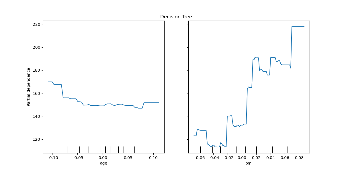
我們繪製決策樹的「年齡」和「bmi」(身體質量指數)特徵的部分依賴曲線。對於兩個特徵,from_estimator 期望繪製兩條曲線。這裡的繪圖函數使用 ax 定義的空間放置兩個圖的網格。
fig, ax = plt.subplots(figsize=(12, 6))
ax.set_title("Decision Tree")
tree_disp = PartialDependenceDisplay.from_estimator(tree, X, ["age", "bmi"], ax=ax)
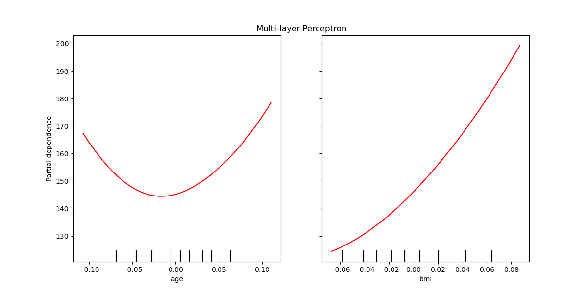
可以繪製多層感知器的部分依賴曲線。在這種情況下,line_kw 會傳遞到 from_estimator 以變更曲線的顏色。
fig, ax = plt.subplots(figsize=(12, 6))
ax.set_title("Multi-layer Perceptron")
mlp_disp = PartialDependenceDisplay.from_estimator(
    mlp, X, ["age", "bmi"], ax=ax, line_kw={"color": "red"}
)
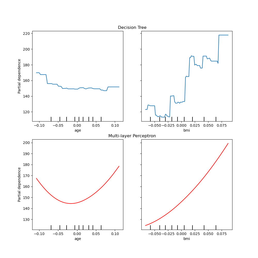
一起繪製兩個模型的部分依賴性#
tree_disp 和 mlp_disp PartialDependenceDisplay 物件包含重新建立部分依賴曲線所需的所有已計算資訊。這表示我們可以輕鬆建立其他圖表,而無需重新計算曲線。
繪製曲線的一種方法是將它們放置在同一個圖表中,每個模型的曲線在每一行上。首先,我們建立一個圖表,其中包含兩列和一行的兩個軸。這兩個軸會傳遞到 tree_disp 和 mlp_disp 的 plot 函數。繪圖函數會使用給定的軸來繪製部分依賴性。產生的圖表會將決策樹部分依賴曲線放置在第一行,多層感知器放置在第二行。
fig, (ax1, ax2) = plt.subplots(2, 1, figsize=(10, 10))
tree_disp.plot(ax=ax1)
ax1.set_title("Decision Tree")
mlp_disp.plot(ax=ax2, line_kw={"color": "red"})
ax2.set_title("Multi-layer Perceptron")
Text(0.5, 1.0, 'Multi-layer Perceptron')
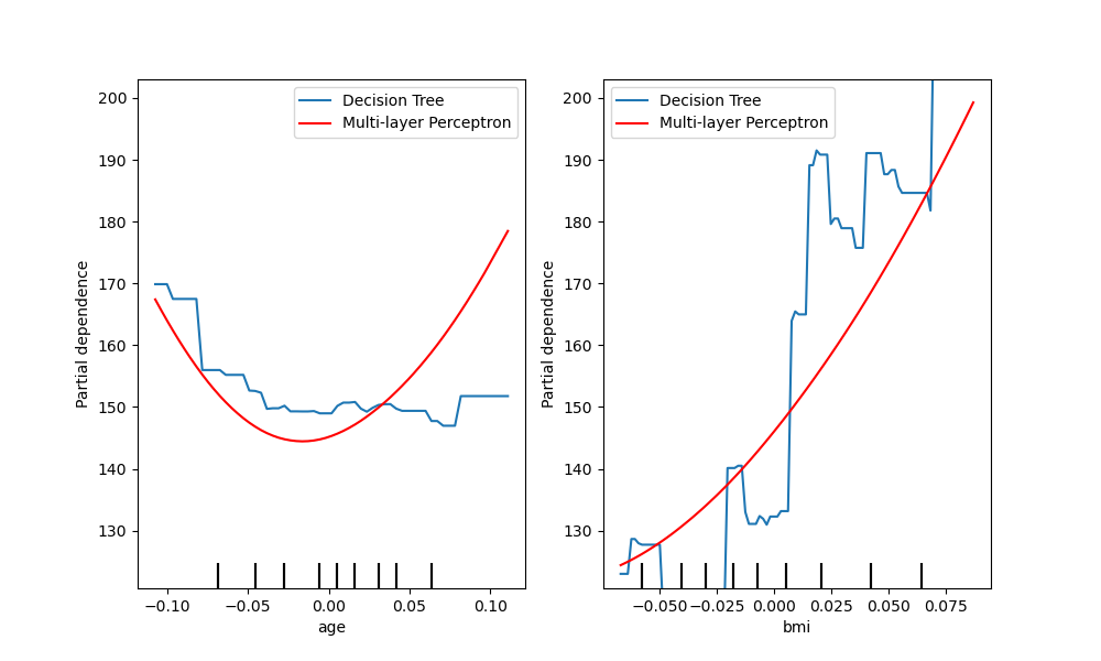
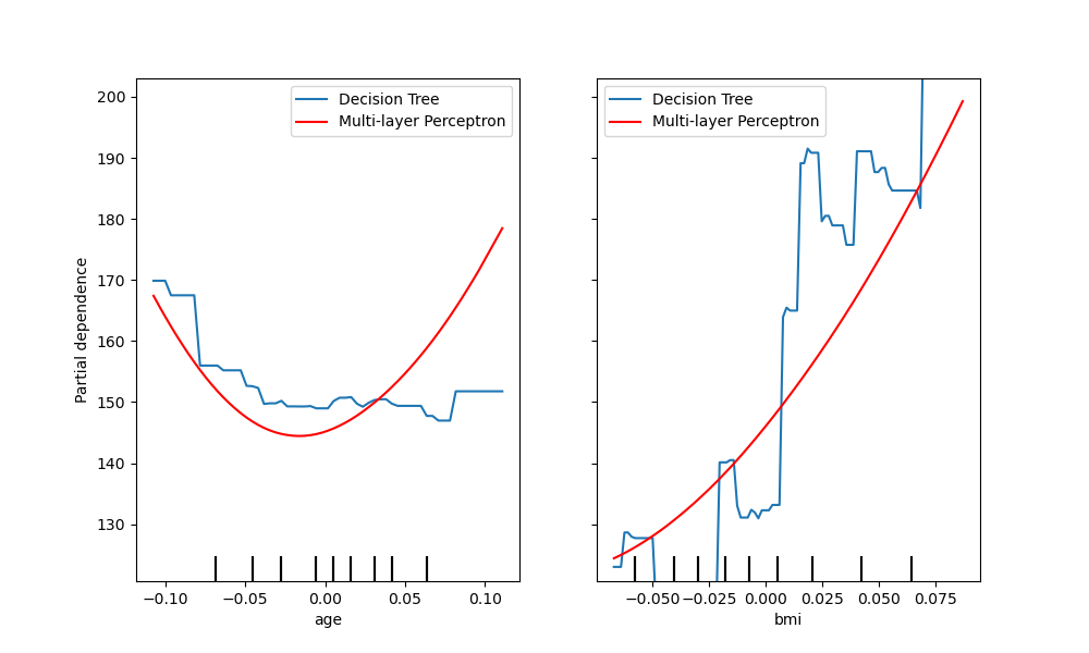
比較曲線的另一種方法是將它們疊放在彼此之上。在這裡,我們建立一個圖表,其中包含一行和兩列。軸會以清單形式傳遞到 plot 函數中,這會將每個模型的部分依賴曲線繪製在相同的軸上。軸清單的長度必須等於繪製的圖表數量。
fig, (ax1, ax2) = plt.subplots(1, 2, figsize=(10, 6))
tree_disp.plot(ax=[ax1, ax2], line_kw={"label": "Decision Tree"})
mlp_disp.plot(
    ax=[ax1, ax2], line_kw={"label": "Multi-layer Perceptron", "color": "red"}
)
ax1.legend()
ax2.legend()
<matplotlib.legend.Legend object at 0x74b4aacca760>
tree_disp.axes_ 是一個 NumPy 陣列容器,其中包含用於繪製部分依賴圖的軸。這可以傳遞給 mlp_disp,以產生與將圖表繪製在彼此之上相同的效果。此外,mlp_disp.figure_ 會儲存圖表,這允許在呼叫 plot 之後調整圖表大小。在這種情況下,tree_disp.axes_ 有兩個維度,因此 plot 只會在最左邊的圖表上顯示 y 標籤和 y 刻度。
tree_disp.plot(line_kw={"label": "Decision Tree"})
mlp_disp.plot(
    line_kw={"label": "Multi-layer Perceptron", "color": "red"}, ax=tree_disp.axes_
)
tree_disp.figure_.set_size_inches(10, 6)
tree_disp.axes_[0, 0].legend()
tree_disp.axes_[0, 1].legend()
plt.show()
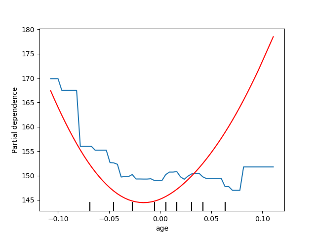
繪製一個特徵的部分依賴性#
在這裡,我們在相同的軸上繪製單一特徵「年齡」的部分依賴曲線。在這種情況下,tree_disp.axes_ 會傳遞到第二個繪圖函數中。
tree_disp = PartialDependenceDisplay.from_estimator(tree, X, ["age"])
mlp_disp = PartialDependenceDisplay.from_estimator(
    mlp, X, ["age"], ax=tree_disp.axes_, line_kw={"color": "red"}
)
腳本的總執行時間: (0 分鐘 2.676 秒)
相關範例