注意
前往結尾下載完整的範例程式碼。或透過 JupyterLite 或 Binder 在您的瀏覽器中執行此範例
梯度提升迴歸#
這個範例示範如何使用梯度提升從弱預測模型集合中產生預測模型。梯度提升可用於迴歸和分類問題。在這裡,我們將訓練一個模型來處理糖尿病迴歸任務。我們將從 GradientBoostingRegressor 中取得結果,使用最小平方法損失和深度為 4 的 500 個迴歸樹。
注意:對於較大的數據集 (n_samples >= 10000),請參閱 HistGradientBoostingRegressor。請參閱 直方圖梯度提升樹中的特徵,該範例展示了 HistGradientBoostingRegressor 的其他一些優點。
# Authors: The scikit-learn developers
# SPDX-License-Identifier: BSD-3-Clause

import matplotlib
import matplotlib.pyplot as plt
import numpy as np

from sklearn import datasets, ensemble
from sklearn.inspection import permutation_importance
from sklearn.metrics import mean_squared_error
from sklearn.model_selection import train_test_split
from sklearn.utils.fixes import parse_version
載入數據#
首先,我們需要載入數據。
diabetes = datasets.load_diabetes()
X, y = diabetes.data, diabetes.target
數據預處理#
接下來,我們將分割我們的數據集,使用 90% 進行訓練,其餘的用於測試。我們還將設定迴歸模型參數。您可以嘗試這些參數,以查看結果如何變化。
n_estimators:將執行的提升階段數。稍後,我們將繪製偏差與提升迭代的關係圖。
max_depth:限制樹中的節點數。最佳值取決於輸入變數的交互作用。
min_samples_split:分割內部節點所需的最小樣本數。
learning_rate:每棵樹的貢獻將縮小多少。
loss:要最佳化的損失函數。在此情況下使用最小平方函數,但是還有許多其他選項(請參閱 GradientBoostingRegressor )。
X_train, X_test, y_train, y_test = train_test_split(
    X, y, test_size=0.1, random_state=13
)

params = {
    "n_estimators": 500,
    "max_depth": 4,
    "min_samples_split": 5,
    "learning_rate": 0.01,
    "loss": "squared_error",
}
擬合迴歸模型#
現在我們將啟動梯度提升迴歸器,並使用我們的訓練數據進行擬合。我們也來看一看測試數據上的均方誤差。
reg = ensemble.GradientBoostingRegressor(**params)
reg.fit(X_train, y_train)

mse = mean_squared_error(y_test, reg.predict(X_test))
print("The mean squared error (MSE) on test set: {:.4f}".format(mse))
The mean squared error (MSE) on test set: 3016.1436
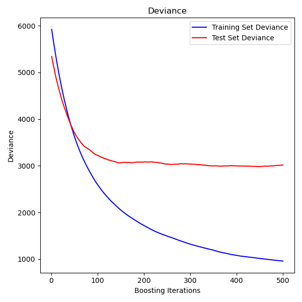
繪製訓練偏差#
最後,我們將視覺化結果。為此,我們將首先計算測試集偏差,然後繪製其與提升迭代的關係圖。
test_score = np.zeros((params["n_estimators"],), dtype=np.float64)
for i, y_pred in enumerate(reg.staged_predict(X_test)):
    test_score[i] = mean_squared_error(y_test, y_pred)

fig = plt.figure(figsize=(6, 6))
plt.subplot(1, 1, 1)
plt.title("Deviance")
plt.plot(
    np.arange(params["n_estimators"]) + 1,
    reg.train_score_,
    "b-",
    label="Training Set Deviance",
)
plt.plot(
    np.arange(params["n_estimators"]) + 1, test_score, "r-", label="Test Set Deviance"
)
plt.legend(loc="upper right")
plt.xlabel("Boosting Iterations")
plt.ylabel("Deviance")
fig.tight_layout()
plt.show()
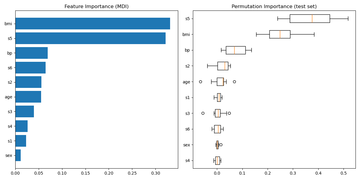
繪製特徵重要性#
警告
小心,基於雜質的特徵重要性對於高基數特徵(許多唯一值)可能會產生誤導。作為替代方法,可以在保留的測試集上計算 reg 的排列重要性。請參閱 排列特徵重要性,以取得更多詳細資訊。
對於此範例,基於雜質的方法和排列方法識別出相同的 2 個強預測特徵,但順序不同。第三個最具預測性的特徵「bp」,對於這 2 種方法也是相同的。其餘的特徵預測性較差,並且排列圖的誤差線顯示它們與 0 重疊。
feature_importance = reg.feature_importances_
sorted_idx = np.argsort(feature_importance)
pos = np.arange(sorted_idx.shape[0]) + 0.5
fig = plt.figure(figsize=(12, 6))
plt.subplot(1, 2, 1)
plt.barh(pos, feature_importance[sorted_idx], align="center")
plt.yticks(pos, np.array(diabetes.feature_names)[sorted_idx])
plt.title("Feature Importance (MDI)")

result = permutation_importance(
    reg, X_test, y_test, n_repeats=10, random_state=42, n_jobs=2
)
sorted_idx = result.importances_mean.argsort()
plt.subplot(1, 2, 2)

# `labels` argument in boxplot is deprecated in matplotlib 3.9 and has been
# renamed to `tick_labels`. The following code handles this, but as a
# scikit-learn user you probably can write simpler code by using `labels=...`
# (matplotlib < 3.9) or `tick_labels=...` (matplotlib >= 3.9).
tick_labels_parameter_name = (
    "tick_labels"
    if parse_version(matplotlib.__version__) >= parse_version("3.9")
    else "labels"
)
tick_labels_dict = {
    tick_labels_parameter_name: np.array(diabetes.feature_names)[sorted_idx]
}
plt.boxplot(result.importances[sorted_idx].T, vert=False, **tick_labels_dict)
plt.title("Permutation Importance (test set)")
fig.tight_layout()
plt.show()
腳本的總執行時間: (0 分鐘 1.594 秒)
相關範例