注意
前往結尾以下載完整的範例程式碼。或透過 JupyterLite 或 Binder 在您的瀏覽器中執行此範例
簡單的 1D 核密度估計#
此範例使用 KernelDensity 類別來說明一維核密度估計的原理。
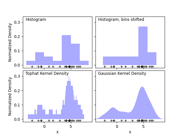
第一張圖顯示了使用直方圖視覺化 1D 中點的密度的一個問題。直觀上,直方圖可以被認為是一種方案,其中單位「區塊」堆疊在規則網格上每個點的上方。但是,如頂部的兩個面板所示,這些區塊的網格選擇可能會導致對密度分佈的底層形狀產生截然不同的想法。如果我們改為將每個區塊以其代表的點為中心,我們會得到左下方面板中顯示的估計。這是一個具有「頂帽」核的核密度估計。這個想法可以推廣到其他核形狀:第一張圖的右下方面板顯示了相同分佈上的高斯核密度估計。
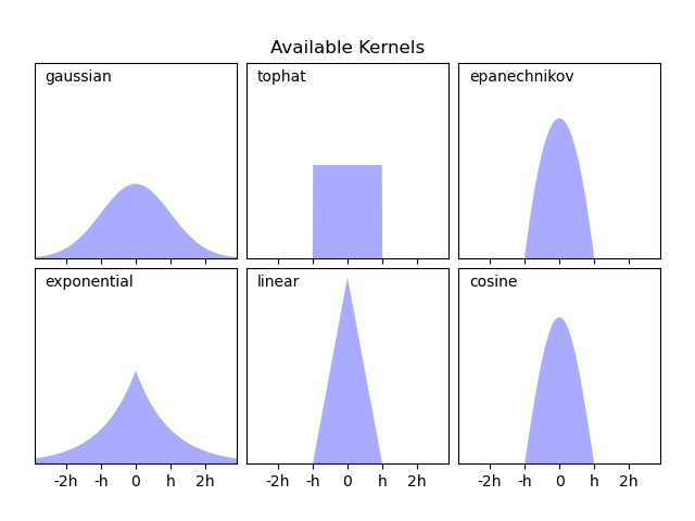
Scikit-learn 通過 KernelDensity 估計器,使用 Ball Tree 或 KD Tree 結構實現高效的核密度估計。此範例的第二張圖顯示了可用的核。
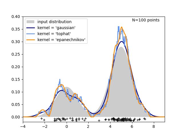
第三張圖比較了 1 維中 100 個樣本分佈的核密度估計。雖然此範例使用 1D 分佈,但核密度估計也很容易且有效率地擴展到更高的維度。
# Authors: The scikit-learn developers
# SPDX-License-Identifier: BSD-3-Clause

import matplotlib.pyplot as plt
import numpy as np
from scipy.stats import norm

from sklearn.neighbors import KernelDensity

# ----------------------------------------------------------------------
# Plot the progression of histograms to kernels
np.random.seed(1)
N = 20
X = np.concatenate(
    (np.random.normal(0, 1, int(0.3 * N)), np.random.normal(5, 1, int(0.7 * N)))
)[:, np.newaxis]
X_plot = np.linspace(-5, 10, 1000)[:, np.newaxis]
bins = np.linspace(-5, 10, 10)

fig, ax = plt.subplots(2, 2, sharex=True, sharey=True)
fig.subplots_adjust(hspace=0.05, wspace=0.05)

# histogram 1
ax[0, 0].hist(X[:, 0], bins=bins, fc="#AAAAFF", density=True)
ax[0, 0].text(-3.5, 0.31, "Histogram")

# histogram 2
ax[0, 1].hist(X[:, 0], bins=bins + 0.75, fc="#AAAAFF", density=True)
ax[0, 1].text(-3.5, 0.31, "Histogram, bins shifted")

# tophat KDE
kde = KernelDensity(kernel="tophat", bandwidth=0.75).fit(X)
log_dens = kde.score_samples(X_plot)
ax[1, 0].fill(X_plot[:, 0], np.exp(log_dens), fc="#AAAAFF")
ax[1, 0].text(-3.5, 0.31, "Tophat Kernel Density")

# Gaussian KDE
kde = KernelDensity(kernel="gaussian", bandwidth=0.75).fit(X)
log_dens = kde.score_samples(X_plot)
ax[1, 1].fill(X_plot[:, 0], np.exp(log_dens), fc="#AAAAFF")
ax[1, 1].text(-3.5, 0.31, "Gaussian Kernel Density")

for axi in ax.ravel():
    axi.plot(X[:, 0], np.full(X.shape[0], -0.01), "+k")
    axi.set_xlim(-4, 9)
    axi.set_ylim(-0.02, 0.34)

for axi in ax[:, 0]:
    axi.set_ylabel("Normalized Density")

for axi in ax[1, :]:
    axi.set_xlabel("x")

# ----------------------------------------------------------------------
# Plot all available kernels
X_plot = np.linspace(-6, 6, 1000)[:, None]
X_src = np.zeros((1, 1))

fig, ax = plt.subplots(2, 3, sharex=True, sharey=True)
fig.subplots_adjust(left=0.05, right=0.95, hspace=0.05, wspace=0.05)


def format_func(x, loc):
    if x == 0:
        return "0"
    elif x == 1:
        return "h"
    elif x == -1:
        return "-h"
    else:
        return "%ih" % x


for i, kernel in enumerate(
    ["gaussian", "tophat", "epanechnikov", "exponential", "linear", "cosine"]
):
    axi = ax.ravel()[i]
    log_dens = KernelDensity(kernel=kernel).fit(X_src).score_samples(X_plot)
    axi.fill(X_plot[:, 0], np.exp(log_dens), "-k", fc="#AAAAFF")
    axi.text(-2.6, 0.95, kernel)

    axi.xaxis.set_major_formatter(plt.FuncFormatter(format_func))
    axi.xaxis.set_major_locator(plt.MultipleLocator(1))
    axi.yaxis.set_major_locator(plt.NullLocator())

    axi.set_ylim(0, 1.05)
    axi.set_xlim(-2.9, 2.9)

ax[0, 1].set_title("Available Kernels")

# ----------------------------------------------------------------------
# Plot a 1D density example
N = 100
np.random.seed(1)
X = np.concatenate(
    (np.random.normal(0, 1, int(0.3 * N)), np.random.normal(5, 1, int(0.7 * N)))
)[:, np.newaxis]

X_plot = np.linspace(-5, 10, 1000)[:, np.newaxis]

true_dens = 0.3 * norm(0, 1).pdf(X_plot[:, 0]) + 0.7 * norm(5, 1).pdf(X_plot[:, 0])

fig, ax = plt.subplots()
ax.fill(X_plot[:, 0], true_dens, fc="black", alpha=0.2, label="input distribution")
colors = ["navy", "cornflowerblue", "darkorange"]
kernels = ["gaussian", "tophat", "epanechnikov"]
lw = 2

for color, kernel in zip(colors, kernels):
    kde = KernelDensity(kernel=kernel, bandwidth=0.5).fit(X)
    log_dens = kde.score_samples(X_plot)
    ax.plot(
        X_plot[:, 0],
        np.exp(log_dens),
        color=color,
        lw=lw,
        linestyle="-",
        label="kernel = '{0}'".format(kernel),
    )

ax.text(6, 0.38, "N={0} points".format(N))

ax.legend(loc="upper left")
ax.plot(X[:, 0], -0.005 - 0.01 * np.random.random(X.shape[0]), "+k")

ax.set_xlim(-4, 9)
ax.set_ylim(-0.02, 0.4)
plt.show()
腳本的總執行時間: (0 分鐘 0.593 秒)
相關範例