注意
前往結尾下載完整範例程式碼。或透過 JupyterLite 或 Binder 在您的瀏覽器中執行此範例
用於衡量分類效能的類別似然比#
此範例演示了 class_likelihood_ratios 函數,該函數計算正負似然比 (LR+、LR-) 來評估二元分類器的預測能力。正如我們將看到的,這些指標與測試集中類別之間的比例無關,這使得它們在研究的可用數據具有與目標應用不同的類別比例時非常有用。
一個典型的用法是醫學中的病例對照研究,該研究具有幾乎平衡的類別,而一般人群則存在很大的類別不平衡。在此類應用中,可以選擇個體具有目標狀況的測試前機率為患病率,即發現受醫學狀況影響的特定人群的比例。然後,測試後機率表示在給定陽性測試結果的情況下,該狀況確實存在的機率。
在此範例中,我們先討論 類別似然比 給出的測試前和測試後賠率之間的聯繫。然後,我們在某些受控情況下評估它們的行為。在最後一節中,我們將它們繪製為陽性類別患病率的函數。
# Authors: The scikit-learn developers
# SPDX-License-Identifier: BSD-3-Clause
測試前與測試後分析#
假設我們有一群受試者,其生理測量值 X 有望作為疾病的間接生物標記,以及實際的疾病指標 y (真實值)。人群中的大多數人沒有攜帶該疾病,但少數人 (在這種情況下約為 10%) 攜帶該疾病
from sklearn.datasets import make_classification

X, y = make_classification(n_samples=10_000, weights=[0.9, 0.1], random_state=0)
print(f"Percentage of people carrying the disease: {100*y.mean():.2f}%")
Percentage of people carrying the disease: 10.37%
建立機器學習模型來診斷具有某些給定生理測量值的人是否可能患有所關注的疾病。為了評估模型,我們需要在保留的測試集上評估其效能
from sklearn.model_selection import train_test_split

X_train, X_test, y_train, y_test = train_test_split(X, y, random_state=0)
然後我們可以擬合我們的診斷模型並計算正似然比,以評估此分類器作為疾病診斷工具的有用性
from sklearn.linear_model import LogisticRegression
from sklearn.metrics import class_likelihood_ratios

estimator = LogisticRegression().fit(X_train, y_train)
y_pred = estimator.predict(X_test)
pos_LR, neg_LR = class_likelihood_ratios(y_test, y_pred)
print(f"LR+: {pos_LR:.3f}")
LR+: 12.617
由於正類別似然比遠大於 1.0,這表示基於機器學習的診斷工具很有用:在給定陽性測試結果的情況下,該狀況確實存在的測試後賠率比測試前賠率大 12 倍以上。
似然比的交叉驗證#
我們在某些特定情況下評估類別似然比測量的變異性。
import pandas as pd


def scoring(estimator, X, y):
    y_pred = estimator.predict(X)
    pos_lr, neg_lr = class_likelihood_ratios(y, y_pred, raise_warning=False)
    return {"positive_likelihood_ratio": pos_lr, "negative_likelihood_ratio": neg_lr}


def extract_score(cv_results):
    lr = pd.DataFrame(
        {
            "positive": cv_results["test_positive_likelihood_ratio"],
            "negative": cv_results["test_negative_likelihood_ratio"],
        }
    )
    return lr.aggregate(["mean", "std"])
我們首先驗證 LogisticRegression 模型,其使用與上一節中使用的預設超參數。
from sklearn.model_selection import cross_validate

estimator = LogisticRegression()
extract_score(cross_validate(estimator, X, y, scoring=scoring, cv=10))
我們確認該模型很有用:測試後賠率比測試前賠率大 12 到 20 倍。
相反地,讓我們考慮一個虛擬模型,該模型將輸出與訓練集中疾病平均患病率相似的隨機預測
from sklearn.dummy import DummyClassifier

estimator = DummyClassifier(strategy="stratified", random_state=1234)
extract_score(cross_validate(estimator, X, y, scoring=scoring, cv=10))
此處兩個類別似然比都與 1.0 相容,這使得此分類器作為提高疾病檢測的診斷工具無效。
虛擬模型的另一個選項是始終預測最常見的類別,在這種情況下為「無疾病」。
estimator = DummyClassifier(strategy="most_frequent")
extract_score(cross_validate(estimator, X, y, scoring=scoring, cv=10))
由於沒有正預測,這意味著不會有真陽性或偽陽性,從而導致 LR+ 未定義,這絕不應被解釋為無限的 LR+ (分類器完美地識別陽性案例)。在這種情況下,class_likelihood_ratios 函數會傳回 nan,預設會引發警告。實際上,LR- 的值有助於我們捨棄此模型。
當交叉驗證具有少量樣本的高度不平衡數據時,可能會出現類似的情況:某些摺疊沒有患有疾病的樣本,因此在用於測試時不會輸出真陽性或偽陰性。在數學上,這會導致無限的 LR+,這也不應被解釋為模型完美地識別陽性案例。此類事件會導致估計的似然比的變異數增加,但仍然可以解釋為具有該狀況的測試後賠率增加。
estimator = LogisticRegression()
X, y = make_classification(n_samples=300, weights=[0.9, 0.1], random_state=0)
extract_score(cross_validate(estimator, X, y, scoring=scoring, cv=10))
關於患病率的不變性#
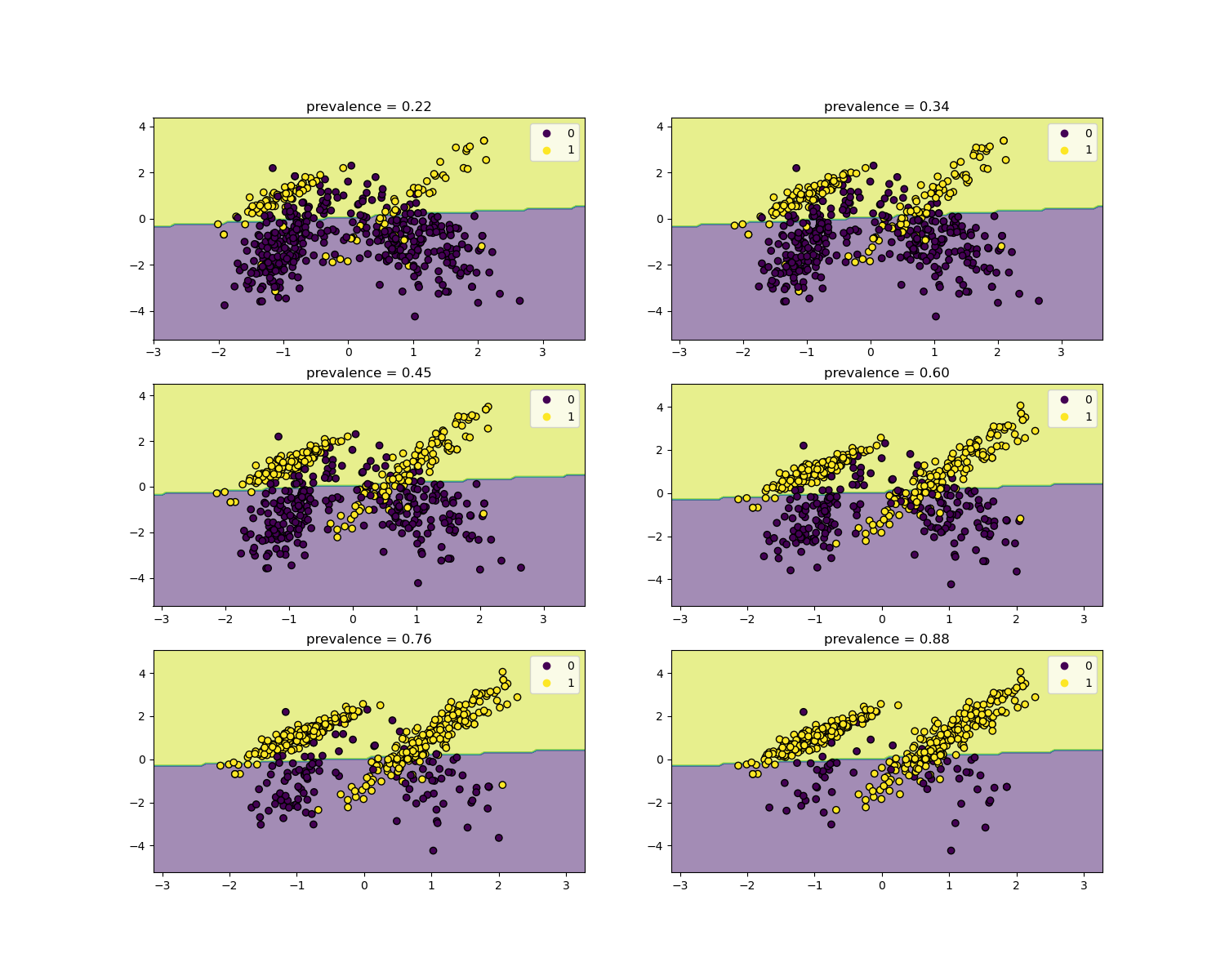
似然比與疾病患病率無關,並且可以在人群之間外推,而無需考慮任何可能的類別不平衡,只要將相同的模型應用於所有人。請注意,在下面的圖表中,決策邊界是恆定的 (請參閱 SVM:不平衡類別的分離超平面,以研究不平衡類別的邊界決策)。
在這裡,我們在一個患病率為 50% 的病例對照研究中訓練一個 LogisticRegression 基礎模型。然後在具有不同患病率的群體中進行評估。我們使用 make_classification 函數來確保數據生成過程始終與下圖所示相同。標籤 1 對應於陽性類別「疾病」,而標籤 0 代表「無疾病」。
from collections import defaultdict

import matplotlib.pyplot as plt
import numpy as np

from sklearn.inspection import DecisionBoundaryDisplay

populations = defaultdict(list)
common_params = {
    "n_samples": 10_000,
    "n_features": 2,
    "n_informative": 2,
    "n_redundant": 0,
    "random_state": 0,
}
weights = np.linspace(0.1, 0.8, 6)
weights = weights[::-1]

# fit and evaluate base model on balanced classes
X, y = make_classification(**common_params, weights=[0.5, 0.5])
estimator = LogisticRegression().fit(X, y)
lr_base = extract_score(cross_validate(estimator, X, y, scoring=scoring, cv=10))
pos_lr_base, pos_lr_base_std = lr_base["positive"].values
neg_lr_base, neg_lr_base_std = lr_base["negative"].values
我們現在將展示每個患病率水平的決策邊界。請注意,我們僅繪製原始數據的子集,以便更好地評估線性模型的決策邊界。
fig, axs = plt.subplots(nrows=3, ncols=2, figsize=(15, 12))

for ax, (n, weight) in zip(axs.ravel(), enumerate(weights)):
    X, y = make_classification(
        **common_params,
        weights=[weight, 1 - weight],
    )
    prevalence = y.mean()
    populations["prevalence"].append(prevalence)
    populations["X"].append(X)
    populations["y"].append(y)

    # down-sample for plotting
    rng = np.random.RandomState(1)
    plot_indices = rng.choice(np.arange(X.shape[0]), size=500, replace=True)
    X_plot, y_plot = X[plot_indices], y[plot_indices]

    # plot fixed decision boundary of base model with varying prevalence
    disp = DecisionBoundaryDisplay.from_estimator(
        estimator,
        X_plot,
        response_method="predict",
        alpha=0.5,
        ax=ax,
    )
    scatter = disp.ax_.scatter(X_plot[:, 0], X_plot[:, 1], c=y_plot, edgecolor="k")
    disp.ax_.set_title(f"prevalence = {y_plot.mean():.2f}")
    disp.ax_.legend(*scatter.legend_elements())
我們定義一個用於自舉法的函數。
def scoring_on_bootstrap(estimator, X, y, rng, n_bootstrap=100):
    results_for_prevalence = defaultdict(list)
    for _ in range(n_bootstrap):
        bootstrap_indices = rng.choice(
            np.arange(X.shape[0]), size=X.shape[0], replace=True
        )
        for key, value in scoring(
            estimator, X[bootstrap_indices], y[bootstrap_indices]
        ).items():
            results_for_prevalence[key].append(value)
    return pd.DataFrame(results_for_prevalence)
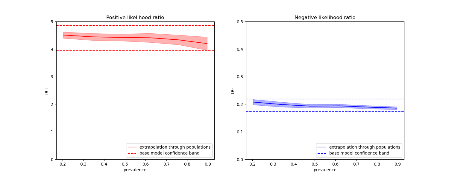
我們使用自舉法為每個患病率評估基礎模型。
results = defaultdict(list)
n_bootstrap = 100
rng = np.random.default_rng(seed=0)

for prevalence, X, y in zip(
    populations["prevalence"], populations["X"], populations["y"]
):
    results_for_prevalence = scoring_on_bootstrap(
        estimator, X, y, rng, n_bootstrap=n_bootstrap
    )
    results["prevalence"].append(prevalence)
    results["metrics"].append(
        results_for_prevalence.aggregate(["mean", "std"]).unstack()
    )

results = pd.DataFrame(results["metrics"], index=results["prevalence"])
results.index.name = "prevalence"
results
在下面的圖表中,我們觀察到使用不同患病率重新計算的類別概似比率,確實在與平衡類別計算出的概似比率的一個標準差範圍內保持恆定。
fig, (ax1, ax2) = plt.subplots(nrows=1, ncols=2, figsize=(15, 6))
results["positive_likelihood_ratio"]["mean"].plot(
    ax=ax1, color="r", label="extrapolation through populations"
)
ax1.axhline(y=pos_lr_base + pos_lr_base_std, color="r", linestyle="--")
ax1.axhline(
    y=pos_lr_base - pos_lr_base_std,
    color="r",
    linestyle="--",
    label="base model confidence band",
)
ax1.fill_between(
    results.index,
    results["positive_likelihood_ratio"]["mean"]
    - results["positive_likelihood_ratio"]["std"],
    results["positive_likelihood_ratio"]["mean"]
    + results["positive_likelihood_ratio"]["std"],
    color="r",
    alpha=0.3,
)
ax1.set(
    title="Positive likelihood ratio",
    ylabel="LR+",
    ylim=[0, 5],
)
ax1.legend(loc="lower right")

ax2 = results["negative_likelihood_ratio"]["mean"].plot(
    ax=ax2, color="b", label="extrapolation through populations"
)
ax2.axhline(y=neg_lr_base + neg_lr_base_std, color="b", linestyle="--")
ax2.axhline(
    y=neg_lr_base - neg_lr_base_std,
    color="b",
    linestyle="--",
    label="base model confidence band",
)
ax2.fill_between(
    results.index,
    results["negative_likelihood_ratio"]["mean"]
    - results["negative_likelihood_ratio"]["std"],
    results["negative_likelihood_ratio"]["mean"]
    + results["negative_likelihood_ratio"]["std"],
    color="b",
    alpha=0.3,
)
ax2.set(
    title="Negative likelihood ratio",
    ylabel="LR-",
    ylim=[0, 0.5],
)
ax2.legend(loc="lower right")

plt.show()
腳本總執行時間: (0 分鐘 2.682 秒)
相關範例