注意
前往末尾下載完整的範例程式碼。或透過 JupyterLite 或 Binder 在您的瀏覽器中執行此範例
比較不同縮放器對具有離群值之資料的影響#
加州房屋資料集的特徵 0(區塊中的收入中位數)和特徵 5(平均房屋入住率)具有非常不同的縮放比例,並且包含一些非常大的離群值。這兩個特性導致難以視覺化資料,更重要的是,它們會降低許多機器學習演算法的預測效能。未縮放的資料也會減慢甚至阻止許多基於梯度之估計器的收斂。
實際上,許多估計器的設計都假設每個特徵取值接近零,或更重要的是,所有特徵在可比較的縮放比例上變化。特別是,基於度量和基於梯度的估計器通常假設近似標準化的資料(具有單位變異的居中特徵)。一個顯著的例外是基於決策樹的估計器,它們對資料的任意縮放具有穩健性。
此範例使用不同的縮放器、轉換器和正規化器,將資料置於預定義的範圍內。
縮放器是線性的(或更精確地說,仿射)轉換器,並且彼此之間的差異在於它們估計用於移動和縮放每個特徵的參數的方式。
QuantileTransformer提供非線性轉換,其中邊際離群值和內群值之間的距離會縮小。PowerTransformer提供非線性轉換,其中資料對應到常態分佈以穩定變異數並最小化偏態。
與先前的轉換不同,正規化是指按每個樣本進行的轉換,而不是按每個特徵進行的轉換。
以下程式碼有點冗長,請隨意直接跳到結果分析。
# Authors: The scikit-learn developers
# SPDX-License-Identifier: BSD-3-Clause

import matplotlib as mpl
import numpy as np
from matplotlib import cm
from matplotlib import pyplot as plt

from sklearn.datasets import fetch_california_housing
from sklearn.preprocessing import (
    MaxAbsScaler,
    MinMaxScaler,
    Normalizer,
    PowerTransformer,
    QuantileTransformer,
    RobustScaler,
    StandardScaler,
    minmax_scale,
)

dataset = fetch_california_housing()
X_full, y_full = dataset.data, dataset.target
feature_names = dataset.feature_names

feature_mapping = {
    "MedInc": "Median income in block",
    "HouseAge": "Median house age in block",
    "AveRooms": "Average number of rooms",
    "AveBedrms": "Average number of bedrooms",
    "Population": "Block population",
    "AveOccup": "Average house occupancy",
    "Latitude": "House block latitude",
    "Longitude": "House block longitude",
}

# Take only 2 features to make visualization easier
# Feature MedInc has a long tail distribution.
# Feature AveOccup has a few but very large outliers.
features = ["MedInc", "AveOccup"]
features_idx = [feature_names.index(feature) for feature in features]
X = X_full[:, features_idx]
distributions = [
    ("Unscaled data", X),
    ("Data after standard scaling", StandardScaler().fit_transform(X)),
    ("Data after min-max scaling", MinMaxScaler().fit_transform(X)),
    ("Data after max-abs scaling", MaxAbsScaler().fit_transform(X)),
    (
        "Data after robust scaling",
        RobustScaler(quantile_range=(25, 75)).fit_transform(X),
    ),
    (
        "Data after power transformation (Yeo-Johnson)",
        PowerTransformer(method="yeo-johnson").fit_transform(X),
    ),
    (
        "Data after power transformation (Box-Cox)",
        PowerTransformer(method="box-cox").fit_transform(X),
    ),
    (
        "Data after quantile transformation (uniform pdf)",
        QuantileTransformer(
            output_distribution="uniform", random_state=42
        ).fit_transform(X),
    ),
    (
        "Data after quantile transformation (gaussian pdf)",
        QuantileTransformer(
            output_distribution="normal", random_state=42
        ).fit_transform(X),
    ),
    ("Data after sample-wise L2 normalizing", Normalizer().fit_transform(X)),
]

# scale the output between 0 and 1 for the colorbar
y = minmax_scale(y_full)

# plasma does not exist in matplotlib < 1.5
cmap = getattr(cm, "plasma_r", cm.hot_r)


def create_axes(title, figsize=(16, 6)):
    fig = plt.figure(figsize=figsize)
    fig.suptitle(title)

    # define the axis for the first plot
    left, width = 0.1, 0.22
    bottom, height = 0.1, 0.7
    bottom_h = height + 0.15
    left_h = left + width + 0.02

    rect_scatter = [left, bottom, width, height]
    rect_histx = [left, bottom_h, width, 0.1]
    rect_histy = [left_h, bottom, 0.05, height]

    ax_scatter = plt.axes(rect_scatter)
    ax_histx = plt.axes(rect_histx)
    ax_histy = plt.axes(rect_histy)

    # define the axis for the zoomed-in plot
    left = width + left + 0.2
    left_h = left + width + 0.02

    rect_scatter = [left, bottom, width, height]
    rect_histx = [left, bottom_h, width, 0.1]
    rect_histy = [left_h, bottom, 0.05, height]

    ax_scatter_zoom = plt.axes(rect_scatter)
    ax_histx_zoom = plt.axes(rect_histx)
    ax_histy_zoom = plt.axes(rect_histy)

    # define the axis for the colorbar
    left, width = width + left + 0.13, 0.01

    rect_colorbar = [left, bottom, width, height]
    ax_colorbar = plt.axes(rect_colorbar)

    return (
        (ax_scatter, ax_histy, ax_histx),
        (ax_scatter_zoom, ax_histy_zoom, ax_histx_zoom),
        ax_colorbar,
    )


def plot_distribution(axes, X, y, hist_nbins=50, title="", x0_label="", x1_label=""):
    ax, hist_X1, hist_X0 = axes

    ax.set_title(title)
    ax.set_xlabel(x0_label)
    ax.set_ylabel(x1_label)

    # The scatter plot
    colors = cmap(y)
    ax.scatter(X[:, 0], X[:, 1], alpha=0.5, marker="o", s=5, lw=0, c=colors)

    # Removing the top and the right spine for aesthetics
    # make nice axis layout
    ax.spines["top"].set_visible(False)
    ax.spines["right"].set_visible(False)
    ax.get_xaxis().tick_bottom()
    ax.get_yaxis().tick_left()
    ax.spines["left"].set_position(("outward", 10))
    ax.spines["bottom"].set_position(("outward", 10))

    # Histogram for axis X1 (feature 5)
    hist_X1.set_ylim(ax.get_ylim())
    hist_X1.hist(
        X[:, 1], bins=hist_nbins, orientation="horizontal", color="grey", ec="grey"
    )
    hist_X1.axis("off")

    # Histogram for axis X0 (feature 0)
    hist_X0.set_xlim(ax.get_xlim())
    hist_X0.hist(
        X[:, 0], bins=hist_nbins, orientation="vertical", color="grey", ec="grey"
    )
    hist_X0.axis("off")
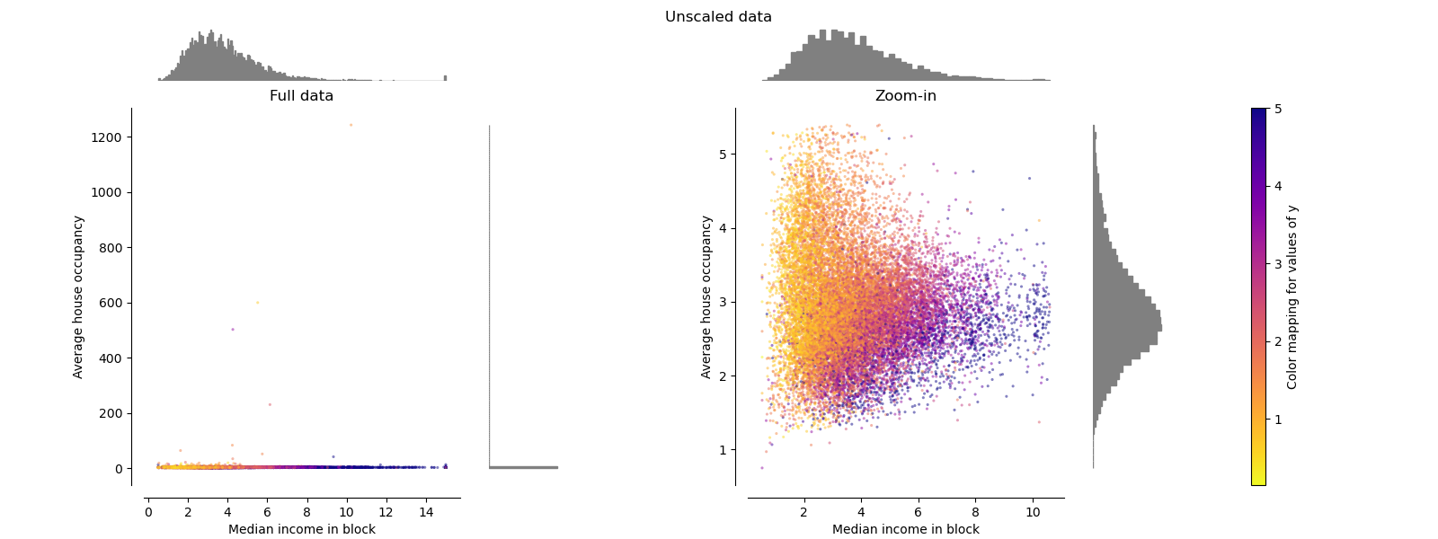
每個縮放器/正規化器/轉換器將顯示兩個圖表。左圖將顯示完整資料集的散佈圖,而右圖將排除極端值,僅考慮資料集的 99%,不包括邊際離群值。此外,每個特徵的邊際分佈將顯示在散佈圖的兩側。
def make_plot(item_idx):
    title, X = distributions[item_idx]
    ax_zoom_out, ax_zoom_in, ax_colorbar = create_axes(title)
    axarr = (ax_zoom_out, ax_zoom_in)
    plot_distribution(
        axarr[0],
        X,
        y,
        hist_nbins=200,
        x0_label=feature_mapping[features[0]],
        x1_label=feature_mapping[features[1]],
        title="Full data",
    )

    # zoom-in
    zoom_in_percentile_range = (0, 99)
    cutoffs_X0 = np.percentile(X[:, 0], zoom_in_percentile_range)
    cutoffs_X1 = np.percentile(X[:, 1], zoom_in_percentile_range)

    non_outliers_mask = np.all(X > [cutoffs_X0[0], cutoffs_X1[0]], axis=1) & np.all(
        X < [cutoffs_X0[1], cutoffs_X1[1]], axis=1
    )
    plot_distribution(
        axarr[1],
        X[non_outliers_mask],
        y[non_outliers_mask],
        hist_nbins=50,
        x0_label=feature_mapping[features[0]],
        x1_label=feature_mapping[features[1]],
        title="Zoom-in",
    )

    norm = mpl.colors.Normalize(y_full.min(), y_full.max())
    mpl.colorbar.ColorbarBase(
        ax_colorbar,
        cmap=cmap,
        norm=norm,
        orientation="vertical",
        label="Color mapping for values of y",
    )
原始資料#
每個轉換都會繪製兩個轉換後的特徵,左圖顯示整個資料集,而右圖則放大顯示沒有邊際離群值的資料集。大多數樣本會壓縮到特定的範圍,收入中位數為 [0, 10],平均房屋入住率為 [0, 6]。請注意,有一些邊際離群值(有些區塊的平均入住率超過 1200)。因此,根據應用程式的不同,特定的預處理可能非常有益。在下文中,我們將介紹這些預處理方法在存在邊際離群值時的一些見解和行為。
make_plot(0)
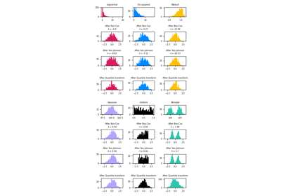
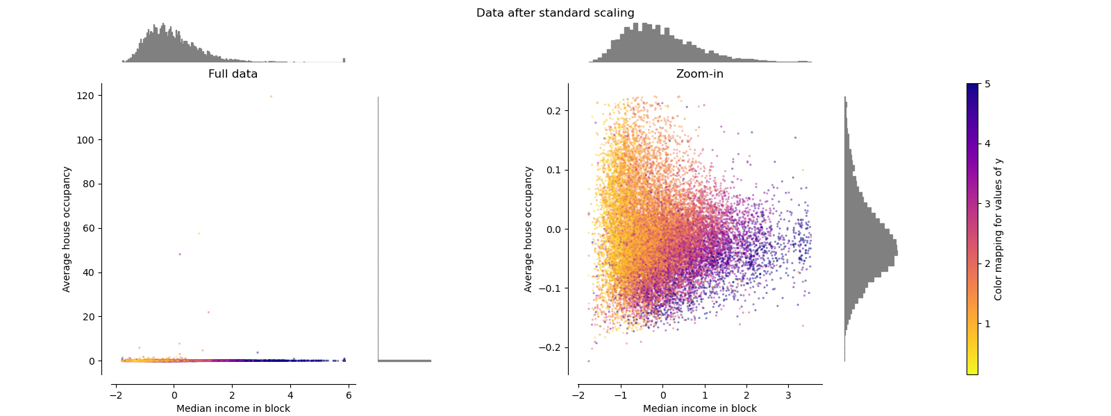
StandardScaler#
StandardScaler會移除平均值並將資料縮放到單位變異數。如下圖左側所示,縮放會縮小特徵值的範圍。但是,在計算經驗平均值和標準差時,離群值會產生影響。特別要注意的是,由於每個特徵上的離群值具有不同的幅度,因此每個特徵上轉換後資料的散佈非常不同:對於轉換後的收入中位數特徵,大多數資料位於 [-2, 4] 範圍內,而對於轉換後的平均房屋入住率,相同的資料則擠壓在較小的 [-0.2, 0.2] 範圍內。
因此,在存在離群值的情況下,StandardScaler無法保證平衡的特徵縮放。
make_plot(1)
MinMaxScaler#
如下圖右側所示,MinMaxScaler會重新縮放資料集,使所有特徵值都在 [0, 1] 範圍內。但是,這種縮放會將所有內群值壓縮到轉換後平均房屋入住率的狹窄範圍 [0, 0.005] 內。
StandardScaler和MinMaxScaler都對離群值的存在非常敏感。
make_plot(2)

MaxAbsScaler#
MaxAbsScaler與MinMaxScaler類似,不同之處在於值的對應範圍取決於是否存在負值或正值。如果僅存在正值,則範圍為 [0, 1]。如果僅存在負值,則範圍為 [-1, 0]。如果同時存在負值和正值,則範圍為 [-1, 1]。在僅限正值的資料上,MinMaxScaler和MaxAbsScaler的行為類似。因此,MaxAbsScaler也受到大型離群值的影響。
make_plot(3)

RobustScaler#
與先前的縮放器不同,RobustScaler 的中心化和縮放統計數據基於百分位數,因此不受少數極端邊緣離群值的影響。 因此,轉換後特徵值的範圍比先前的縮放器更大,更重要的是,它們大致相似:如放大圖所示,對於兩個特徵,大多數轉換後的值都落在 [-2, 3] 範圍內。 請注意,離群值本身仍然存在於轉換後的數據中。 如果需要單獨的離群值剪裁,則需要非線性轉換(見下文)。
make_plot(4)

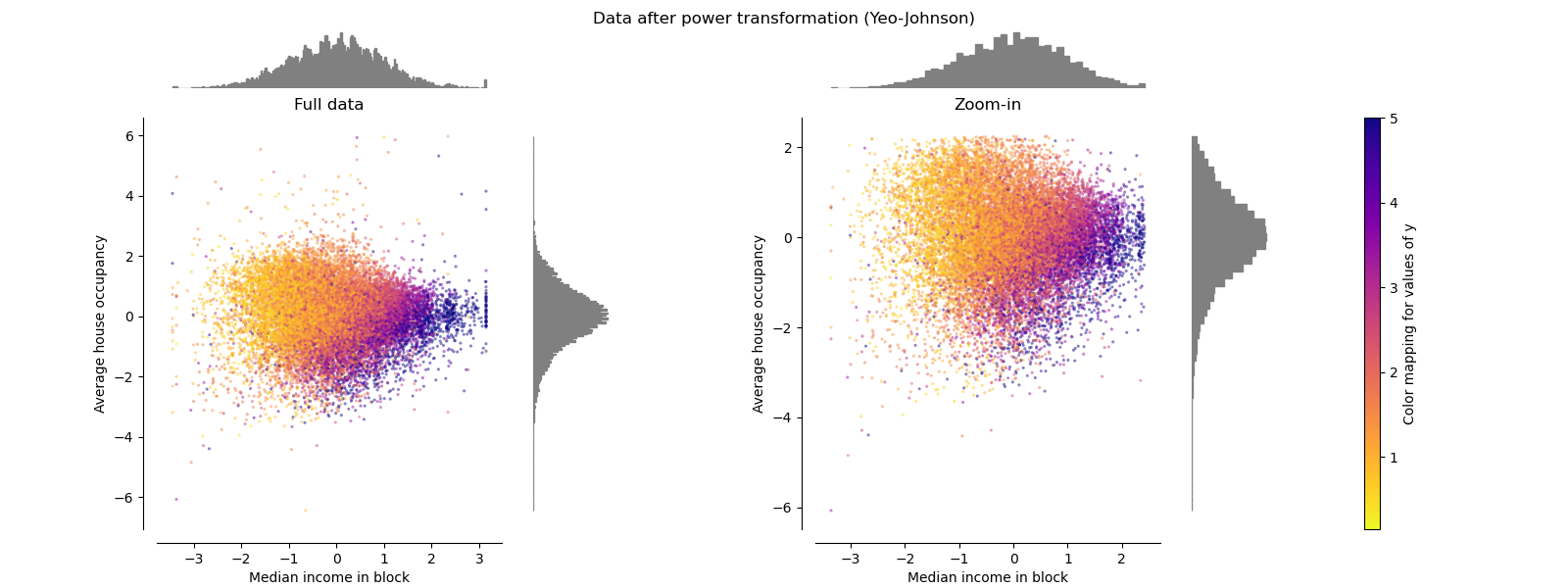
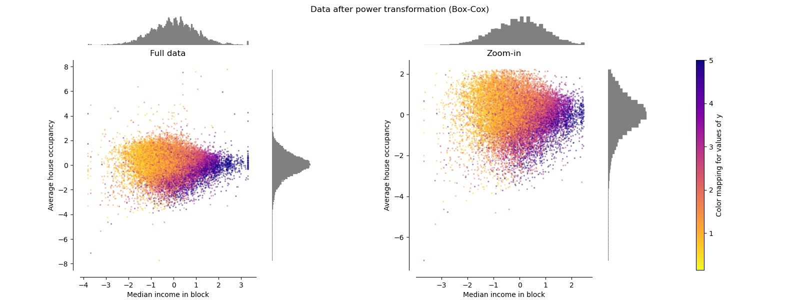
PowerTransformer#
PowerTransformer 對每個特徵應用冪轉換,使數據更接近高斯分佈,以穩定變異數並最小化偏度。 目前支援 Yeo-Johnson 和 Box-Cox 轉換,並且兩種方法中的最佳縮放因子都是透過最大似然估計確定的。 預設情況下,PowerTransformer 應用零均值、單位變異數標準化。 請注意,Box-Cox 只能應用於嚴格正數的數據。 收入和平均房屋入住率恰好是嚴格正數,但如果存在負值,則首選 Yeo-Johnson 轉換。
make_plot(5)
make_plot(6)
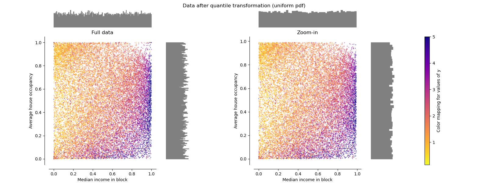
QuantileTransformer (均勻輸出)#
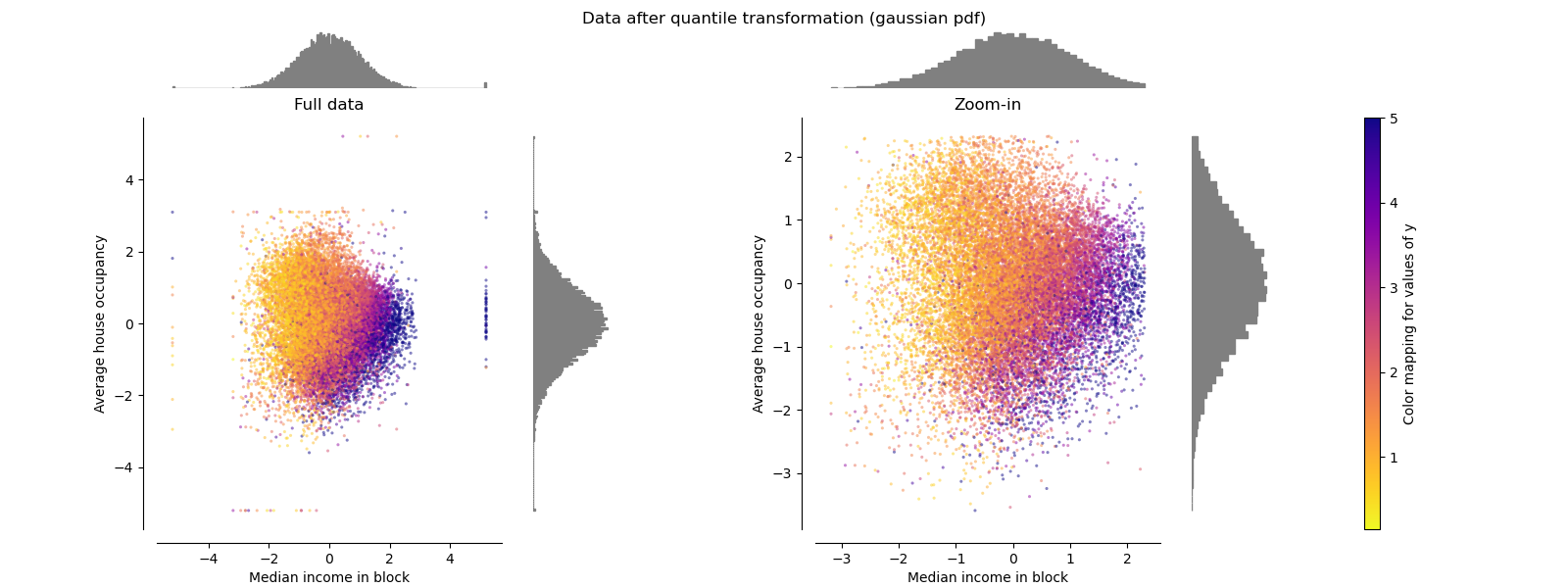
QuantileTransformer 應用非線性轉換,使每個特徵的機率密度函數映射到均勻或高斯分佈。 在這種情況下,所有數據(包括離群值)都將被映射到範圍為 [0, 1] 的均勻分佈,使離群值與正常值難以區分。
RobustScaler 和 QuantileTransformer 在某種意義上對離群值具有魯棒性,即在訓練集中添加或刪除離群值將產生大致相同的轉換。 但與 RobustScaler 相反,QuantileTransformer 還會自動透過將任何離群值設定為預先定義的範圍邊界 (0 和 1) 來壓縮它們。 這可能會導致極端值的飽和假影。
make_plot(7)
QuantileTransformer (高斯輸出)#
若要映射到高斯分佈,請設定參數 output_distribution='normal'。
make_plot(8)
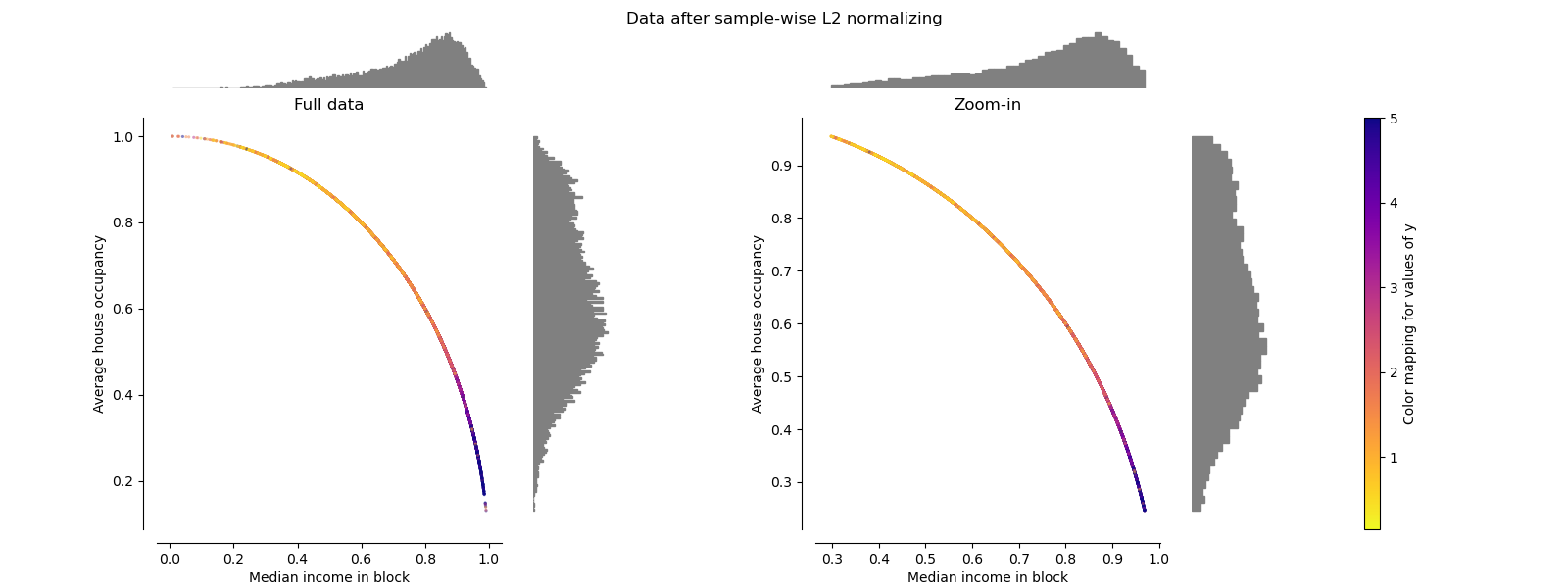
Normalizer#
Normalizer 會重新縮放每個樣本的向量,使其具有單位範數,而與樣本的分佈無關。 從下面的兩張圖中可以看到,所有樣本都被映射到單位圓上。 在我們的範例中,兩個選定的特徵只有正值; 因此,轉換後的數據僅位於正象限中。 如果某些原始特徵混合了正值和負值,情況就不是這樣了。
make_plot(9)

plt.show()
腳本總執行時間: (0 分鐘 8.660 秒)
相關範例