注意
前往結尾以下載完整的範例程式碼。或透過 JupyterLite 或 Binder 在您的瀏覽器中執行此範例
分位數迴歸#
此範例說明分位數迴歸如何預測非平凡的條件分位數。
左圖顯示誤差分佈為常態,但具有非恆定變異數,即具有異方差性的情況。
右圖顯示不對稱誤差分佈的範例,即帕雷托分佈。
# Authors: The scikit-learn developers
# SPDX-License-Identifier: BSD-3-Clause
資料集生成#
為了說明分位數迴歸的行為,我們將生成兩個合成資料集。兩個資料集的真實生成隨機過程將由相同的期望值組成,與單個特徵 x 具有線性關係。
import numpy as np

rng = np.random.RandomState(42)
x = np.linspace(start=0, stop=10, num=100)
X = x[:, np.newaxis]
y_true_mean = 10 + 0.5 * x
我們將透過改變目標 y 的分佈來建立兩個後續問題,同時保持相同的期望值
在第一種情況下,會加入異方差常態雜訊;
在第二種情況下,會加入不對稱的帕雷托雜訊。
y_normal = y_true_mean + rng.normal(loc=0, scale=0.5 + 0.5 * x, size=x.shape[0])
a = 5
y_pareto = y_true_mean + 10 * (rng.pareto(a, size=x.shape[0]) - 1 / (a - 1))
讓我們首先視覺化資料集以及殘差 y - mean(y) 的分佈。
import matplotlib.pyplot as plt

_, axs = plt.subplots(nrows=2, ncols=2, figsize=(15, 11), sharex="row", sharey="row")

axs[0, 0].plot(x, y_true_mean, label="True mean")
axs[0, 0].scatter(x, y_normal, color="black", alpha=0.5, label="Observations")
axs[1, 0].hist(y_true_mean - y_normal, edgecolor="black")


axs[0, 1].plot(x, y_true_mean, label="True mean")
axs[0, 1].scatter(x, y_pareto, color="black", alpha=0.5, label="Observations")
axs[1, 1].hist(y_true_mean - y_pareto, edgecolor="black")

axs[0, 0].set_title("Dataset with heteroscedastic Normal distributed targets")
axs[0, 1].set_title("Dataset with asymmetric Pareto distributed target")
axs[1, 0].set_title(
    "Residuals distribution for heteroscedastic Normal distributed targets"
)
axs[1, 1].set_title("Residuals distribution for asymmetric Pareto distributed target")
axs[0, 0].legend()
axs[0, 1].legend()
axs[0, 0].set_ylabel("y")
axs[1, 0].set_ylabel("Counts")
axs[0, 1].set_xlabel("x")
axs[0, 0].set_xlabel("x")
axs[1, 0].set_xlabel("Residuals")
_ = axs[1, 1].set_xlabel("Residuals")
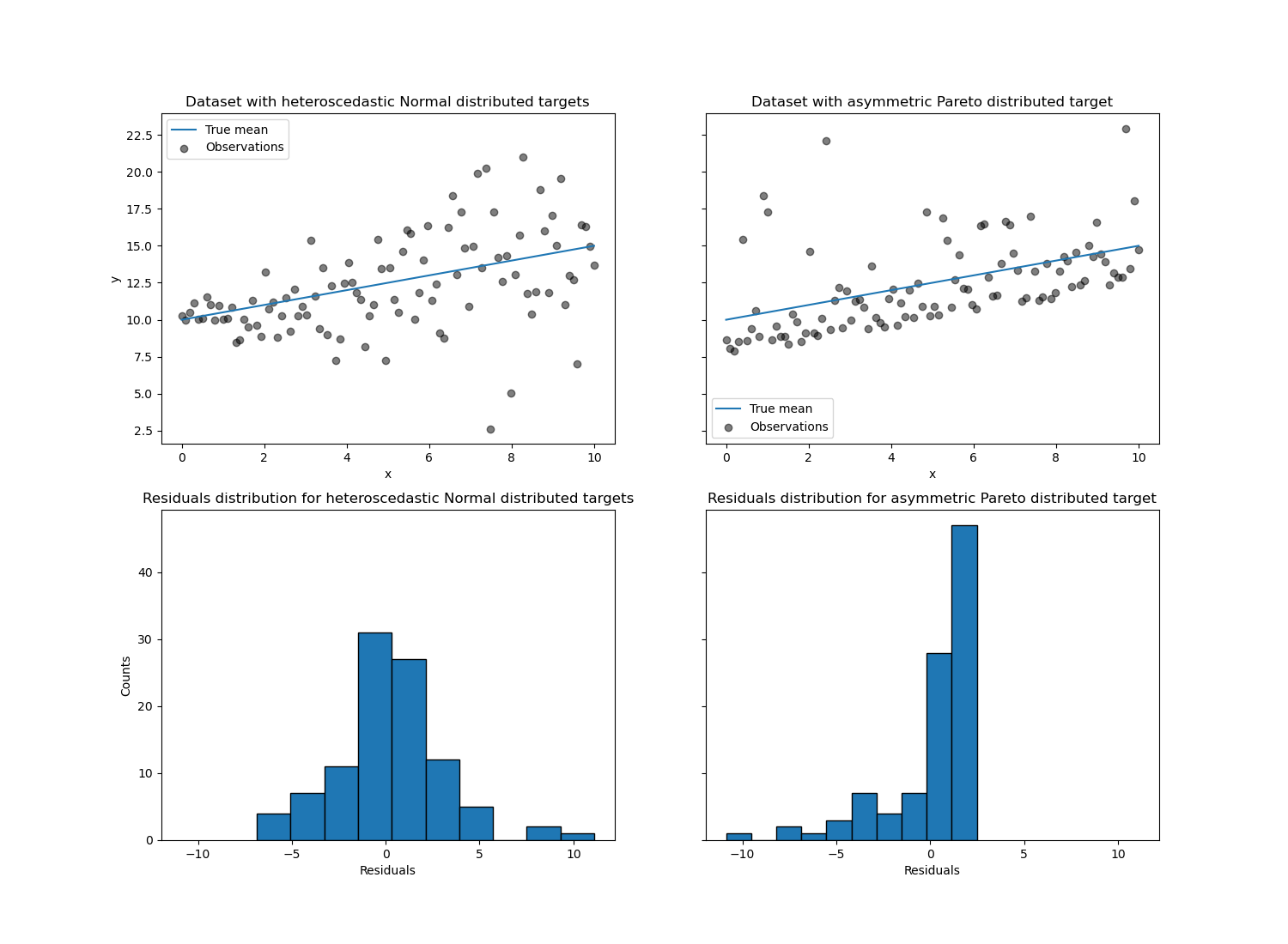
對於異方差常態分佈的目標,我們觀察到雜訊的變異數隨著特徵 x 的值增加而增加。
對於不對稱帕雷托分佈的目標,我們觀察到正殘差是有界的。
這些類型的嘈雜目標使得透過 LinearRegression 進行估計效率較低,也就是說,我們需要更多資料才能獲得穩定的結果,此外,大型離群值可能對擬合係數產生巨大影響。(換句話說:在具有恆定變異數的設定中,普通最小平方法估計量隨著樣本大小的增加,收斂到*真實*係數的速度快得多。)
在這種不對稱設定中,中位數或不同的分位數提供了額外的見解。最重要的是,中位數估計對於離群值和重尾分佈更穩健。但請注意,極端分位數是由極少數的資料點估計的。95% 分位數或多或少是由 5% 的最大值估計的,因此也對離群值有點敏感。
在本教學的其餘部分中,我們將展示如何在實務中使用 QuantileRegressor,並深入了解擬合模型的屬性。最後,我們將比較 QuantileRegressor 和 LinearRegression。
擬合 QuantileRegressor#
在本節中,我們想要估計條件中位數以及分別固定在 5% 和 95% 的低分位數和高分位數。因此,我們將獲得三個線性模型,每個分位數一個。
我們將使用 5% 和 95% 的分位數來找出訓練樣本中超出中心 90% 區間的離群值。
from sklearn.linear_model import QuantileRegressor

quantiles = [0.05, 0.5, 0.95]
predictions = {}
out_bounds_predictions = np.zeros_like(y_true_mean, dtype=np.bool_)
for quantile in quantiles:
    qr = QuantileRegressor(quantile=quantile, alpha=0)
    y_pred = qr.fit(X, y_normal).predict(X)
    predictions[quantile] = y_pred

    if quantile == min(quantiles):
        out_bounds_predictions = np.logical_or(
            out_bounds_predictions, y_pred >= y_normal
        )
    elif quantile == max(quantiles):
        out_bounds_predictions = np.logical_or(
            out_bounds_predictions, y_pred <= y_normal
        )
現在,我們可以繪製三個線性模型,並區分中心 90% 區間內的樣本和該區間外的樣本。
plt.plot(X, y_true_mean, color="black", linestyle="dashed", label="True mean")

for quantile, y_pred in predictions.items():
    plt.plot(X, y_pred, label=f"Quantile: {quantile}")

plt.scatter(
    x[out_bounds_predictions],
    y_normal[out_bounds_predictions],
    color="black",
    marker="+",
    alpha=0.5,
    label="Outside interval",
)
plt.scatter(
    x[~out_bounds_predictions],
    y_normal[~out_bounds_predictions],
    color="black",
    alpha=0.5,
    label="Inside interval",
)

plt.legend()
plt.xlabel("x")
plt.ylabel("y")
_ = plt.title("Quantiles of heteroscedastic Normal distributed target")
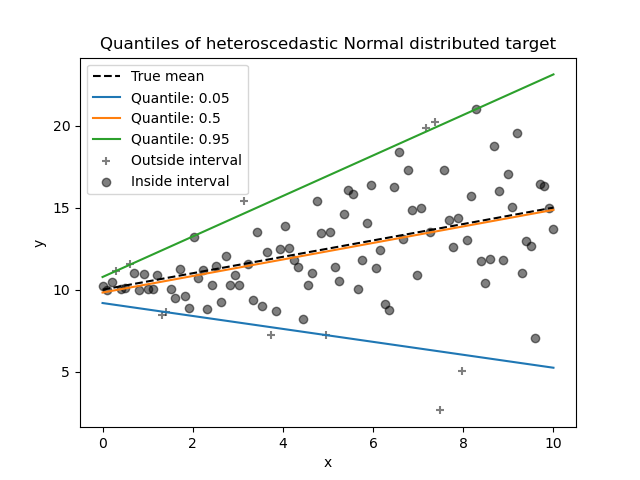
由於雜訊仍然是常態分佈的,特別是對稱,因此真實條件平均值和真實條件中位數重合。實際上,我們看到估計的中位數幾乎與真實平均值重合。我們觀察到雜訊變異數增加對 5% 和 95% 分位數的影響:這些分位數的斜率非常不同,並且它們之間的間隔隨著 x 的增加而變寬。
為了進一步了解 5% 和 95% 分位數估計量的意義,可以計算預測分位數之上和之下的樣本數(以以上圖表上的十字表示),考慮到我們總共有 100 個樣本。
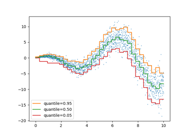
我們可以使用不對稱的帕雷托分佈目標重複相同的實驗。
quantiles = [0.05, 0.5, 0.95]
predictions = {}
out_bounds_predictions = np.zeros_like(y_true_mean, dtype=np.bool_)
for quantile in quantiles:
    qr = QuantileRegressor(quantile=quantile, alpha=0)
    y_pred = qr.fit(X, y_pareto).predict(X)
    predictions[quantile] = y_pred

    if quantile == min(quantiles):
        out_bounds_predictions = np.logical_or(
            out_bounds_predictions, y_pred >= y_pareto
        )
    elif quantile == max(quantiles):
        out_bounds_predictions = np.logical_or(
            out_bounds_predictions, y_pred <= y_pareto
        )
plt.plot(X, y_true_mean, color="black", linestyle="dashed", label="True mean")

for quantile, y_pred in predictions.items():
    plt.plot(X, y_pred, label=f"Quantile: {quantile}")

plt.scatter(
    x[out_bounds_predictions],
    y_pareto[out_bounds_predictions],
    color="black",
    marker="+",
    alpha=0.5,
    label="Outside interval",
)
plt.scatter(
    x[~out_bounds_predictions],
    y_pareto[~out_bounds_predictions],
    color="black",
    alpha=0.5,
    label="Inside interval",
)

plt.legend()
plt.xlabel("x")
plt.ylabel("y")
_ = plt.title("Quantiles of asymmetric Pareto distributed target")
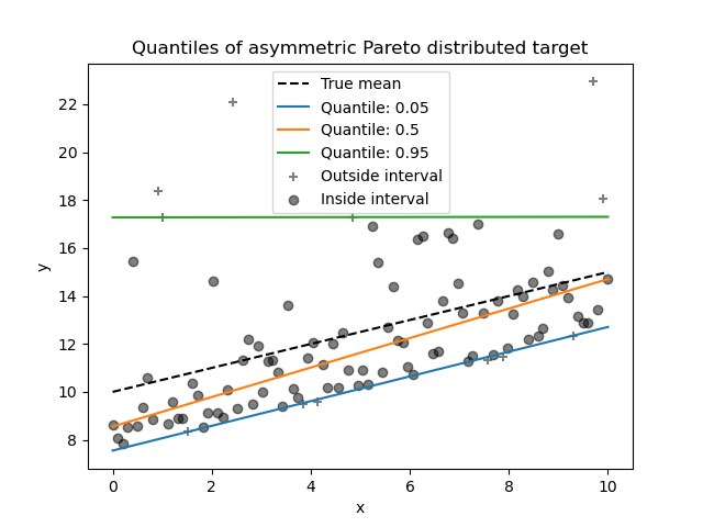
由於雜訊分佈的不對稱性,我們觀察到真實平均值和估計的條件中位數不同。我們也觀察到每個分位數模型都有不同的參數,以便更好地擬合所需的分位數。請注意,理想情況下,所有分位數在這種情況下都是平行的,這在更多資料點或較不極端的分位數(例如 10% 和 90%)的情況下會變得更明顯。
比較 QuantileRegressor 和 LinearRegression#
在本節中,我們將詳細說明 QuantileRegressor 和 LinearRegression 最小化誤差的差異。
實際上,LinearRegression 是一種最小平方法方法,可最小化訓練目標和預測目標之間的均方誤差 (MSE)。相反,QuantileRegressor,其中 quantile=0.5 反而會最小化平均絕對誤差 (MAE)。
讓我們先計算此類模型在均方誤差和平均絕對誤差方面的訓練誤差。我們將使用不對稱的帕雷托分佈目標,使其更有趣,因為平均值和中位數不相等。
from sklearn.linear_model import LinearRegression
from sklearn.metrics import mean_absolute_error, mean_squared_error

linear_regression = LinearRegression()
quantile_regression = QuantileRegressor(quantile=0.5, alpha=0)

y_pred_lr = linear_regression.fit(X, y_pareto).predict(X)
y_pred_qr = quantile_regression.fit(X, y_pareto).predict(X)

print(
    f"""Training error (in-sample performance)
    {linear_regression.__class__.__name__}:
    MAE = {mean_absolute_error(y_pareto, y_pred_lr):.3f}
    MSE = {mean_squared_error(y_pareto, y_pred_lr):.3f}
    {quantile_regression.__class__.__name__}:
    MAE = {mean_absolute_error(y_pareto, y_pred_qr):.3f}
    MSE = {mean_squared_error(y_pareto, y_pred_qr):.3f}
    """
)
Training error (in-sample performance)
    LinearRegression:
    MAE = 1.805
    MSE = 6.486
    QuantileRegressor:
    MAE = 1.670
    MSE = 7.025
在訓練集上,我們看到 QuantileRegressor 的 MAE 低於 LinearRegression。與此相反,LinearRegression 的 MSE 低於 QuantileRegressor。這些結果證實了 MAE 是 QuantileRegressor 最小化的損失函數,而 MSE 是 LinearRegression 最小化的損失函數。
我們可以通過查看交叉驗證獲得的測試誤差來進行類似的評估。
from sklearn.model_selection import cross_validate

cv_results_lr = cross_validate(
    linear_regression,
    X,
    y_pareto,
    cv=3,
    scoring=["neg_mean_absolute_error", "neg_mean_squared_error"],
)
cv_results_qr = cross_validate(
    quantile_regression,
    X,
    y_pareto,
    cv=3,
    scoring=["neg_mean_absolute_error", "neg_mean_squared_error"],
)
print(
    f"""Test error (cross-validated performance)
    {linear_regression.__class__.__name__}:
    MAE = {-cv_results_lr["test_neg_mean_absolute_error"].mean():.3f}
    MSE = {-cv_results_lr["test_neg_mean_squared_error"].mean():.3f}
    {quantile_regression.__class__.__name__}:
    MAE = {-cv_results_qr["test_neg_mean_absolute_error"].mean():.3f}
    MSE = {-cv_results_qr["test_neg_mean_squared_error"].mean():.3f}
    """
)
Test error (cross-validated performance)
    LinearRegression:
    MAE = 1.732
    MSE = 6.690
    QuantileRegressor:
    MAE = 1.679
    MSE = 7.129
我們在樣本外評估中得出類似的結論。
腳本總運行時間: (0 分鐘 0.588 秒)
相關範例