注意
前往結尾以下載完整範例程式碼。或透過 JupyterLite 或 Binder 在您的瀏覽器中執行此範例
在 scikit-learn 中視覺化交叉驗證的行為#
選擇正確的交叉驗證物件是正確擬合模型的關鍵部分。有很多方法可以將資料分割為訓練集和測試集,以避免模型過擬合,標準化測試集中的群組數量等等。
此範例視覺化幾個常見的 scikit-learn 物件的行為以進行比較。
# Authors: The scikit-learn developers
# SPDX-License-Identifier: BSD-3-Clause

import matplotlib.pyplot as plt
import numpy as np
from matplotlib.patches import Patch

from sklearn.model_selection import (
    GroupKFold,
    GroupShuffleSplit,
    KFold,
    ShuffleSplit,
    StratifiedGroupKFold,
    StratifiedKFold,
    StratifiedShuffleSplit,
    TimeSeriesSplit,
)

rng = np.random.RandomState(1338)
cmap_data = plt.cm.Paired
cmap_cv = plt.cm.coolwarm
n_splits = 4
視覺化我們的資料#
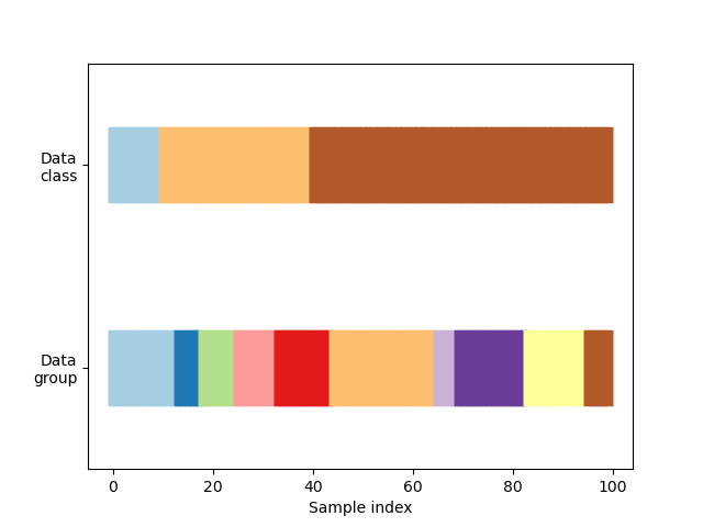
首先,我們必須了解我們資料的結構。它有 100 個隨機產生的輸入資料點、在資料點中不均勻分割的 3 個類別,以及在資料點中均勻分割的 10 個「群組」。
正如我們將看到的,一些交叉驗證物件會對標記資料執行特定操作,另一些會對分組資料有不同的行為,而另一些則不使用此資訊。
首先,我們將視覺化我們的資料。
# Generate the class/group data
n_points = 100
X = rng.randn(100, 10)

percentiles_classes = [0.1, 0.3, 0.6]
y = np.hstack([[ii] * int(100 * perc) for ii, perc in enumerate(percentiles_classes)])

# Generate uneven groups
group_prior = rng.dirichlet([2] * 10)
groups = np.repeat(np.arange(10), rng.multinomial(100, group_prior))


def visualize_groups(classes, groups, name):
    # Visualize dataset groups
    fig, ax = plt.subplots()
    ax.scatter(
        range(len(groups)),
        [0.5] * len(groups),
        c=groups,
        marker="_",
        lw=50,
        cmap=cmap_data,
    )
    ax.scatter(
        range(len(groups)),
        [3.5] * len(groups),
        c=classes,
        marker="_",
        lw=50,
        cmap=cmap_data,
    )
    ax.set(
        ylim=[-1, 5],
        yticks=[0.5, 3.5],
        yticklabels=["Data\ngroup", "Data\nclass"],
        xlabel="Sample index",
    )


visualize_groups(y, groups, "no groups")
定義一個視覺化交叉驗證行為的函數#
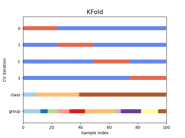
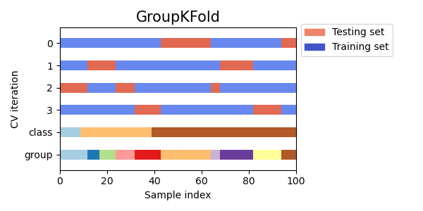
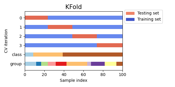
我們將定義一個函數,讓我們可以視覺化每個交叉驗證物件的行為。我們將執行 4 個資料分割。在每次分割時,我們將視覺化為訓練集選擇的索引(以藍色顯示)和測試集(以紅色顯示)。
def plot_cv_indices(cv, X, y, group, ax, n_splits, lw=10):
    """Create a sample plot for indices of a cross-validation object."""
    use_groups = "Group" in type(cv).__name__
    groups = group if use_groups else None
    # Generate the training/testing visualizations for each CV split
    for ii, (tr, tt) in enumerate(cv.split(X=X, y=y, groups=groups)):
        # Fill in indices with the training/test groups
        indices = np.array([np.nan] * len(X))
        indices[tt] = 1
        indices[tr] = 0

        # Visualize the results
        ax.scatter(
            range(len(indices)),
            [ii + 0.5] * len(indices),
            c=indices,
            marker="_",
            lw=lw,
            cmap=cmap_cv,
            vmin=-0.2,
            vmax=1.2,
        )

    # Plot the data classes and groups at the end
    ax.scatter(
        range(len(X)), [ii + 1.5] * len(X), c=y, marker="_", lw=lw, cmap=cmap_data
    )

    ax.scatter(
        range(len(X)), [ii + 2.5] * len(X), c=group, marker="_", lw=lw, cmap=cmap_data
    )

    # Formatting
    yticklabels = list(range(n_splits)) + ["class", "group"]
    ax.set(
        yticks=np.arange(n_splits + 2) + 0.5,
        yticklabels=yticklabels,
        xlabel="Sample index",
        ylabel="CV iteration",
        ylim=[n_splits + 2.2, -0.2],
        xlim=[0, 100],
    )
    ax.set_title("{}".format(type(cv).__name__), fontsize=15)
    return ax
讓我們看看它對於 KFold 交叉驗證物件看起來如何
fig, ax = plt.subplots()
cv = KFold(n_splits)
plot_cv_indices(cv, X, y, groups, ax, n_splits)
<Axes: title={'center': 'KFold'}, xlabel='Sample index', ylabel='CV iteration'>
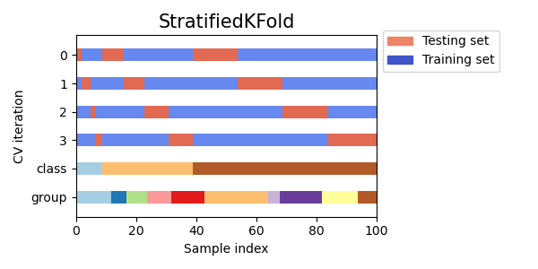
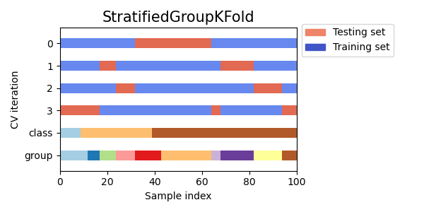
如您所見,預設情況下,KFold 交叉驗證迭代器不會考慮資料點類別或群組。我們可以透過使用以下任一項來變更此設定:
StratifiedKFold以保留每個類別的樣本百分比。GroupKFold以確保同一群組不會出現在兩個不同的摺疊中。StratifiedGroupKFold以保持GroupKFold的限制,同時嘗試傳回分層摺疊。
cvs = [StratifiedKFold, GroupKFold, StratifiedGroupKFold]

for cv in cvs:
    fig, ax = plt.subplots(figsize=(6, 3))
    plot_cv_indices(cv(n_splits), X, y, groups, ax, n_splits)
    ax.legend(
        [Patch(color=cmap_cv(0.8)), Patch(color=cmap_cv(0.02))],
        ["Testing set", "Training set"],
        loc=(1.02, 0.8),
    )
    # Make the legend fit
    plt.tight_layout()
    fig.subplots_adjust(right=0.7)


接下來,我們將視覺化多個 CV 迭代器的此行為。
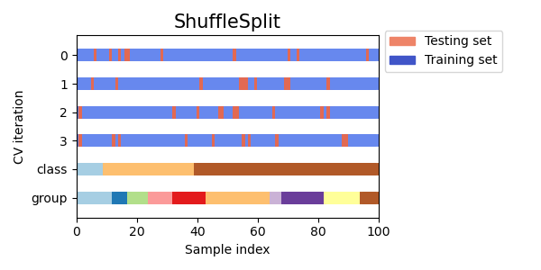
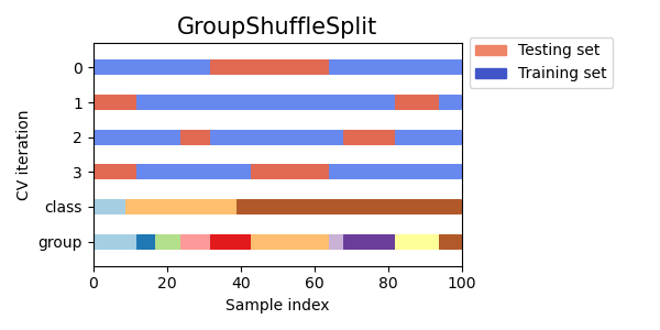
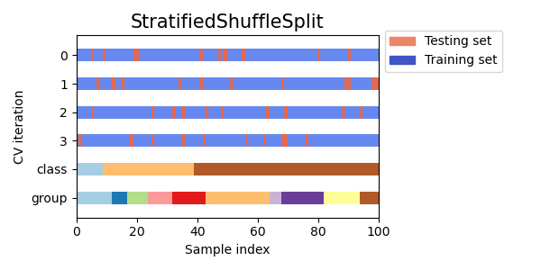
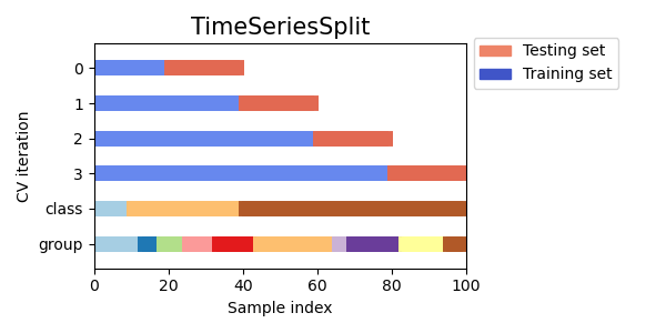
視覺化多個 CV 物件的交叉驗證索引#
讓我們視覺化比較多個 scikit-learn 交叉驗證物件的交叉驗證行為。下面我們將循環遍歷幾個常見的交叉驗證物件,視覺化每個物件的行為。
請注意,有些會使用群組/類別資訊,而有些則不會。
cvs = [
    KFold,
    GroupKFold,
    ShuffleSplit,
    StratifiedKFold,
    StratifiedGroupKFold,
    GroupShuffleSplit,
    StratifiedShuffleSplit,
    TimeSeriesSplit,
]


for cv in cvs:
    this_cv = cv(n_splits=n_splits)
    fig, ax = plt.subplots(figsize=(6, 3))
    plot_cv_indices(this_cv, X, y, groups, ax, n_splits)

    ax.legend(
        [Patch(color=cmap_cv(0.8)), Patch(color=cmap_cv(0.02))],
        ["Testing set", "Training set"],
        loc=(1.02, 0.8),
    )
    # Make the legend fit
    plt.tight_layout()
    fig.subplots_adjust(right=0.7)
plt.show()

腳本的總執行時間: (0 分鐘 1.333 秒)
相關範例