注意
跳至結尾下載完整範例程式碼。或者透過 JupyterLite 或 Binder 在您的瀏覽器中執行此範例
使用不同指標的凝聚式分群#
示範不同指標對階層式分群的影響。
此範例經過設計,旨在顯示不同指標選擇的影響。它應用於波形,波形可以被視為高維向量。事實上,指標之間的差異通常在高維度中更為明顯(特別是對於歐幾里得和城市街區)。
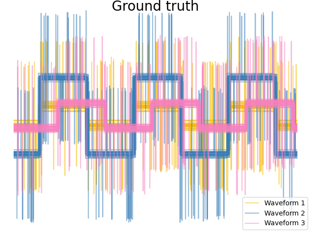
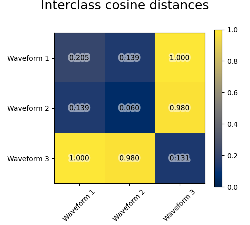
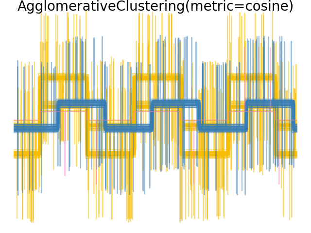
我們從三組波形產生資料。其中兩個波形(波形 1 和波形 2)彼此成比例。餘弦距離對於資料的縮放是不變的,因此無法區分這兩個波形。因此,即使沒有雜訊,使用此距離進行分群也無法分離波形 1 和 2。
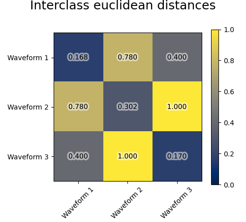
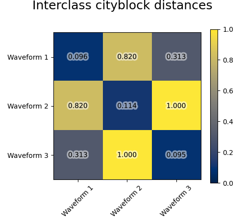
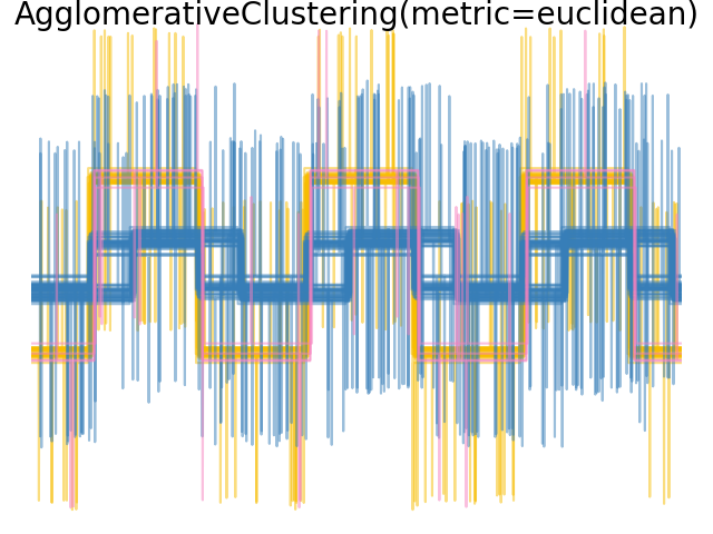
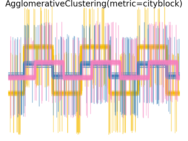
我們將觀測雜訊新增到這些波形。我們產生非常稀疏的雜訊:只有 6% 的時間點包含雜訊。因此,此雜訊的 l1 範數(即「城市街區」距離)遠小於其 l2 範數(「歐幾里得」距離)。這可以在類別間距離矩陣上看到:對角線上的值,表示類別的分散程度,對於歐幾里得距離遠大於城市街區距離。
當我們將分群應用於資料時,我們發現分群反映了距離矩陣中的內容。事實上,對於歐幾里得距離,由於雜訊的影響,類別間分離不良,因此分群無法分離波形。對於城市街區距離,分離效果良好,並且恢復了波形類別。最後,餘弦距離根本無法分離波形 1 和 2,因此分群將它們放在同一個群集中。
# Authors: The scikit-learn developers
# SPDX-License-Identifier: BSD-3-Clause

import matplotlib.patheffects as PathEffects
import matplotlib.pyplot as plt
import numpy as np

from sklearn.cluster import AgglomerativeClustering
from sklearn.metrics import pairwise_distances

np.random.seed(0)

# Generate waveform data
n_features = 2000
t = np.pi * np.linspace(0, 1, n_features)


def sqr(x):
    return np.sign(np.cos(x))


X = list()
y = list()
for i, (phi, a) in enumerate([(0.5, 0.15), (0.5, 0.6), (0.3, 0.2)]):
    for _ in range(30):
        phase_noise = 0.01 * np.random.normal()
        amplitude_noise = 0.04 * np.random.normal()
        additional_noise = 1 - 2 * np.random.rand(n_features)
        # Make the noise sparse
        additional_noise[np.abs(additional_noise) < 0.997] = 0

        X.append(
            12
            * (
                (a + amplitude_noise) * (sqr(6 * (t + phi + phase_noise)))
                + additional_noise
            )
        )
        y.append(i)

X = np.array(X)
y = np.array(y)

n_clusters = 3

labels = ("Waveform 1", "Waveform 2", "Waveform 3")

colors = ["#f7bd01", "#377eb8", "#f781bf"]

# Plot the ground-truth labelling
plt.figure()
plt.axes([0, 0, 1, 1])
for l, color, n in zip(range(n_clusters), colors, labels):
    lines = plt.plot(X[y == l].T, c=color, alpha=0.5)
    lines[0].set_label(n)

plt.legend(loc="best")

plt.axis("tight")
plt.axis("off")
plt.suptitle("Ground truth", size=20, y=1)


# Plot the distances
for index, metric in enumerate(["cosine", "euclidean", "cityblock"]):
    avg_dist = np.zeros((n_clusters, n_clusters))
    plt.figure(figsize=(5, 4.5))
    for i in range(n_clusters):
        for j in range(n_clusters):
            avg_dist[i, j] = pairwise_distances(
                X[y == i], X[y == j], metric=metric
            ).mean()
    avg_dist /= avg_dist.max()
    for i in range(n_clusters):
        for j in range(n_clusters):
            t = plt.text(
                i,
                j,
                "%5.3f" % avg_dist[i, j],
                verticalalignment="center",
                horizontalalignment="center",
            )
            t.set_path_effects(
                [PathEffects.withStroke(linewidth=5, foreground="w", alpha=0.5)]
            )

    plt.imshow(avg_dist, interpolation="nearest", cmap="cividis", vmin=0)
    plt.xticks(range(n_clusters), labels, rotation=45)
    plt.yticks(range(n_clusters), labels)
    plt.colorbar()
    plt.suptitle("Interclass %s distances" % metric, size=18, y=1)
    plt.tight_layout()


# Plot clustering results
for index, metric in enumerate(["cosine", "euclidean", "cityblock"]):
    model = AgglomerativeClustering(
        n_clusters=n_clusters, linkage="average", metric=metric
    )
    model.fit(X)
    plt.figure()
    plt.axes([0, 0, 1, 1])
    for l, color in zip(np.arange(model.n_clusters), colors):
        plt.plot(X[model.labels_ == l].T, c=color, alpha=0.5)
    plt.axis("tight")
    plt.axis("off")
    plt.suptitle("AgglomerativeClustering(metric=%s)" % metric, size=20, y=1)


plt.show()
腳本的總執行時間: (0 分鐘 1.135 秒)
相關範例