注意
跳至結尾以下載完整範例程式碼。 或透過 JupyterLite 或 Binder 在您的瀏覽器中執行此範例
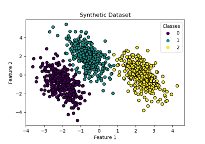
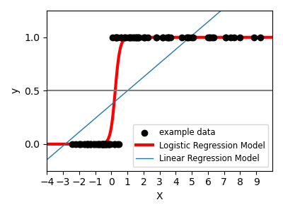
邏輯函數#
圖中顯示了邏輯迴歸如何在合成資料集中,使用邏輯曲線將值分類為 0 或 1,即類別一或二。
# Authors: The scikit-learn developers
# SPDX-License-Identifier: BSD-3-Clause

import matplotlib.pyplot as plt
import numpy as np
from scipy.special import expit

from sklearn.linear_model import LinearRegression, LogisticRegression

# Generate a toy dataset, it's just a straight line with some Gaussian noise:
xmin, xmax = -5, 5
n_samples = 100
np.random.seed(0)
X = np.random.normal(size=n_samples)
y = (X > 0).astype(float)
X[X > 0] *= 4
X += 0.3 * np.random.normal(size=n_samples)

X = X[:, np.newaxis]

# Fit the classifier
clf = LogisticRegression(C=1e5)
clf.fit(X, y)

# and plot the result
plt.figure(1, figsize=(4, 3))
plt.clf()
plt.scatter(X.ravel(), y, label="example data", color="black", zorder=20)
X_test = np.linspace(-5, 10, 300)

loss = expit(X_test * clf.coef_ + clf.intercept_).ravel()
plt.plot(X_test, loss, label="Logistic Regression Model", color="red", linewidth=3)

ols = LinearRegression()
ols.fit(X, y)
plt.plot(
    X_test,
    ols.coef_ * X_test + ols.intercept_,
    label="Linear Regression Model",
    linewidth=1,
)
plt.axhline(0.5, color=".5")

plt.ylabel("y")
plt.xlabel("X")
plt.xticks(range(-5, 10))
plt.yticks([0, 0.5, 1])
plt.ylim(-0.25, 1.25)
plt.xlim(-4, 10)
plt.legend(
    loc="lower right",
    fontsize="small",
)
plt.tight_layout()
plt.show()
腳本的總執行時間: (0 分鐘 0.114 秒)
相關範例