注意
跳到結尾以下載完整的範例程式碼。或者透過 JupyterLite 或 Binder 在您的瀏覽器中執行此範例
3 類別分類的機率校準#
此範例說明 sigmoid 校準如何變更 3 類別分類問題的預測機率。圖示為標準的 2 單體,其中三個角對應三個類別。箭頭從未校準的分類器預測的機率向量指向在保留驗證集上進行 sigmoid 校準後,相同分類器預測的機率向量。顏色表示實例的真實類別(紅色:類別 1,綠色:類別 2,藍色:類別 3)。
資料#
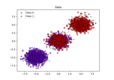
下方,我們產生一個具有 2000 個樣本、2 個特徵和 3 個目標類別的分類資料集。然後,我們將資料分割如下
train:600 個樣本(用於訓練分類器)
valid:400 個樣本(用於校準預測機率)
test:1000 個樣本
請注意,我們也建立 X_train_valid 和 y_train_valid,其中包含 train 和 valid 子集。當我們只想訓練分類器,但不想校準預測機率時,會使用此方法。
# Authors: The scikit-learn developers
# SPDX-License-Identifier: BSD-3-Clause

import numpy as np

from sklearn.datasets import make_blobs

np.random.seed(0)

X, y = make_blobs(
    n_samples=2000, n_features=2, centers=3, random_state=42, cluster_std=5.0
)
X_train, y_train = X[:600], y[:600]
X_valid, y_valid = X[600:1000], y[600:1000]
X_train_valid, y_train_valid = X[:1000], y[:1000]
X_test, y_test = X[1000:], y[1000:]
擬合和校準#
首先,我們將在串聯的訓練和驗證資料(1000 個樣本)上訓練一個具有 25 個基底估計器(樹)的 RandomForestClassifier。這是未校準的分類器。
from sklearn.ensemble import RandomForestClassifier

clf = RandomForestClassifier(n_estimators=25)
clf.fit(X_train_valid, y_train_valid)
為了訓練校準的分類器,我們從相同的 RandomForestClassifier 開始,但僅使用 train 資料子集(600 個樣本)進行訓練,然後使用 valid 資料子集(400 個樣本)以 method='sigmoid' 進行校準,此過程分為兩個階段。
from sklearn.calibration import CalibratedClassifierCV
from sklearn.frozen import FrozenEstimator

clf = RandomForestClassifier(n_estimators=25)
clf.fit(X_train, y_train)
cal_clf = CalibratedClassifierCV(FrozenEstimator(clf), method="sigmoid")
cal_clf.fit(X_valid, y_valid)
比較機率#
下方,我們繪製一個 2 單體,其中箭頭顯示測試樣本的預測機率變化。
import matplotlib.pyplot as plt

plt.figure(figsize=(10, 10))
colors = ["r", "g", "b"]

clf_probs = clf.predict_proba(X_test)
cal_clf_probs = cal_clf.predict_proba(X_test)
# Plot arrows
for i in range(clf_probs.shape[0]):
    plt.arrow(
        clf_probs[i, 0],
        clf_probs[i, 1],
        cal_clf_probs[i, 0] - clf_probs[i, 0],
        cal_clf_probs[i, 1] - clf_probs[i, 1],
        color=colors[y_test[i]],
        head_width=1e-2,
    )

# Plot perfect predictions, at each vertex
plt.plot([1.0], [0.0], "ro", ms=20, label="Class 1")
plt.plot([0.0], [1.0], "go", ms=20, label="Class 2")
plt.plot([0.0], [0.0], "bo", ms=20, label="Class 3")

# Plot boundaries of unit simplex
plt.plot([0.0, 1.0, 0.0, 0.0], [0.0, 0.0, 1.0, 0.0], "k", label="Simplex")

# Annotate points 6 points around the simplex, and mid point inside simplex
plt.annotate(
    r"($\frac{1}{3}$, $\frac{1}{3}$, $\frac{1}{3}$)",
    xy=(1.0 / 3, 1.0 / 3),
    xytext=(1.0 / 3, 0.23),
    xycoords="data",
    arrowprops=dict(facecolor="black", shrink=0.05),
    horizontalalignment="center",
    verticalalignment="center",
)
plt.plot([1.0 / 3], [1.0 / 3], "ko", ms=5)
plt.annotate(
    r"($\frac{1}{2}$, $0$, $\frac{1}{2}$)",
    xy=(0.5, 0.0),
    xytext=(0.5, 0.1),
    xycoords="data",
    arrowprops=dict(facecolor="black", shrink=0.05),
    horizontalalignment="center",
    verticalalignment="center",
)
plt.annotate(
    r"($0$, $\frac{1}{2}$, $\frac{1}{2}$)",
    xy=(0.0, 0.5),
    xytext=(0.1, 0.5),
    xycoords="data",
    arrowprops=dict(facecolor="black", shrink=0.05),
    horizontalalignment="center",
    verticalalignment="center",
)
plt.annotate(
    r"($\frac{1}{2}$, $\frac{1}{2}$, $0$)",
    xy=(0.5, 0.5),
    xytext=(0.6, 0.6),
    xycoords="data",
    arrowprops=dict(facecolor="black", shrink=0.05),
    horizontalalignment="center",
    verticalalignment="center",
)
plt.annotate(
    r"($0$, $0$, $1$)",
    xy=(0, 0),
    xytext=(0.1, 0.1),
    xycoords="data",
    arrowprops=dict(facecolor="black", shrink=0.05),
    horizontalalignment="center",
    verticalalignment="center",
)
plt.annotate(
    r"($1$, $0$, $0$)",
    xy=(1, 0),
    xytext=(1, 0.1),
    xycoords="data",
    arrowprops=dict(facecolor="black", shrink=0.05),
    horizontalalignment="center",
    verticalalignment="center",
)
plt.annotate(
    r"($0$, $1$, $0$)",
    xy=(0, 1),
    xytext=(0.1, 1),
    xycoords="data",
    arrowprops=dict(facecolor="black", shrink=0.05),
    horizontalalignment="center",
    verticalalignment="center",
)
# Add grid
plt.grid(False)
for x in [0.0, 0.1, 0.2, 0.3, 0.4, 0.5, 0.6, 0.7, 0.8, 0.9, 1.0]:
    plt.plot([0, x], [x, 0], "k", alpha=0.2)
    plt.plot([0, 0 + (1 - x) / 2], [x, x + (1 - x) / 2], "k", alpha=0.2)
    plt.plot([x, x + (1 - x) / 2], [0, 0 + (1 - x) / 2], "k", alpha=0.2)

plt.title("Change of predicted probabilities on test samples after sigmoid calibration")
plt.xlabel("Probability class 1")
plt.ylabel("Probability class 2")
plt.xlim(-0.05, 1.05)
plt.ylim(-0.05, 1.05)
_ = plt.legend(loc="best")
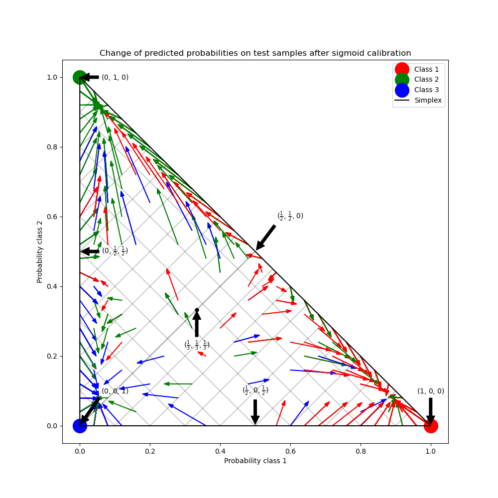
在上圖中,單體的每個頂點都代表一個完美預測的類別(例如,1、0、0)。單體內的中心點表示以相等的機率預測三個類別(即,1/3、1/3、1/3)。每個箭頭都從未校準的機率開始,並以箭頭頭部在校準的機率結束。箭頭的顏色表示該測試樣本的真實類別。
未校準的分類器對其預測過於自信,並產生較大的 對數損失。校準的分類器由於兩個因素而產生較低的 對數損失。首先,請注意在上圖中,箭頭通常指向遠離單體的邊緣,其中一個類別的機率為 0。其次,大部分箭頭指向真實類別,例如,綠色箭頭(真實類別為「綠色」的樣本)通常指向綠色頂點。這會減少過於自信的 0 預測機率,同時增加正確類別的預測機率。因此,校準的分類器會產生更準確的預測機率,從而產生較低的 對數損失
我們可以透過比較未校準和校準的分類器在 1000 個測試樣本預測上的 對數損失 來客觀地展示這一點。請注意,另一種方法是增加 RandomForestClassifier 的基底估計器(樹)數量,這也會導致 對數損失 的類似減少。
Log-loss of
 * uncalibrated classifier: 1.327
 * calibrated classifier: 0.549
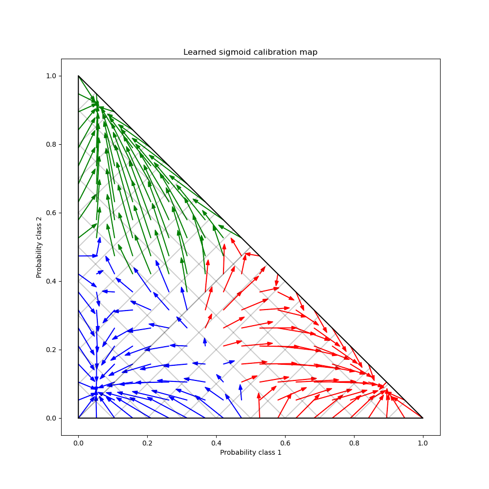
最後,我們在 2 單體上產生一個可能的未校準機率網格,計算相應的校準機率,並為每個機率繪製箭頭。箭頭會根據最高的未校準機率著色。這說明了學習到的校準圖。
plt.figure(figsize=(10, 10))
# Generate grid of probability values
p1d = np.linspace(0, 1, 20)
p0, p1 = np.meshgrid(p1d, p1d)
p2 = 1 - p0 - p1
p = np.c_[p0.ravel(), p1.ravel(), p2.ravel()]
p = p[p[:, 2] >= 0]

# Use the three class-wise calibrators to compute calibrated probabilities
calibrated_classifier = cal_clf.calibrated_classifiers_[0]
prediction = np.vstack(
    [
        calibrator.predict(this_p)
        for calibrator, this_p in zip(calibrated_classifier.calibrators, p.T)
    ]
).T

# Re-normalize the calibrated predictions to make sure they stay inside the
# simplex. This same renormalization step is performed internally by the
# predict method of CalibratedClassifierCV on multiclass problems.
prediction /= prediction.sum(axis=1)[:, None]

# Plot changes in predicted probabilities induced by the calibrators
for i in range(prediction.shape[0]):
    plt.arrow(
        p[i, 0],
        p[i, 1],
        prediction[i, 0] - p[i, 0],
        prediction[i, 1] - p[i, 1],
        head_width=1e-2,
        color=colors[np.argmax(p[i])],
    )

# Plot the boundaries of the unit simplex
plt.plot([0.0, 1.0, 0.0, 0.0], [0.0, 0.0, 1.0, 0.0], "k", label="Simplex")

plt.grid(False)
for x in [0.0, 0.1, 0.2, 0.3, 0.4, 0.5, 0.6, 0.7, 0.8, 0.9, 1.0]:
    plt.plot([0, x], [x, 0], "k", alpha=0.2)
    plt.plot([0, 0 + (1 - x) / 2], [x, x + (1 - x) / 2], "k", alpha=0.2)
    plt.plot([x, x + (1 - x) / 2], [0, 0 + (1 - x) / 2], "k", alpha=0.2)

plt.title("Learned sigmoid calibration map")
plt.xlabel("Probability class 1")
plt.ylabel("Probability class 2")
plt.xlim(-0.05, 1.05)
plt.ylim(-0.05, 1.05)

plt.show()
腳本的總執行時間:(0 分鐘 1.589 秒)
相關範例